How To Build A Mobile Website

Advertisement

Over the past few years, mobile web usage has considerably increased to the point that web developers and designers can no longer afford to ignore it. In wealthy countries, the shift is being fueled by faster mobile broadband connections and cheaper data service. However, a large increase has also been seen in developing nations where people have skipped over buying PCs and gone straight to mobile.

Unfortunately, the mobile arena introduces a layer of complexity that can be difficult for developers to accommodate. Mobile development is more than cross-browser, it should be cross-platform. The vast number of mobile devices makes thorough testing a practical impossibility, leaving developers nostalgic for the days when they only had to support legacy browsers.

In addition to supporting different platforms, each device may use any number of mobile web browsers. For instance, an Android user could access your site using the native Android browser, or could have also installed Opera Mini or Firefox Mobile. It’s fine as long as the smartphone uses a progressive web browser (and it’s safe to say that most browsers are progressive nowadays), but it doesn’t have to.

Smartphone Market Share
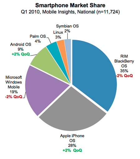
Source: Nielsen Study, Image credit

The mobile web reintroduces several issues that have been largely ignored in recent years. First, even with 4G networks, bandwidth becomes a serious issue for mobile consumers. Additionally, mobile devices have a significantly reduced screen size, which presents screen real estate issues that have not existed since the days of projection monitors. Combine these issues with cross-platform compatibility problems, and it isn’t hard to see how mobile development is a lot like ‘stepping backwards in time’. So let’s tackle these issues one at a time and create a road map for mobile web development:

How To Implement Mobile Stylesheets

The first step to adding mobile support to a website is including a special stylesheet to adjust the CSS for mobile devices:

Server-side Methods & The UA String

One approach to including mobile stylesheets involves detecting the user agent string with a server-side language such as PHP. With this technique, the site detects mobile devices and either serves an appropriate stylesheet or redirects the user to a mobile subdomain, for instance m.facebook.com. This server-side approach has several advantages: it guarantees the highest level of compatibility and also allows the website to serve special mark-up/content to mobile users.

Facebook Mobile (m.facebook.com)
Large image

While this technique is perfect for enterprise level websites, there are practical concerns that make it difficult to implement on most sites. New user agent strings come out almost daily, so keeping the UA list current is next to impossible. Additionally, this approach depends on the device to relay its true user agent. Even though, browsers have spoofed their UA string to get around this type of detection in the past. For instance, most UA strings still start with “Mozilla” to get through the Netscape checks used in the 90′s, and for several years Opera pretended to be IE. As Peter-Paul Koch writes:

“It’s an arms race. If device detection really catches on, browsers will start to spoof their user agent strings to end up on the right side of the detects.”

Client-side Methods & Media Queries

Alternately, the easiest approach involves detecting the mobile device on the client side. One of the earliest techniques for including mobile stylesheets involves taking advantage of the stylesheet’s media type, for instance:

<link rel="stylesheet" href="site.css" media="screen" />
<link rel="stylesheet" href="mobile.css" media="handheld" />

Here we’ve included two stylesheets, the first site.css targets desktops and laptops using the screen media type, while the second mobile.css targets mobile devices using handheld. While this would otherwise be an excellent approach, device support is another issue. Older mobile devices tend to support the handheld media type, however they vary in their implementation: some disable the screen stylesheets and only load handheld, whereas others load both.

Additionally, most newer devices have done away with the handheld distinction altogether, in order to serve their users fully-featured web pages as opposed to duller mobile layouts. To support newer devices, we’ll need to use media queries, which allow us to target styles to the device width (you can see another practical adaptation of media queries in Ethan Marcotte’s article Responsive Web Design). Since mobile devices typically have smaller screens, we can target handheld devices by detecting screens that are 480px and smaller:

<link rel="stylesheet" href="mobile.css" media="only screen and (max-device width:480px)"/>

While this targets most newer devices, many older devices don’t support media queries, so we’ll need a hybrid approach to get the largest market penetration.

First, define two stylesheets: screen.css with everything for normal browsers and antiscreen.css to overwrite any styles that you don’t want on mobile devices. Tie these two stylesheets together in another stylesheet core.css:

@import url("screen.css");
@import url("antiscreen.css") handheld;
@import url("antiscreen.css") only screen and
(max-device-width:480px);

Finally, define another stylesheet handheld.css with additional styling for mobile browsers and link them on the page:

<link rel="stylesheet" href="core.css" media="screen"/>
<link rel="stylesheet" href="handheld.css" media="handheld,
only screen and (max-device-width:480px)"/>

While this technique reaches a large market share of mobile devices, it is by no means perfect. Some mobile devices such as iPad are more than 480 pixels wide and will not work with this method. However, these larger devices arguably don’t need a condensed mobile layout. Moving forward, there will likely be more devices that don’t fit into this mold. Unfortunately, it is very difficult to future-proof mobile detection, since standards are still emerging.

Besides device detection, the media query approach also presents other issues. Mainly, media queries can only style content differently and provide no control over content delivery. For instance, a media query can be used to hide a side column’s content, but it cannot prevent that mark-up from being downloaded by your users. Given mobile bandwidth issues, this additional HTML should not simply be ignored.

User Initiated Method

Ikea's non-mobile site

Considering the difficulties with mobile UA detection and the pitfalls of media queries, some companies such as IKEA have opted to simply allow the user to decide whether to view the mobile version of their website. While this has the clear disadvantage of requiring more user interaction, it is arguably the most fool-proof method and also the easiest to accomplish.

The site contains a link that reads “Visit our mobile site” which transports the user to a mobile subdomain. This approach has some drawbacks. Of course, some mobile users may miss the link, and other non-mobile visitors may click it, since it is visible regardless of what device is being used. Even though, this technique has the advantage of allowing the user to make the mobile decision. Some users prefer a condensed layout that is optimized for their device, whereas other users may prefer to access the entire website, without the restrictions of a limited mobile layout.

What To Change With Mobile Stylesheets

Now that we’ve implemented mobile stylesheets, it’s time to get down to the nuts and bolts of which styles we actually want to change.

Increase & Alter Screen Real Estate

CNN Standard Site vs. Mobile

The primary goal of mobile stylesheets is to alter the layout for a smaller display. First and foremost this means reducing multi-column layouts to single columns. Most mobile screens are vertical, so horizontal space becomes even more “expensive” and mobile layouts can rarely afford more than one column of content. Next, reduce clutter throughout the page by setting display: none; on any less important elements. Finally, save additional pixels by reducing margins and padding to create a tighter layout.

Reduce Bandwidth

Another goal of mobile stylesheets is to reduce bandwidth for slower mobile networks. First make sure to remove or replace any large background images, especially if you use a background image for the whole site. Additionally set display: none on any unnecessary content images.

If your site uses images for buttons or navigation, consider replacing these with plain-text / CSS counterparts. Finally if you’d like to force the browser to use the alternate text for any of your images, use this snippet (and use JavaScript to add the as-text class for img and make sure that alt-attributes are properly defined in your markup):

img.as-text { content: attr(alt); }

Other Changes

Besides addressing screen size and bandwidth concerns, there are a few additional changes that should be made in any mobile stylesheet. First, you can improve readability by increasing the font size of any small or medium-sized text. Next, clicking is generally less precise on mobile devices, so make sure to increase the clickable areas of any important buttons or links by setting display: block and adding padding to the clickable elements.

Additionally, floated elements can cause problems for mobile layouts, so consider removing any floats that aren’t absolutely necessary. Remember that horizontal real estate is especially expensive on mobile, so you should always opt for adding vertical scrolling as opposed to horizontal.

Finally, mouseover states do not work with most mobile devices, so make sure to have proper definitions of :active-states. Also, sometimes it may be useful to apply definitions from the already defined :hover states to the :active states. This pseudo-class is displayed when the user clicks an item, and therefore will work on mobile devices. However this only enhances the user experience and should not be relied on for more important elements, such as drop-down navigation. In these cases it is best to show the links at all times in mobile devices.

Beyond Stylesheets

In addition to mobile stylesheets, we can add a number of special mobile features through mark-up.

Clickable Phone Numbers

First, most handheld devices include a phone, so let’s make our phone numbers clickable:

<a href="tel:15032084566" class="phone-link">(503) 208-4566</a>

Now mobile users can click this number to call it, however there are a few things to note. First, the number in the actual link starts with a 1 which is important since the web is international (1 is the US country code).

Second, this link is clickable whether or not the user has a mobile device. Since we’re not using the server-side method described above, our best option is to simply hide the fact that the number is clickable via CSS. So use the phone-link class to disable the link styling in your screen stylesheet, and then include it again for mobile.

Special Input Types

iPhone displays special HTML5 input types

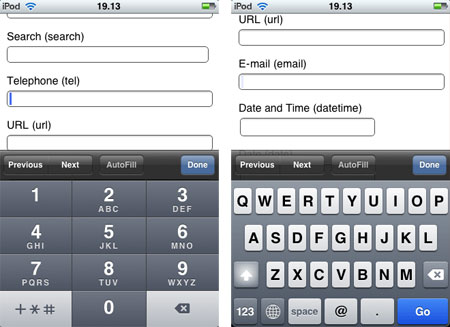
When it comes to mobile browsing, another concern is the difficulty of typing compared to a standard full-sized keyboard. But we can make it easier on our users by taking advantage of some special HTML5 input types:

<input type="tel" />
<input type="email" />

These input types allow devices such as iPhone to display a contextual keyboard that relates to the input type. In the example above type="tel" triggers a numeric keypad ideal for entering phone numbers, and type="email" triggers a keypad with @ and . buttons.

HTML5 input types also provide in-browser validation and special input menus that are useful in both mobile and non-mobile browsing. Furthermore, since non-supportive browsers naturally degrade to view these special input types as <input type="text" />, there’s no loss in using HTML5 input types throughout your websites today.

See a complete list of HTML5 input types. You can find some information about the current browser support of HTML5 input attributes in the post HTML5 Input Attributes & Browser Support by Estelle Weyl.

Viewport Dimensions & Orientation

When modern mobile devices render a webpage, they scale the page content to fit inside their viewport, or visible area. Although the default viewport dimensions work well for most layouts, it is sometimes useful to alter the viewport. This can be accomplished using a <meta> tag that was introduced by Apple and has since been picked up by other device manufacturers. In the document’s <head> include this snippet:

<meta name="viewport" content="width=320" />

In this example we’ve set the viewport to 320, which means that 320 pixels of the page will be visible across the width of the device.

The viewport meta tag can also be used to disable the ability to resize the page:

<meta name="viewport" content="width=320,user-scalable=false" />

However, similar to disabling the scrollbars, this technique takes control away from the user and should only be used for a good reason.

Additionally, it is possible to add certain styles based on the device orientation. This means that different styles can be applied depending on whether the user is holding their phone vertically or horizontally.

To detect the device orientation, we can use a media query similar to the client-side device detection we discussed earlier. Within your stylesheet, include:

@import url("portrait.css") all and
(orientation:portrait);
@import url("landscape.css") all and
(orientation:landscape);

Here portrait.css styles will be added for vertical devices and the landscape.css will be added for horizontal.

However orientation media queries have not been adopted by all devices, so this is best accomplished with the max-width media query. Simply apply different max-width queries for the different orientation widths you want to target. This is a much more robust approach, since presumably the reason to target different orientations is to style for different widths.

Special Concerns For iPhone / iPad

iPhone 4

With a market share of 28% and estimates of as much as 50% of mobile browsing going through iPhone, it makes sense that developers make special accommodations for the mobile giant.

No Flash

Regardless of Apple’s ethics, the reality is that iPhones do not play Flash unless they are jailbroken. Fortunately, there are alternatives to Flash, and iPhone’s issues with this technology are often easy to get around. The main use for Flash in modern websites is Flash video, which can easily be circumvented using HTML5 video. However since older browsers don’t support HTML5, make sure to include a Flash backup for non-supportive browsers (this is why the whole debate about Flash vs. HTML5 is a bit pointless, because you can actually offer both to your users and the user’s device will pick up the one it can render automatically).

Beyond video, it is usually best to use JavaScript to accommodate any simple functionality. JavaScript libraries such as jQuery make it easy to build rich interactive applications without Flash. Regardless of your desire to support iPhone, these JavaScript apps typically have a number of additional advantages over Flash alternatives.

Finally, certain applications are simply too hard to recreate with HTML5 and Javascript. For these, iPhone users will have to be left out, however make sure to include appropriate alternate content.

Apple Loves Adobe
A spoof of Adobe’s “We Love Apple” campaign, where the heart is replaced by the broken plugin icon.

Other Shortcomings

Besides Flash, there are a few additional caveats to supporting iPhones and iPads.

First, iPhone does not support <input type="file" />, since it does not have an accessible internal file structure. While most mobile devices connect to a computer as an external hard-drive, Apple has taken steps to ensure that the iPhone file structure remains obfuscated.

Next, iPhone will only cache files that are 25 kb or less, so try to keep any reused files under this restriction. This can be a bit counter-intuitive, as it often means breaking out large image sprites and concatenated JavaScripts into smaller chunks. However be careful to serve these files only to iPhone, or it will cause extra HTTP requests in all other browsers.

Finally, when it comes to @font-face font embedding, iPhone’s Mobile Safari doesn’t fully support it and supports the SVG file format instead. However, SVG fonts are only supported by Chrome, Opera and iPhone, so we’ll need a hybrid approach to target all browsers. In addition to the SVG, we’ll need an .otf or .ttf for Firefox and Safari, as well as an EOT for IE (IE has actually supported @font-face since IE4).

After obtaining the necessary files, tie them all together with the appropriate CSS:

@font-face {
    font-family: 'Comfortaa Regular';
    src: url('Comfortaa.eot');
    src: local('Comfortaa Regular'),
         local('Comfortaa'),
         url('Comfortaa.ttf') format('truetype'),
         url('Comfortaa.svg#font') format('svg');
}

For more information, read this article on cross-platform font-face support.

Special iPhone / iPad Enhancements

Despite iPhone’s various shortcomings, the device offers a wonderfully rich user experience that developers can leverage in ways not possible with older mobile devices.

First, there are a variety of JavaScript libraries that can be used to access some of the more advanced functionality available in iPhone. Take a look at Sencha Touch, jQTouch and iui. These three libraries allow you to better interface with the iPhone, and also work on similar devices such as Android. Additionally, keep an eye on the much anticipated jQuery Mobile which has just been released in alpha.

Next, the App Store isn’t the only way to get an icon on your users’ iPhones: you can simply have them bookmark your page. Unfortunately the default bookmark icon is a condensed screen shot of the page, which doesn’t usually look very good, so let’s create a special iPhone icon. Also check the Icon Reference Chart by Jon Hicks for further details.

Start by saving a 57 x 57 pixel PNG somewhere on your website, then add this snippet within your <head> tag:

<link rel="apple-touch-icon" href="/customIcon.png"/>

Don’t worry about rounded corners or a glossy effect, iPhone will add those by default.

Conclusion

As the worldwide shift to mobile continues, handheld device support will become increasingly important. Hopefully this article has left you with both the desire and toolset necessary to make mobile support a reality in your websites.

Although mobile occupies a significant chunk of global web browsing, the technology is still very much in its infancy. Just as standards emerged for desktop browsing, new standards are emerging to unify mobile browsers. This means that the techniques described in this article are only temporary, and it is your responsibility to stay on top of this ever-changing technology.

In fact, the only thing in web development that remains constant is the perpetual need to continue learning!

Additional Reading

Buy our eBook “Mobile Design For iPhone And iPad”!

Screenshot

This article is a free sample of our new eBook Mobile Design For iPhone And iPad (just $9.90). This eBook presents articles on professional mobile design for the iPhone as well as the iPad, including studies of trends in mobile design and guidelines for the development of mobile web pages.

These articles are a selection of the best from Smashing Magazine in 2009 and 2010, dealing with mobile design for the iPhone and iPad, plus an exclusive 90-page study about mobile web design trends.

The authors are: Alexander Dawson, Alexander Komarov, Cameron Chapman, Jen Gordon, Jon Raasch, Kim Pimmel, Luke Wroblewski, Marc Edwards, Michael Flarupp, Nick Francis, Rachel Andrew and Steven Snell. Available as a PDF, ePub and Mobipocket formats.

(ik) (vf)

Jon Raasch is a front-end web developer / UI designer with endless love for jQuery, CSS3 and performance tuning. Follow him on Twitter or read his blog.

  1. 1

    Thanks for this. Came at a good time, as I am thinking of doing a few Mobile applets.

    Quite surprised by the OS market share, Blackbury taking a big chunk. Thought Andriod and Symbian would have had a lot more.

    I’m primarily a Windows Development, so seeing the windows market share gives me hope. Although they are down a bit, I would hope that the New Windows Mobile 7 will pick that up.

    0
    • 2

      I was a bit surprised by these numbers too, especially considering the figures Apple has been touting. Some of the Blackberry dominance may be due to people still using an older device (since iPhone / Android are newer).

      See the other charts here: http://tech.fortune.cnn.com/2010/06/04/nielsen-iphone-android-gain-on-rim/

      0
      • 3

        Its important to note that these figures are US-based and that worldwide Nokia dominates worldwide as well as Sony, LG, Samsung and other manufacturers. And even within the US, the Blackberry dominance definitely isn’t just due to people using older devices. RIM still dominates the corporate world and is extremely popular with text-crazed teenagers.

        Its important to note this iPhone/Android development is popular, easier and more attractive. But to create a true mobile experience, website makers need to look at the big picture, not just a fraction of the smartphone market. That remaining unattractive piece of the pie just also happens to be a huge piece of pie.

        0
      • 4

        Note that the OS chart data is almost a year old, back in Q1 2010… by now, Nov 2010, I believe that Android has more than caught up with Apple.

        +1
  2. 5

    Fantastic post. Some great tips, especially those that talk about finer details like the input types; helps distinguish a good mobile site from a great one. Will definitely be using some of these tips for a mobile version of Grounded Travel.

    0
  3. 6

    You should use tables in your mobile designs. Since they scale based on width tables make great layout elements. Just make sure there’s no border or it will look stupid.

    Speaking of looking stupid there’s no Flash. How do you direct mobile users around a killer flash intro, or use HTML 5 to animate it?

    0
    • 7

      I can’t tell if you’re kidding but I’d skip the Flash intro in all platforms, mobile or not. Modern mobile browsers do a good job of scaling any content, so there’s not as much of a need for table based mobile layouts these days. Besides, you should be sticking to one column anyway, so there’s not much need to use table cell scaling.

      0
      • 8

        Tables scale well in all browsers so you can use the same layout for a mobile device or on Chrome or even IE6. A single column layout won’t work well when the subnav is coded in the left column, so they are very necessary, and my clients love Flash intros because they are an engaging way to introduce people to the site and work in every browser (except mobile).

        +1
        • 9

          You should never use Tables to design your website. Table are for tabular data, not layouts.

          +1
          • 10

            Actually Connor, Myspace, one of the world’s largest social media websites uses nested tables for it’s layouts.

            0
          • 11

            @Mike And it is also one of the most poorly-designed websites in the world. Tables should never be used, as Connor has stated.

            +1
          • 12

            I’m not sure you guys know what you’re talking about. The same table can be used for any 3 column layout and it can be styled into any design you have. It scales automatically if you set the width right, and if you remove a column and set the colspan of one of the remaining columns to 2 you have a 2 column version of the same layout. It looks the same on an iPad or Chrome or IE6. It has more advantages than any other type of layout.

            0
          • 13

            @Mike, Actually these guys are very right. Tables are for tabular data not style and layout. CSS is for layout and style. It’s considered bad practice to mix content and design, it makes things a horrid mess to maintain and update, it holds far less advantages than it does drawbacks. It’s the true mark of an inexperienced designer. Learn CSS and build sites correctly and semantically.

            And yes, Myspace is a very very poorly designed site. Hence the reason it is such a pain to apply any css to. A well designed site would only need a fraction of the css myspace needs in order to hack and cobble a theme together. The fact that it uses nested tables only makes things worse and further proves this fact.

            Don’t believe us; check out w3.org for current web coding standards
            Specifically: http://www.w3.org/TR/html401/struct/tables.html
            Which states, clearly:

            Tables should not be used purely as a means to layout document content as this may present problems when rendering to non-visual media. Additionally, when used with graphics, these tables may force users to scroll horizontally to view a table designed on a system with a larger display. To minimize these problems, authors should use style sheets to control layout rather than tables.

            +2
          • 14

            @O’Ryan

            You sir have showed me the error of my ways. I will forever on code using divs, semantic markup, and code that validates according to W3C standards. I will only use websafe fonts except when the statement of work entails using a css-friendly method of font replacement such as @font-face and only then will I use fonts where I am licensed to do so. I will never use Flash for intros or otherwise as it can drain resources, it can’t be read (well) by screen readers or search engines, and it’s not very mobile-friendly.

            I will limit my use of css conditional statements as using best practices to code improves cross-browser compatibility and while conditionals are helpful, they are just glorified workarounds. Though in the case where functionality or css that is unsupported by IE6 is required, it can give IE6 users a similar yet slightly lesser experience when IE6 must be supported on a project (though I will still fight tooth and nail to not support it so it will fade away eventually).

            When developing for a mobile platform I will test on the actual device in addition to it’s emulators as to catch the tiny nuances that an emulator can’t show.

            Png fixes should be used sparingly but can be a necessary evil. Oh yeah, use Firebug.

            0
          • 15

            Obvious troll was obvious.

            0
          • 16

            One should never use the table-tag for layout. But table layout is perfecly ok, if applied by using the css feature display:table.

            0
  4. 17

    Thank you so much for this post! I was hoping for something like this that could help me to build mobile sites. I will definitely use these great tips in upcoming projects!

    0
  5. 18

    It might be a good idea to update the year old Nielson graphic.
    http://blog.nielsen.com/nielsenwire/online_mobile/mobile-snapshot-smartphones-now-28-of-u-s-cellphone-market/

    Android is now 20% of the mobile market and climbing, iPhone is 27%, RIM is 30% and falling, etc.

    +1
  6. 19

    Great post. On the comment about marketshare…I don’t have the exact link, but I have seen several recent articles (within last month or so) showing that Android has now displaced iphone for top spot of users.

    0
  7. 21

    Finaly a great tutorial about mobile websites!

    0
  8. 22

    You have a problem with Smashingmagazine website design on chrome 7.0.517.41 . I have a big scroll bar because of bottom photo.

    0
  9. 23

    Awesome write-up. Lots of good info that I didn’t even realize was available for mobile development.

    0
  10. 24

    Nice post, I especially like the comments about the form enhancements for IPhone users. Another thing you can do is to make a call when someone clicks on a phone number… put href=”tel:number_here” in your link. We designed our website for mobile use recently, here’s my findings

    0
  11. 25

    Nicolas Gallagher

    November 3rd, 2010 6:46 am

    Fairly sure that approaches such as setting images to “display:none” doesn’t stop them being downloaded, and therefore, doesn’t help with bandwidth concerns. The recent study that suggests mobile users, in general, are not fans of stripped down mobile sites points towards the IKEA approach being fairly appropriate.

    0
    • 26

      I just did some quick testing and it looks like images (in an <img> tag) still get pulled regardless of display:none. I tested in desktop FF, so I’m not sure how mobile browsers handle this. However this advice still works for elements with a background-image.

      -1
    • 27

      You’re right about this, any content set to “display: none” still exists, its just hidden. This is why frontend solutions alone are insufficient to deliver the appropriate experience for mobile and why the recent obsession with media queries is short-sighted.

      James says it best in the comments below explaining how a mobile site is not merely a squashed down version of the desktop site, but rather a unique experience to provide users an optimized experience for their context.

      0
  12. 28

    So the iPhone is limited to caching components that are <25K and jQuery 1.4.3 (minified) is 26K? If 26K of jQuery is loaded on every page load, that seems a very good reason no to use it at all (or jQuery Mobile, which apparently requires regular jQuery). Am I misunderstanding anything here?

    0
  13. 33

    This is great but it doesn’t help me with the Blackberry 8300.

    0
  14. 34

    The task should fall onto mobile phone manufacturers to provide as rich of a browsing experience as a traditional computer, rather than webmasters to detect & create device/browser-dependent versions of their websites.

    Comparing older “smart” phones with the current iPhone tells me that already, manufacturers have come far. It will only get better.

    In the meantime, I’ll continue to develop web-standardized content and wait for mobile phones to catch up.

    0
    • 35

      I don’t think this is a very practical approach, it reminds me of deliberately ignoring IE6 despite a realistic usage share of over 10%. With mobile browsing where it’s at today, I think it would be a big mistake for any company to not target these devices, today and in the future.

      0
  15. 36

    Stephanie Rieger

    November 3rd, 2010 7:25 am

    There are a few problems with the specified approach for dealing with style sheets. Devices that don’t understand media queries (many of which are very popular around the world) will get the desktop styles as they won’t load the 2nd antiscreen. Most of these devices also don’t support ‘handheld’ (as you duly noted) so the first antiscreen ‘handheld’ style sheet will also be ignored by a large number of devices. Only the iPhone, Android devices, Nokia (primarily touch) devices and the very newest (i.e. just released) BlackBerry will get the mobile version.

    Another issue is that hiding images using display:none does just that…it simply hides the image. On most browsers, the image is still downloaded to the device. Some of these issues are discussed in this article http://www.cloudfour.com/css-media-query-for-mobile-is-fools-gold/

    What many people are beginning to recommend is to serve the simplest markup first and use media queries to enhance. In this way “the absence of a media query is the first media query”. The simple devices that don’t understand the media query *always* get the ‘basic’ version because it’s the default. The more capable devices that understand the media query get an enhanced ‘mobile’ experience. You can use yet another style sheet to enhance for the desktop (if the site is meant to be flexible all the way from mobile to desktop…otherwise, you can use this approach to simply build an extremely flexible mobile site).

    (I would include specific links to a working example of this but I think that would be considered ‘advertising’ per Smashing’s guidelines.)

    0
  16. 37

    I stopped reading as soon as I saw a graph of the “Smart phone” market.
    iOS and Android combined are only 8% of the total mobile device market.

    0
  17. 41

    iPhone OS3 and OS3.1 will only cache 15k:

    http://www.phpied.com/iphone-caching/

    “iPhone will not cache components bigger than 15K (was 25K in the previous experiment)

    total cache is about 1.5MB (was 500K)

    Previous experiment showed that the iPhone will not cache components bigger that 25K, but this number is now down to 15K. And this is ungzipped size, meaning if you have for example a 20K JavaScript and your server sends it gzipped down to 10K, it will not be cached by the iPhone.

    All in all we can safely summarize that the iPhone has no cache to speak of. 15K per component is nothing and the limit of 1.5Megs shared with all other pages will have your cached components kicked out pretty quickly.

    consider HTML5 application cache to improve cacheability”

    0
  18. 42

    Don’t forget that mobile users might simply want to do different things to their sedentary brethren.

    Taking a site designed for one user context and assuming that some layout changes will make it suitable for an entirely different context is risky: you might get away with it – but there’s no excuse for not having thought about what mobile users want from your service from first principles.

    e.g. No-one thinks twice about putting ‘contact us’ at the end of a footer menu on a desktop site. On a mobile site, it may deserve to be front and foremost. We’re talking about a communications device here! Challenge all your desktop assumptions.

    (Also, the limitations of mediaqueries aside, using ‘antiscreen.css’ to retrospectively dumb-down is scary. Why not send the mobile stylesheet by default and then *enhance* for the desktop browser?)

    0
  19. 43

    Great post! One note, I believe for Apple products you can have a “apple-touch-icon.png” right in your site’s root folder WITHOUT the extra mark-up in the of your document, and the iPhone/iPod will pick it up. (like favicon.ico).

    0
    • 44

      Nice, I didn’t know about this, thanks for the advice.

      0
    • 45

      You can also place it in another folder and point to it like this:

      link rel=”apple-touch-icon-precomposed” href=”/custom_icon.png”

      Bonus, Android also interprets that when you add the bookmark to your homescreen.

      0
  20. 46

    Stephanie Rieger

    November 3rd, 2010 8:21 am

    There are a few problems with the specified approach for dealing with style sheets. Devices that don’t understand media queries (many of which are very popular around the world) will get the desktop styles as they won’t load the 2nd antiscreen. Most of these devices also don’t support ‘handheld’ (as you duly noted) so the first antiscreen ‘handheld’ style sheet will also be ignored by a large number of devices. Only the iPhone, Android devices, Nokia (primarily touch) devices and the very newest (i.e. just released) BlackBerry will get the mobile version.

    Another issue is that hiding images using display:none does just that…it simply hides the image. On most browsers, the image is still downloaded to the device.

    What many people are beginning to recommend is to serve the simplest markup first and use media queries to enhance. In this way “the absence of a media query is the first media query”. The simple devices that don’t understand the media query *always* get the ‘basic’ version because it’s the default. The more capable devices that understand the media query get an enhanced ‘mobile’ experience. You can use yet another style sheet to enhance for the desktop (if the site is meant to be flexible all the way from mobile to desktop…otherwise, you can use this approach to simply build an extremely flexible mobile site).

    0
    • 47

      I think we can agree that there is no perfect solution at this point, but I’m intrigued by this approach. How would you serve the stylesheet to desktop browsers in a way that isn’t loaded by mobile devices? This doesn’t seem much different from the media query approach mentioned here (assuming that semantic markup is used). Do you have a link to this approach? I think everyone would benefit from another approach.

      0
      • 48

        Stephanie Rieger

        November 3rd, 2010 9:11 am

        Thanks Jon for the comment. I can’t post links in comments here so sent you some links via Twitter.

        +1
      • 50

        Stephanie’s solution is indeed conducive to the media query approach that you’ve described, only its thinking about it differently. Instead of scaling down for mobile, we’re actually scaling up for desktop. The desktop media query might include something like this:

        max-device width:3000px

        This is a drastic change in mentality but could be a great solution. The mobile site would be the default, then different styles, larger assets, and more functionality get loaded in for the appropriate screen size. This would require a combination of server side logic, Javascript and CSS, but would ultimately create a user experience catered to their appropriate context.

        The mantra of “there is no silver bullet” rings especially true for mobile web development, so relying solely on one method of detection will fall short.

        0
    • 51

      Stephanie,

      I think this is certainly great thinking, and a very useful approach. I would have no problem with it, except for the fact that you’re designing for about a 3% market share, then adding enhancements for better devices.

      I like the method being used, because it progressively enhances the layout, rather than degrading it.

      So my question is: Why are people agreeing with starting from a platform that only has a 3% market share, but when I suggest that people code for IE6/7 first, and enhance from there, people react like I’m supporting the new rise of nazism?

      Don’t get me wrong — I agree with the principles of this approach (that is, designing for mobile, and working your way up), but I think it’s hypocritical for developers to ignore or serve a bad experience to a 5-15% market share, but then focus their efforts on a 3% instead.

      0
      • 52

        Steven Anthony

        April 4th, 2012 4:01 am

        I’m thinking about a couple of reasons as to why it would be useful to develop specifically for such a ‘minority’ market share.

        First off this ‘minority’ is a goldmine. From a business perspective, having a user on a full-feature website is great (anyone would agree), however the fact that a mobile viewer is only ONE step away from calling the business (and becoming a prospective client) is invaluable.

        Another thought is that it is only in recent times that IE has not dominated the market. However there was a time when your target audience could easily be 100% IE. Could you make the case that you shouldn’t develop for IE6 just because it’s a backward, (non-standards-compliant, complete piece of crap) browser even though it encompasses your entire audience? And what if only 1% of your audience were IE? What then? That’s really up to you and goals.

        Yes, it’s true that IE has had an increasingly low amount of users. And yes, it’s true that relatively few people use mobile devices to browse the web. However, the difference is that while the IE share is decreasing, mobile browsing is an evolving, ever-growing market.

        0
  21. 53

    i am thinking to make mobile version for my client now. Very useful post. thanks a lot.

    0
  22. 54

    “The site contains a link that reads “Visit our mobile site” which transports the user to a mobile subdomain.”

    Why not combine this with a Media Query or User Agent string so that the page is given an overlay on the first time the user lands on the site? The overlay gives the user the choice between the normal and mobile site. This can then set a cookie or session and still allow the user to choose which version they want.

    Obviously you wouldnt show the overlay for a normal browser. You would accomplish this by using either technique. I would personally opt for Media Queries.

    0
    • 55

      What we did was check on page load if the site is a mobile device by checking user agents and then redirect accordingly, however if the user did want to see either version of our site (mobile or desktop site) then we have a link within each to take them to the other version of our site. Voila, you are not forcing the user to do one or the other, but they are shown what we would want them to see on 1st visit… i.e. mobile for mobile and desktop for desktop

      0
  23. 56

    How about the rest of the world? The Market share graph is awkwardly misleading.

    0
  24. 57

    I was lucky enough to get to code Audible’s mobile website. It was definitely a bit more difficult than a normal website, considering I had to make it flexible for vertical and horizontal alignments, as well as pixel perfect. It was fun learning how to get it “cross-mobile” compatible though ;)

    BTW Blackberry is the IE of the mobile web….

    0
  25. 58

    This isn’t about how to build mobile sites. It’s about how to build sites for iPhones. Good tips nevertheless, but the title of this article is misleading.

    0
    • 59

      There’s a section that’s specific to iPhone but most of the article applies to mobile dev in general. Sure, some of the tips only affect more modern devices such as iPhone, but they also pertain to other devices such as Android.

      0
  26. 61

    You didn’t mention the DOCTYPE – any particular recommendations on that front?

    0
  27. 62

    If you make the apple-touch-icon 129x129px, rather than the suggested 57×57, then it’ll look much better scaled on an iPad or iPhone 4 with its retina display (and still looks good on an iPhone 3GS or less).

    0
  28. 63

    Love this article very helpful!

    0
  29. 64

    Thanks for this article which will be really helpful. I understand now why some people thinks we should realize website on mobile first (http://www.lukew.com/ff/entry.asp?1137).
    Its a new market with so many cool things to do.

    0
  30. 65

    very good article. i have gone through from the beginning to the end and now had a good understanding for building mobile capable websites.
    Thanks for sharing.. Love it!

    0
  31. 66

    I’m making a mobile version of my website and from my experience, i’d say : never use the same html for mobile and desktop versions. You remove almost everything on the mobile version anyway. Don’t try to make everything fit, rearrange your html, have incredibly complex stylesheets.
    A good template system is a much better idea.

    Use mediaqueries for orientation in the same mobile css, don’t make two css : portrait and landscape.

    Be aware that the iphone 4 pretends to have the same resolution that the previous iphones. It just doubles the resolution internally. If you want a highdef pic, specify its size at half its real size. The other phones will scale it but the iphone 4 will show all the pixels. It should be the same with android phones with very high dpi.

    0
  32. 67

    There are dashes of sound advice in places here.
    The fact is this : Any well designed thoroughly tested fluid width layout scales down fine 99% of the time in webkit based mobile browsers.
    It’s also easy to test your layout using a webkit based desktop browser with the window scaled right down.
    So you do not need to fragment your site into two separate layouts if you tackle the smart phone market from the very outset as part of your brief.
    I believe that if starting a new site design today, it is utterly foolhardy not to design for the small screen of the smart phone first and then scale upwards for desktop or TV type displays afterwards using the same layout.

    The javascript cache in smart phones is a non issue as HTML 5 app cache emerges (Already in webkit, Opera) and visitors rarely move more than three levels away from a popular referral link on a site, (Unless the site has tons of reference, like a news site.)
    The extra bandwidth is minimal or shouldn’t matter in most instances, as long as jQuery or other heavy js isn’t loaded on every page unless app cache is used. It’s still a trade off, yet you shouldn’t try to penalise Android and Symbian webkit users just because Apple decided to make mobile Safari use an idiotically small cache size. Bad design from Apple.

    It goes without saying that on a site with tons of information to read like a news site, you wouldn’t use any or more than 10k js per page if you don’t use HTML 5 app cache but on a site page with a canvas game on it, size doesn’t really matter as much because the main content is the game itself and rich content virtually never comes in size small.

    0
  33. 68

    I should probably put more effort in mobile support in my websites. It’s never been my top priority as I don’t browse that much on handhelds myself, but the article is right. It can’t be ignored anymore, and there are lots of options.

    Great read, thanks!

    0
  34. 69

    wonderful information on mobile site.. very useful thanks for share..

    0
  35. 70

    A useful article – thanks Jon!

    0
  36. 71

    Thanks for article! Fresh info for me.

    0
  37. 72

    A very useful article indeed! But I would really like to know if you would recommend using ‘HTML-MP’ (HTML-Mobile Profile + CSS), because i’ve read a lot of articles about mobile webdesign and some describe the use of external stylesheets – like you do – and others prefer coding an extra website using ‘HTML-MP’, which is a recommendation by the World Wide Web Consortium (?).

    0
    • 73

      Stephanie Rieger

      November 4th, 2010 9:17 am

      Hi Timo,
      This really depends on the devices/browsers you plan to support. Modern “smartphone” browsers (iPhone, Android, Nokia touch, Nokia S60 3rd Edition, most BlackBerry, newer Samsung and LG) support “normal” HTML.

      On older devices and “featurephones” there may only be support for XHTML MP and you may run into rendering irregularities if you don’t use an XHTML MP doctype for your content.

      In either case, you can use an external CSS style sheet as long as the device supports it (all smartphones and most newer featurephones will support external CSS files). Not all devices will support all levels and features of CSS however, so it’s good to get to know what devices have what level of support.

      Hope this helps!

      0
  38. 75

    “Additionally set display: none on any unnecessary content images.”

    Just because they are set to not display doesn’t mean they don’t get loaded. As a bandwidth-saving measure this is pointless.
    Not a bad article per se, but very fragmented information.

    0
  39. 76

    Is designing for a smart phone really necessary? Personally, I can’t afford the extravagant monthly fee of a smart phone, so surfing the internet on one is out-of-the-question. Additionally, who really wants to surf the internet on a screen that’s smaller than your hand? I’ve tried one, and it causes eye strain which is bad for eye health (and I have 20/20 vision).

    With the iPad, I can see MUCH MORE POTENTIAL for a better experience and less eye strain due to the larger, more comfortable screen — or, for an optimum experience, use a 24″ screen. :)

    0
  40. 77

    Wow pretty timely, I just designed and developed a small mobile site for the company I work for today.

    After the experience, my biggest takeaways are:

    * Provide for and test on all sorts of platforms (Android, BB, iPhone, iPad, etc)

    * Use the existing Android or iPhone style UI! In my opinion, this is not the place to get *too* creative with styling. Instead, follow the existing design precedents for popular mobile sites. Building from these familar UIs mitigates the learning curve for users and is sure to create a much more intuitive experience.

    On a different note, I definitely disagree with those who suggest that you should use the same site (albeit scaled down) for both normal and mobile browsers. The two experiences are completely different, and require separate handling. IMO a mobile site is not just a question of whether your normal site will scale down properly — it’s a question of, how can I repurpose my site site to deliver as much value, as conveniently as possible?

    +1
  41. 78

    thanks for tips. very helpful article.

    0
  42. 79

    A very good article!
    I’m quit new to mobile devellopment, but i already have have ben using JQTouch for a mobile WebApp of ours and it works very well. We started by targeting WebKit browsers (Safari, Chrome) with this App using HTML5, local storage, client side Database, manifest file…the works…
    I can recomend this very good book: “Building iPhone Apps with HTML, CSS, and JavaScript” by Jonathan Stark (there exist a fre download Version. Please Google).
    We were starting with this type of App as we are Apple fans ;-) and we need an App where the user can work off-line, collecting data, that he can send later on when he moves back in an area where GSM is available.

    A nice approach by the JQTouch framework (among others) ist that the comlete WebApp is loaded at once. The different “Web Pages” are implemented as DIV-Blocks in this one HTML file. Off course it has to be done that way, otherwise of-line Work is not possible…

    As we are very well aware about that not every user hast got an iPhone, we are now searching for other ways to implement our WebApp using “HTML4″, i.e. no manifest file, no local storage and no database in the first place…

    I am mostly concerned about the “click” vs. “tap” event-problem in the JQTouch framework, so i ask my selve if i can use JQTouch for a more “HTML4″ type of WebApp putting the Data in the session until the user gets back in an area covered by GSM.

    Perhaps another book by Jonathan Stark helps us on the way (i have just started reading it): “Building Android Apps with HTML, CSS, and JavaScript” (there exist a fre download Version of this book to. Please Google).

    Can you give us a hint on this?
    Is it possible so set up a WebApp with JQTouch (or similar) that runs on plain and simple HTML(4) using only simple forms and session storage?
    It should run on Windows mobile too ;-)

    0
  43. 80

    No mention of the merits of building native apps for each device, shouldn’t that be part of the discussion? Useful information for sure, but most of the sites I work on show much greater traffice for native apps vs the mobile version of the site. It seems that for consumer sites, native apps may prove to be much more important than websites.

    Compounded by increasing screen size and more efficient mobile browsers, it seems the only remaining argument for building a mobile site is based on use case. Since what users are doing with their mobile device can be markedly different than what they do on a desktop/laptop.

    Tia.

    0
  44. 81

    good article

    0
  45. 82

    Jinendra Jinadasa

    November 12th, 2010 6:23 pm

    Very indepth. Helpful to those trying to startup their mobile sites. Any ideas as to when HTML 5 will be a standard and is it compatiable on all mobile web browsers?

    0
  46. 83

    After actually looking at the Ikea sites, I have to wonder if anyone else actually examined them. Admittedly, I just used my desktop Firefox w/ Web Developer small-screen rendering enabled. But still, it seems that the main Ikea site would work fine in smartphone-sized screens. And contrary to what the author (and one comment writer) suggest, Ikea’s mobile site is not offered as a replacement for Ikea’s main site. Instead, the mobile site functions simply as a store finder: there’s a field to enter your zip code, and then nearby stores w/ addresses and contact info are listed. It seems to be for people who are mobile, in their cars, willing and able to visit an Ikea store. It appears to serve as nothing more than a store-finding app, really.

    0
  47. 84

    Very nice post, I do not have any time to read this at this moment, but I definitly will when I get home this afternoon!

    0
  48. 85

    The mobile market share differs alot elsewhere than North America…

    0
  49. 86

    Thank you very much. Great article.

    0
  50. 87

    I can’t for the life of me figure out how to implement this.

    1 img.as-text { content: attr(alt); }

    Would someone be so kind as to walk me through it?
    Much appreciated!
    -S

    0
  51. 88

    This really is a great post.

    I was wondering Jon if there is an easy way for me to change my online website so that it is compatible for mobile browsing? I have heard that it is just a matter of adding a line of code into each page. What would this code be? Could I do it myself or do I need to hire a programmer?

    Someone said above to build a mobile website first and then build up to the desktop. Sounds great advice.

    Anthony

    0
    • 89

      Johnathan Altman

      February 18th, 2011 7:50 am

      Hey Anthony,

      I just posted below. If you aren’t a programmer, go to Kishkee.com and build your site there. It’s made for people who aren’t programmers. Then you can just drop a line of code into your site and viewers that come from phones will be directed to your mobile site automatically.

      Hope this helps.

      0
  52. 90

    Johnathan Altman

    February 18th, 2011 7:48 am

    I was building and resizing everything for a mobile site that a client asked me to build. Then, I came across Kishkee.com. Granted, they don’t give me as much freedom as would say building a site from scratch, but it was enough that the site looks very professional. Took me about twenty minutes start to finish and my client loves it. Now, I have some account that gives me like three sites for $20/month and I build them for my clients and resell them for about 100 — pretty sick deal.

    0
  53. 91

    Dragan Stefanov

    April 28th, 2011 1:40 am

    Nice wrap up, but for a non tech guy there is a easier way. We just launched our drag and drop mobile landing pages/sites builder. Check it out at http:// ma.rs

    0
  54. 92

    Another way of setting the viewport with the metatag (which I have found to be useful when I build mobile websites) is to set the viewport equal to the device width (this example is taken from Ars Technica’s mobile site):

    meta name=”viewport” content=”width=device-width; initial-scale=1.0; maximum-scale=1.6; user-scalable=1;”

    0
  55. 93

    Great article! Question though. If you remove content, as you want to simplify your website to make more mobile friendly, how strongly will this effect your search engine rankings.

    If you think this is a bad idea (removing content) what would you suggest if you have a website with reams of content?

    0
  56. 94

    Sonu Parashar

    June 29th, 2011 1:53 am

    Thanks for this posting. Number of mobile phone users is increasing day by day. It is more than 2.5 billion according to an estimate and this figure is rapidly increasing. Of this one third of the mobile users are using Internet from their mobile phones. There has been a constant increase in the number of mobile phone users who are using their mobile phones to browse the Internet.

    Digital marketers are keen to capture this new audience for their businesses and brands. And one thing that is critical to capture the attention of ever growing mobile users is to build a mobile website. In fact building a mobile website is first step in the right direction. And no wonder why business development manages are keen to tap the huge potential that mobile phone penetration promises. Industry experts are claiming ‘Mobile’ as the next big thing in the Internet space. http://www.mofuse.com is also a good mobile website builder

    +1
  57. 95

    Tony Marshall

    August 5th, 2011 3:32 am

    Hi,

    Neat article. Things are changing so quickly in this market it’s neither wonder people are questioning some of the facts.

    In recent surveys we’ve undertaken we are finding less than 10% of websites in a sector offering mobile versions of their site. Our research is all UK based but it included some pretty big brand names.

    I think for smaller website owners mobile versions are preferable to an app. for many reasons. Mainly cost and distribution. The cost of entry is low for a mobile version – £500 will get you a fully functional e-commerce website with many products and categories. Equally importantly the distribution is handled by Google in their search results – you don’t have to get users to find and download your app. Users will seek out the amazon or ebay app for sure, but are they really going to download an app for every small SME website?

    We find that once we’ve asked website owners to look at how many visitors are currently visiting their website on a mobile device they are almost always surprised – not just with the volume (typically 8-15% in our experience) but with the growth rate. And from the mobile websites we’ve built we are typically seeing between a 3 and 5 fold increase in orders taken, albeit from a small base figure – but they’re all incremental orders that most likely would be lost otherwise.

    Finally we couldn’t find a decent tool to show website owners how their site looks on a mobile device so we built one. It’s free for anyone to use and displays how the website would look to browsers using a mobile phone – http://www.sayuconnect.com/mobile_check.php

    If anyone knows of any others please let me know.

    Tony

    0
  58. 96

    This how-to article is very informative. I am a photographer and with a bit of knowledge on HTML and CSS, I just signed up for a mobile CMS provider which as we all know, we can construct on our own the mobile versions of our website. This article would allow me to customize more of my mobile website and couple it with the tech support from brick&mobile (brickandmobile.com) I would definitely be able to maximize my mobile website. Since the time I signed up with them, my clients for my photography went up. Thanks to mobile technology and businesses with the likes of brick&mobile, I was able to optimize my business at a cost effective way.

    0
  59. 97

    Thank you! This is just what I needed. Been trying to figure a way to easily make a mobile version of my website!

    0
  60. 98

    We love smashingmagzine.com and it helped us build a wordpress theme based around best practices of mobile website generation. If your interested in seeing how we connected WordPress to a mobile site outlined here, try http://mobilepresspro.com/

    0
  61. 99

    smashingmagazine cuts through the sometimes confusing messages about optimising your site for mobile. I would also add keep it short and sweet and always focus on the user and the way they interact with your brand and content. There is no point adding lots of content that doesn’t help the user get what they want quickly.
    We have recently outlined why a mobile website is now critical to businesses large and small. -

    0
  62. 100

    Been doing a ton of research… and by far the best mobile site bulider is gomo.io

    super powerful… ya its not the sexiest looking as far as UX is concerned, but its super powerful and ive been using it like crazy with my clients.

    Mofuse and mobify are good tools too. one is a CMS and the other is a converter tool

    0
  63. 101

    well that’s the best tutorial i found about build a mobile website ;) thanks dear

    0
  64. 102

    I interpreted this article as “If you are using this device then do this, but you can’t do that for this device except when this happens but then you need to consider this but be careful of this if this happens on that device using that browser, however, if you are using that browser then the js file needs to read this only when you have written this code and then added the css file to this css file that imports this css file to do this if you are using that browser but only after you add this js to that file in this circumstance otherwise it won’t work so you have to add another file to include this code in case the user is using this device and this browser.”

    seriously….wtf

    0
  65. 103

    Nice article. Very informative. Mobile websites are very useful for any business i think. It’s very importent to display the most crucial and compelling information on the first screen when a visitor visits your mobile site. Make sure you have a nice bright image at the top to catch their attention too.

    0
  66. 104

    Thanks for the article! Basic question: I’m fine with the actual designing of a mobile-version, but how do I manage and update a mobile subdomain so that the user can have the optionality of switching back and forth between the mobile and desktop version of the site? In other words, what is the best way to ensure that the content remains the same on both sites, and only the layouts change? Or do I have to manually update and upload the desktop site, then manually update and upload the mobile site?

    0
  67. 105

    I tried zuznow.com solution and got a high-quality result and best mobile presence for only 35$ a month. I didn’t have to do anything – and the service was really good. I recommend:-)

    0
  68. 106

    Nice article. You can use mobilization services as provided by companies too. Below are a list of companies that help business go mobile. Ranked according from best in my opinion

    0
  69. 107

    Great article ! Mobile platforms getting more attention these days. I also mention about a new mobile website building platform that is jaemobi .. it also has mobile ecommerce feature.

    Regards
    Okan

    0
  70. 108

    Its a great fact that new technology always comes with some features that not only change our life-style but also the market trend. Mobile website development is also a crucial instance here. As we know today people are being mobile and more mobile so definitely the companies who are ready to compete will never compromise and will follow this technology to gain new customers and to retain existing customers. I also want to share some useful points here to keep in mind during mobile website development. Mobile website should be:-
    1 ) Simple and perfect in layout.
    2) Able to support different mobile’s screen.
    3) Compatible with different cross browser and mobile platforms.
    4) Able to provide easy navigation.
    5) User friendly
    6) SEO friendly.
    In a conclusion we can say “less is more” is the main key-point for mobile website development. For any help regarding mobile website development you can contact at:- cdnmobilesolutions.com

    0
  71. 109

    I just found a software to create Mobile Website without writing a single HTML Code.
    I created a Mobile Website on less then 2 hours. The name of the software is Management-Ware Webelement. Anyone who want to create a mobile Website and doesn’t want to pay a montly plan, I suggest Webelement.

    0
  72. 110

    Hello I want to know how to create my own website or mobile webpages. Please inform me. Thanks.

    0
  73. 111

    James D Bloom

    June 27th, 2012 1:01 pm

    This is a great resource with lots of useful information, although it doesn’t seem to cover much on performance for mobile web. I done a very thorough presentation on this at http://blog.jamesdbloom.com/mobile-web-best-practices/. I’ve also added several other blogs relating to mobile web performance and simplification.

    +1
  74. 112

    Phil Roberts

    July 9th, 2012 8:24 am

    HI everyone,
    I have been developing mobile sites for a few years now and its been tough to give the client what they want in respect of and I quote ‘HOW IT LOOKS ON SCREEN’.
    Most of my clients don’t care how long it takes to load as long as it looks good!!

    So after a lot of css coding and messing about with jquery and the like I now have satisfied customers, why? because I just went back to a good old image with image maps for links!

    My clients love the mobile pages and with the use of a manifest file and .appcache once the main file for the page has been downloaded its in the cache and comes straight back on screen even with no network connection!

    What about updates I hear you ask, well if I make an update to the image file I just amend a version number in the .appcache file and the next time the page is called with a connection it is recached as the new version – simple.

    I have started a new venture doing solely these types of pages and my clients are loving them.

    My main currently has some work left for completion but you can have a peek at:
    http://www.kwikpages.co.uk

    I hope the way I have approached this gives you food for thought as I looked at it from the clients point of view and not a coders ‘can it load in under a billionth of a second’ view.

    Best regards
    Phil

    +2
  75. 113

    I think one of the hardest parts about being a business owner is just knowing where the starting point is for different, important aspects of running a successful business! For instance, how important is having a sound video marketing strategy compared to, say, having a strong mobile website? How important is reputation management, and where should I get started with that? I don’t know – to me, that’s the toughest part, is just knowing how important different elements are, and knowing how to get started with each. I ended up using a service in Australia called Local Business Services Australia that was really amazing, as far as helping me navigate these things, but I have no idea how one would go about doing all this on their own!

    0
  76. 114

    A mobile conversion tool can reduce time for development of a mobile webite. A mobile optimzied site that provides a app like experience is what Wubiquo does. In addition to better navigability and automatically designed widgets based on how content is organized, Now that’s intelligence.

    0
  77. 115

    You must be kidding me. This is the worst builder I’ve ever seen. If you’re going to use a mobile site builder you should be using Kishkee.com. Highly recommended if you’re not looking to code a site yourself.

    0
  78. 116

    While shifting your focus/emphasis, don’t abandon technology altogether. The link currently [Jan 2012] causes my browser to hang …_not_cool_. (Likely it’s a bad interaction between your Javascript and an older browser [FF 3.6.15] combined with some anti-ad stuff [“hosts” file diverts doubleclick.net/etc. to 127.0.0.1.) Please degrade more gracefully; I seldom try to visit a hanging link twice:-)

    0
  1. 1

    @Mike, Actually these guys are very right. Tables are for tabular data not style and layout. CSS is for layout and style. It’s considered bad practice to mix content and design, it makes things a horrid mess to maintain and update, it holds far less advantages than it does drawbacks. It’s the true mark of an inexperienced designer. Learn CSS and build sites correctly and semantically.

    And yes, Myspace is a very very poorly designed site. Hence the reason it is such a pain to apply any css to. A well designed site would only need a fraction of the css myspace needs in order to hack and cobble a theme together. The fact that it uses nested tables only makes things worse and further proves this fact.

    Don’t believe us; check out w3.org for current web coding standards
    Specifically: http://www.w3.org/TR/html401/struct/tables.html
    Which states, clearly:

    Tables should not be used purely as a means to layout document content as this may present problems when rendering to non-visual media. Additionally, when used with graphics, these tables may force users to scroll horizontally to view a table designed on a system with a larger display. To minimize these problems, authors should use style sheets to control layout rather than tables.

    +2
  2. 2

    Phil Roberts

    July 9th, 2012 8:24 am

    HI everyone,
    I have been developing mobile sites for a few years now and its been tough to give the client what they want in respect of and I quote ‘HOW IT LOOKS ON SCREEN’.
    Most of my clients don’t care how long it takes to load as long as it looks good!!

    So after a lot of css coding and messing about with jquery and the like I now have satisfied customers, why? because I just went back to a good old image with image maps for links!

    My clients love the mobile pages and with the use of a manifest file and .appcache once the main file for the page has been downloaded its in the cache and comes straight back on screen even with no network connection!

    What about updates I hear you ask, well if I make an update to the image file I just amend a version number in the .appcache file and the next time the page is called with a connection it is recached as the new version – simple.

    I have started a new venture doing solely these types of pages and my clients are loving them.

    My main currently has some work left for completion but you can have a peek at:
    http://www.kwikpages.co.uk

    I hope the way I have approached this gives you food for thought as I looked at it from the clients point of view and not a coders ‘can it load in under a billionth of a second’ view.

    Best regards
    Phil

    +2
  3. 3

    It might be a good idea to update the year old Nielson graphic.
    http://blog.nielsen.com/nielsenwire/online_mobile/mobile-snapshot-smartphones-now-28-of-u-s-cellphone-market/

    Android is now 20% of the mobile market and climbing, iPhone is 27%, RIM is 30% and falling, etc.

    +1
  4. 4

    Stephanie Rieger

    November 3rd, 2010 9:11 am

    Thanks Jon for the comment. I can’t post links in comments here so sent you some links via Twitter.

    +1
  5. 5

    Tables scale well in all browsers so you can use the same layout for a mobile device or on Chrome or even IE6. A single column layout won’t work well when the subnav is coded in the left column, so they are very necessary, and my clients love Flash intros because they are an engaging way to introduce people to the site and work in every browser (except mobile).

    +1
  6. 6

    You should never use Tables to design your website. Table are for tabular data, not layouts.

    +1
  7. 7

    Note that the OS chart data is almost a year old, back in Q1 2010… by now, Nov 2010, I believe that Android has more than caught up with Apple.

    +1
  8. 8

    @Mike And it is also one of the most poorly-designed websites in the world. Tables should never be used, as Connor has stated.

    +1
  9. 9

    Wow pretty timely, I just designed and developed a small mobile site for the company I work for today.

    After the experience, my biggest takeaways are:

    * Provide for and test on all sorts of platforms (Android, BB, iPhone, iPad, etc)

    * Use the existing Android or iPhone style UI! In my opinion, this is not the place to get *too* creative with styling. Instead, follow the existing design precedents for popular mobile sites. Building from these familar UIs mitigates the learning curve for users and is sure to create a much more intuitive experience.

    On a different note, I definitely disagree with those who suggest that you should use the same site (albeit scaled down) for both normal and mobile browsers. The two experiences are completely different, and require separate handling. IMO a mobile site is not just a question of whether your normal site will scale down properly — it’s a question of, how can I repurpose my site site to deliver as much value, as conveniently as possible?

    +1
  10. 10

    Sonu Parashar

    June 29th, 2011 1:53 am

    Thanks for this posting. Number of mobile phone users is increasing day by day. It is more than 2.5 billion according to an estimate and this figure is rapidly increasing. Of this one third of the mobile users are using Internet from their mobile phones. There has been a constant increase in the number of mobile phone users who are using their mobile phones to browse the Internet.

    Digital marketers are keen to capture this new audience for their businesses and brands. And one thing that is critical to capture the attention of ever growing mobile users is to build a mobile website. In fact building a mobile website is first step in the right direction. And no wonder why business development manages are keen to tap the huge potential that mobile phone penetration promises. Industry experts are claiming ‘Mobile’ as the next big thing in the Internet space. http://www.mofuse.com is also a good mobile website builder

    +1
  11. 11

    James D Bloom

    June 27th, 2012 1:01 pm

    This is a great resource with lots of useful information, although it doesn’t seem to cover much on performance for mobile web. I done a very thorough presentation on this at http://blog.jamesdbloom.com/mobile-web-best-practices/. I’ve also added several other blogs relating to mobile web performance and simplification.

    +1

Leave a Comment

Yay! You've decided to leave a comment. That's fantastic! Please keep in mind that comments are moderated and rel="nofollow" is in use. So, please do not use a spammy keyword or a domain as your name, or it will be deleted. Let's have a personal and meaningful conversation instead. Thanks for dropping by!

↑ Back to top