Developing Responsive Designs With Opera Mobile Emulator
This is our seventh article in a series that introduces useful and freely available tools and techniques, developed and released by active members of the Web design community. The first article covered PrefixFree; the second introduced Foundation, a responsive framework; the third presented Sisyphus.js, a library for Gmail-like client-side drafts. The fourth shared a free plugin called GuideGuide with us, and later we’ve announced Erskine’s responsive grid generator Gridpak and Remy Sharp’s debugging tool JS Bin.
Back in 2009, when coding version 10 of Opera Mobile, my Opera colleagues decided to tune the Opera Mobile build machine so that it would churn out builds not only for common mobile platforms, but for Windows and Linux as well. Originally intended for quality assurance and testing, these desktop builds proved also to be useful for Web development; being able to use Opera Mobile on a desktop machine took away the need to do all testing on a phone, and the mobile browser window was suddenly only an Alt/Command + Tab away from our text editor — exciting!
So, we decided to iron out the wrinkly bits, added a Mac build channel, and turned it into a publicly available developer tool, called Opera Mobile Emulator. Coming in at a fairly small size, Opera Mobile Emulator can be downloaded for free from Opera’s developer website or from the Mac App Store, and installing it is straightforward. The engine and UI are exactly the same as when you run Opera Mobile on a phone, while desktop-specific hooks, such as the profile selector, keyboard shortcuts and command-line flags, give you a bit of extra debugging power.
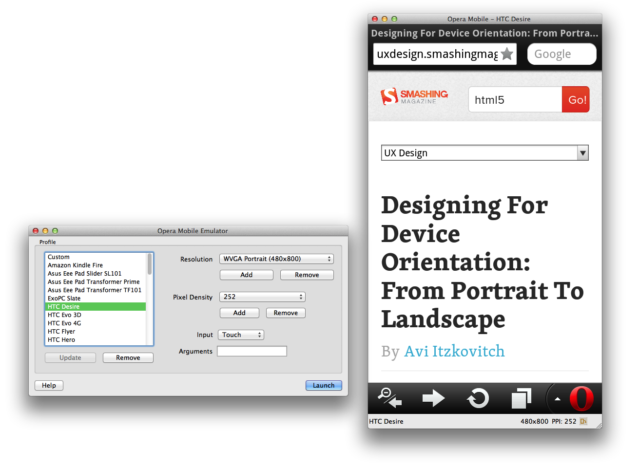
In this article, we’ll look at how you can use Opera Mobile Emulator to create responsive designs, and we’ll cover some of its more exotic settings.
Disclosure: I work for Opera Software and am the product manager of Opera Mobile Emulator, among other things.
Basic Usage
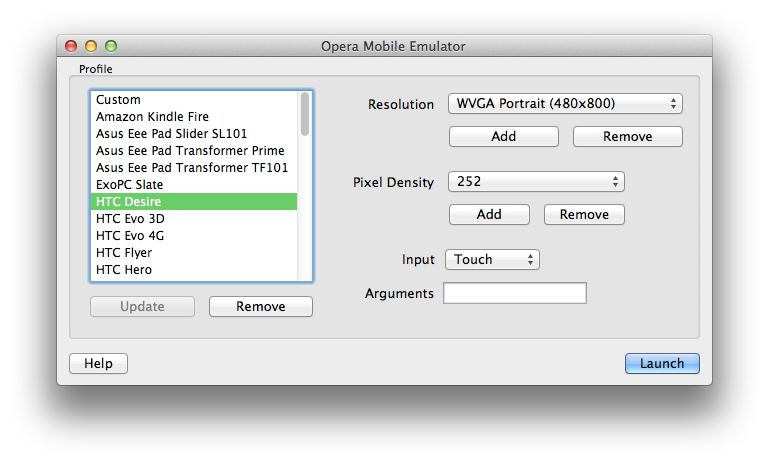
When launching the emulator, you are greeted with a profile selector. Using the profiles on the left side, you can launch one or more Opera Mobile instances with device-specific settings. For example, selecting the “HTC Desire” profile will launch Opera Mobile in WVGA (480 × 800 pixels) portrait mode with a zoom level of 150%, just like it would on an actual HTC Desire phone. If you select a different profile, a separate Opera Mobile instance will launch with settings to match that profile.
Pages can be loaded by typing in the URL in the address bar (obviously!), or else by dragging and dropping any file or URL onto the browser window. In-page navigation is similarly easy: clicks match to taps, and you can use pinch gestures on the trackpad to zoom in and out of pages. If the latter does not work on your machine, you can zoom by using the scroll wheel on your mouse or by clicking the “+” and “-” overlays that appear in the browser window when you pan around.
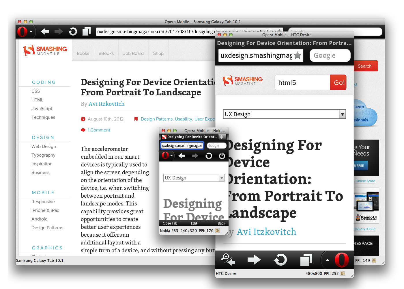
You’ll notice that spawned Opera Mobile instances can be resized from all sides, and the loaded website’s layout will alter accordingly. This is, of course, different from the experience on devices where the browser is a full-screen app, but it comes in very handy when you want to test how your viewport meta tag or media query settings work at different screen sizes. In fact, resizing an Opera Mobile instance to test different layouts will give you a more realistic feel of viewport behavior than doing the same on a desktop browser, because the latter will not respond to different viewport settings, and so viewport-related bugs might get overlooked.
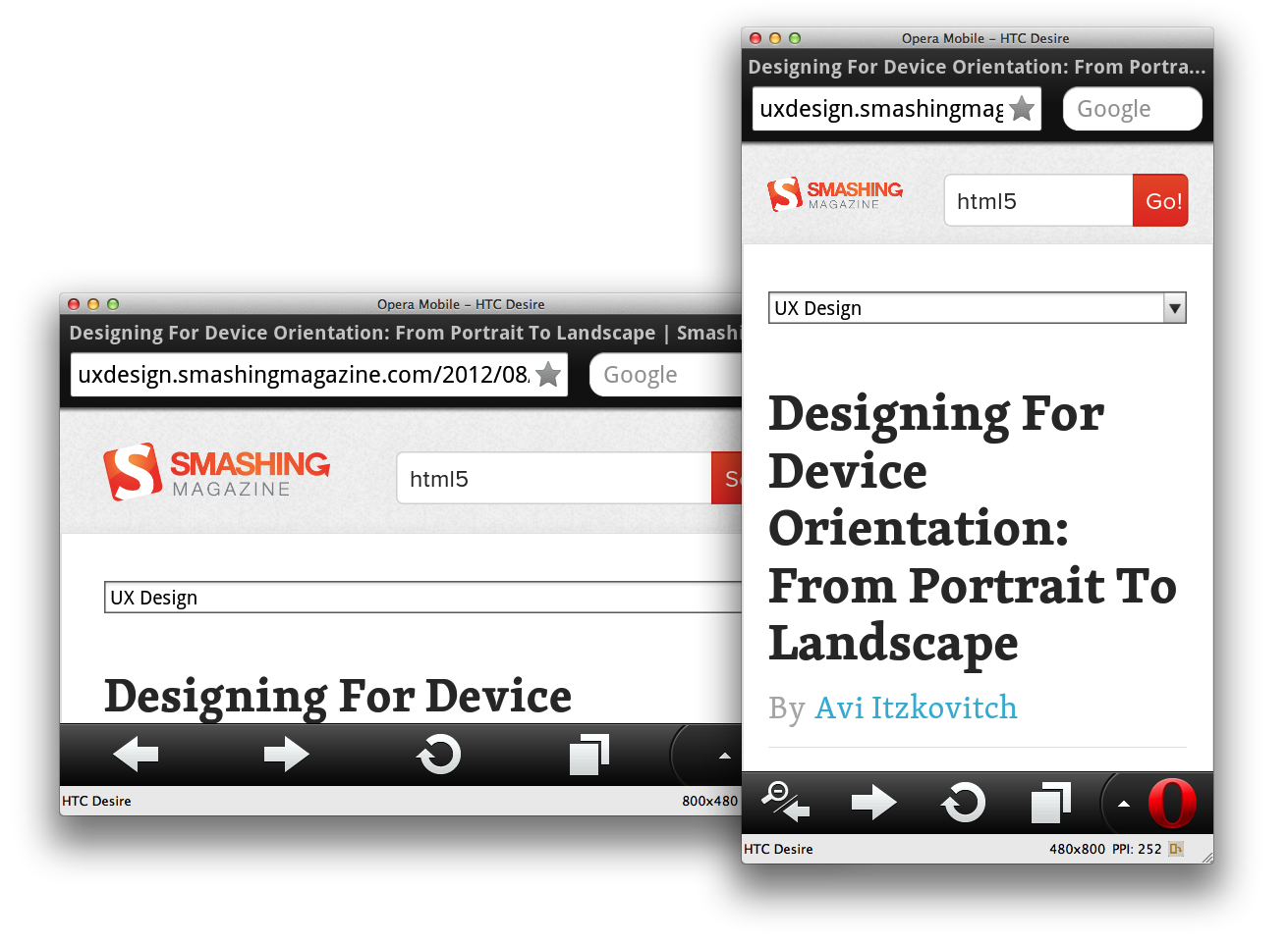
It’s worth noting here that the device-width media query in Opera Mobile Emulator is not querying the width of the computer screen, but rather the width of the launched Opera Mobile instance. Also, if you’re only interested in checking the differences between portrait and landscape orientation, you can use the Alt/Option + R key combo, or click on the “Rotate screen” button in the bottom-right corner.
Of course, everyone’s workflow is different, and I’m here to help make yours more efficient, not dictate to you. Obviously, nothing beats testing on actual devices, because you’ll get an accurate idea of the feel of your website in a mobile setting, on a device with limited CPU and so on. However, actual device testing is finicky, so I prefer to leave it until my project has reached at least alpha quality, preferring a rapid (1) develop, (2) test with Opera Mobile Emulator, (3) debug iteration while getting the project off the ground.
Advanced Launch Options
On the right side of the profile selector, you’ll find a number of profile options.
The “Resolution” drop-down menu gives you a choice between a number of common screen sizes and orientations, with the option to add your own as well. The “Pixel Density” drop-down menu is a list of PPI values: for the HTC Desire, this is 252, which will result in a 150% default zoom and a devicePixelRatio of 1.5 when launched. Selecting a PPI of, for example, 285, on the other hand, will result in a zoom level of 200% and a corresponding devicePixelRatio of 2.
In short, this combination of resolution and pixel density values will differ per profile and affect how the viewport behaves, as well as determine which media queries are applied.
Finally, the “Input” drop-down menu allows you to choose between three input modes to which certain UI and UA changes are tied:
- “Touch” This option will launch Opera Mobile with a UI that is optimized for use on touchscreen phones, and will give it a UA string with
Opera Mobiin it. - “Keypad” This option will launch Opera Mobile with a UI and shortcut keys optimized for non-touchscreen phones — for the developer’s convenience, mouse clicks, panning and zoom gestures will still work, though. The UA string will contain
Opera Mobi. - “Tablet” This option will launch Opera Mobile with a tablet-optimized UI. In this case, the UA string will contain
Opera Tablet.
Launching With Arguments
The last option in the profile selector is the Arguments field, which is arguably the most powerful one of the bunch. In it, you can type a number of arguments or flags, which will be used to launch a new Opera Mobile instance. For example, -displaysize 320 × 480 -url www.opera.com will launch Opera Mobile with a window size of 320 × 480 pixels and will load www.opera.com.
These flags also work from the command line. By default, the Opera Mobile Emulator is executable from the following locations:
- Mac
/Applications/Opera Mobile Emulator.app/Contents/Resources/Opera Mobile.app/Contents/MacOS/ - Windows
C:Program FilesOpera Mobile Emulator - Linux
/usr/bin/
Repeating our last example would then look as follows:
- Mac
./Opera Mobile -displaysize 320x480 -url www.opera.com - Windows
OperaMobileEmu.exe -displaysize 320x480 -url www.opera.com - Linux
operamobile -displaysize 320x480 -url www.opera.com
Two arguments that come in very handy when testing responsive designs are -displayzoom and -monitorppi:
-displayzoomThis is useful if you want to reduce the size that an Opera Mobile instance takes up on your desktop, while preserving its reported width and height values,devicePixelRatioand so on. In other words, if you want to try out the “Samsung Galaxy Note” profile, which results in a browser with a size of 800 × 1280 pixels, then you can add a-displayzoom 50flag to launch it with a quarter-sized surface of 400 × 640 pixels — a much better match for the 900-pixel-high screen of, for instance, a MacBook Air.-monitorppiThis, on the other hand, allows you to set the PPI of your computer monitor (for example,-monitorppi 128for a 13-inch MacBook Air) and launch an Opera Mobile instance with a zoom factor adjusted to match the physical dimensions of the profiled phone’s screen. This will give you a better idea of how big, say, the clickable areas really will be when the page loads on an actual device, but remember that the PPI you get on the screen won’t be representative of what you’ll see on the device.
Note that -displayzoom and -monitorppi are mutually exclusive and thus cannot be used together.
For a full list of possible arguments, click on “Help” in the profile selector, or run the emulator from the command line with the –help argument.
In-Browser Settings
One thing to keep in mind is that, even when launching an Opera Mobile instance with an Android profile, the UA might be different. You can change the UA string after launching Opera Mobile by clicking on the red “O” and going to Settings → Advanced → User Agent, where you can choose between five options, including “Android.” If you need to set a completely custom UA string, go to opera:config in the URL field and search for “Custom User-Agent.” In this field, you can set a custom UA string, which will override any other set UA string.
Other settings worth highlighting are the options for clearing the cookies, cache and shared locations, found under Settings → Privacy, and the toggle to turn off the on-screen keyboard, found under Settings → Advanced → Opera keyboard.
Connecting To Opera Dragonfly For Advanced Debugging
In any Web project, there is a point when you absolutely need to look under the hood of the browser to see what precisely is going on. That’s why Opera Mobile Emulator can talk to Opera Dragonfly, Opera’s built-in Web debugger.
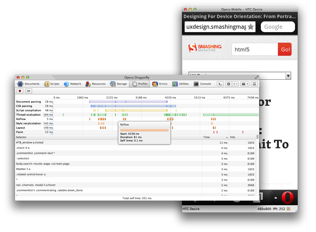
You can easily set this up as follows:
- Download, install and run Opera for desktop.
- Load a page in Opera for desktop, right-click anywhere, and click “Inspect Element” to launch Opera Dragonfly.
- In Opera Dragonfly, click on the “Remote debug configuration” button (third button in the top right), and click “Apply” (the default settings are fine)
- Then, open Opera Mobile Emulator and launch an Opera Mobile instance.
- Go to
opera:debugin Opera Mobile, and click “Connect” (the default settings are fine) - You are now connected and can load any page you want to investigate in Opera Mobile. Be sure to select the correct debugging context (fourth button in the top right) in Opera Dragonfly when you change tabs.
Under Opera Dragonfly’s Network → Network log, you can, for instance, inspect whether your media queries are written correctly and whether image files referenced in the style sheet are not unnecessarily downloaded to devices with small screen sizes. If done right, you should see them only pop up towards the bottom of the waterfall chart when expanding the Opera Mobile browser window’s dimensions.
Also worth noting are the features under Network → Network options. There is a checkbox to disable all caching (which you may want to do when testing), and there is an option to set global header overrides — this is particularly handy when you rely on browser sniffing (careful!) or particular headers to optimize your content for, and you want to test out different header variations without opening up different browsers.
For an overview of other Opera Dragonfly features, including those related to inspecting the DOM and scripts, CSS profiling, picking colors, and using the command line, I recommend looking at the Opera Dragonfly documentation.
So, that’s a wrap! I hope you’ve enjoyed this introduction to how Opera Mobile Emulator can help you optimize your responsive designs. Try it out for yourself, and let us know what you think and how you want to see it improved.


 Register!
 Flexible CMS. Headless & API 1st

