Looking Beyond Common Media Query Breakpoints
With all the talk about responsive Web design, designers and coders are moving even further from the fixed pixel layouts of design’s print-based history. We’re finally thinking in terms of fluid layouts and expandable, interactive content. But when you get down to it, we’re still thinking of the fluidity in terms of desktop, tablet and mobile sizes.
Chances are that your responsive websites have media query breakpoints at precisely the tablet and mobile widths, essentially creating three different versions of a website with the same code.
While this is much more ideal than what we’ve all done until now, it’s not always the best way to approach things. Often, our content breakpoints (the viewport widths where content should be reformatted) are different from common device breakpoints (the viewport widths that reflect physical devices).
When we code for only a general desktop size, a general tablet size and a general mobile size, we are forgetting about the infinite other shapes and sizes that our devices are and will be in the future (especially as TV becomes a more popular medium for Web content). We’re not truly utilizing the full potential of responsive design. We’re not truly coding for any device.

Our goal should be to always present content in order of importance, no matter what size a screen is. There’s nothing wrong with using media query breakpoints at tablet and mobile widths (in fact, that’s a great start), but don’t forget about all the other possible sizes that a screen can and will be, and don’t forget that no matter how a user accesses content, there will always be a need for content hierarchy.
We’ve all read about what kinds of goals users have on each different device, but the fact is that Internet users will access the Web on any number of devices for any number of reasons. We can’t claim to know what the most important content is to them at any given point in time or from any given place, but we can make an educated guess as to what the most important content overall is and make sure that it always shows up before less important content.
Design is based on creating hierarchy and controlling what a viewer sees and when, so designing a website based on content hierarchy makes a lot of sense. It’s essentially what we all do now when we initially design a desktop layout, only instead of worrying about how the design responds in relation to content, a lot of designers make sure that the design responds in relation to aesthetics, letting content arrange itself organically. This is an oversight.
With good design systems (as opposed to just good design), I propose we focus our responsive efforts on the content, and not on the design alone.
One note before we get started here: a content-first approach doesn’t necessarily mean that a designer or coder needs all the real content up front. That’s a huge help, but in real life, that’s just not always possible. We might not know the exact content we’re working with when we start a project, but we always know the nature of that content, and we can usually guess how it ranks amongst all the other content on a page.
The Top-Down Approach
By definition, a user enters a website “at the top” and then scrolls down. In the past, there’s been a whole lot of focus on keeping important content “above the fold” so that users don’t miss anything. Well, I have a news update. In 2012, people know how to scroll. I’m not saying to bury important content below the fold, but just know that almost all Internet users these days know that with a flick of the finger or a scrollball roll, they can adjust their view of the page. Furthermore, a lot of savvy users will quickly scan an entire page before reading any of the content.
This means that we can and should sacrifice the precious “above the fold” space in favor of readability and usability. The most important thing is not that the content is viewable without scrolling, it’s that it’s digestible, clear and easily scanned when it’s on the screen.
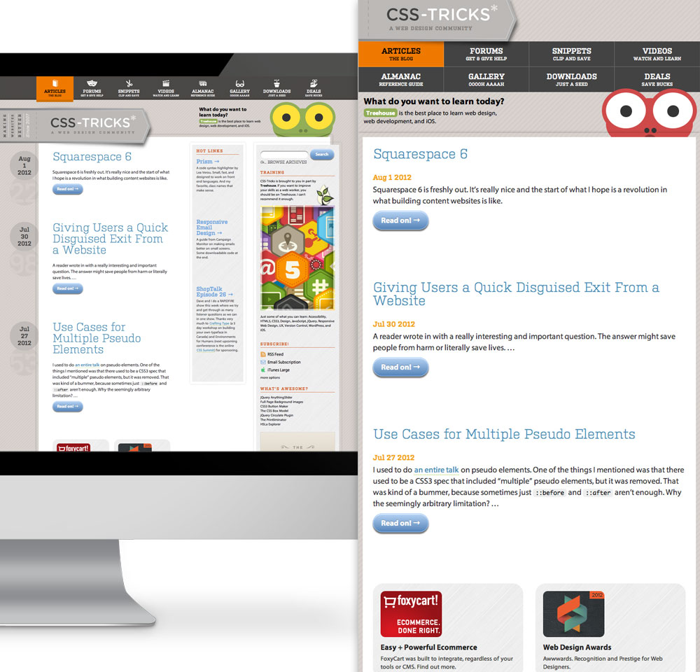
Take the website CSS-Tricks as an example. There are several major breakpoints where content shifts around so that readers get the most important content first, based on what fits on the screen. Each different layout re-prioritizes content based on the available screen real estate.

When, Where And Why
We can safely assume that a “top-down” content hierarchy is almost always applicable, and we can plan all of our content to go most to least important, top to bottom. In the case of the desktop screen, we may have three columns of information, each with its own top-to-bottom content hierarchy. Then when the viewport gets too small, we stack the columns themselves from most to least important, top to bottom.
We can achieve this through a commonly-used, collapsible column system where containers are treated as inline elements, left-floated elements or both. Then we adjust these column widths with media queries in the stylesheet.
We use something like this in my company’s platform:
<div class=’one-third column’></div>
<div class=’one-third column’></div>
<div class=’one-third column’></div>
And our styles go something like this:
.column { float:left; display:inline; }
.one-third.column {
   width: 33.333333333% /* 320px / 960px */;
}

@media only screen and (max-width: 767px) {
   .one-third.column {
      width: 100%;
   }
}Note: The “only” keyword after @media is optional and only there so that older browsers ignore the media query if they don’t support it.
We can get fancier by adding another class to the first column, which we’ll say has more important content, and then adding a separate “in-between” media query for cases where we want a layout that’s a bit more custom.
As an example, when the viewport is wider than a certain amount of pixels, say 900, we can safely assume that three columns will fit in that area. When our screen real estate is less than 900 pixels wide, three columns would create reading areas that are too small. So we add a media query to break this into a single column on top that has the more important content, with two columns side by side underneath. Then at 300 pixels wide, we go back to three stacked columns that are full width.
<div class=’one-third column more-important’></div>
<div class=’one-third column’></div>
<div class=’one-third column’></div>
.column { float:left; display:inline; }
.one-third.column {
width: 33.333333333% /* 320px / 960px */;
}
@media only screen and (max-width: 500px) {
.one-third.column {
width: 50%;
}
.one-third.column.more-important {
width:100%;
}
}
@media only screen and (max-width: 300px) {
.one-third.column {
width: 100%;
}
}Most responsive Web designers today will stop at my original code example. Their website will respond with media queries, but in a very content-agnostic way. I say we take things a step further like my second code example, and we create better content presentation with more thought and more media queries. Everything should be based around presenting content in a controlled and successful way.
When deciding on columns and column size, keep in mind that columns that are too wide are just as hard to read as columns that are too narrow.
With a nested column system, we can nest columns within each other to create a huge variety of layouts for different screen sizes. And, again, we should think about it in terms of content size, not device size. As it currently stands, most coders will add breakpoints at around 1024 pixels for a tablet and maybe 480 pixels for mobile landscape. (Feeling saucy? Add in 768 pixels to cover tablet portrait.)
I propose we start with those, but we add media query breakpoints wherever it makes our content look best, based on how that content actually looks. In addition to device size, media queries should be based on content, column width and most importantly… real-life testing.
If we do this correctly, our layouts will look great on a mobile phone and great on a tablet, even if we don’t do media queries at their exact widths. Why? Because our layouts will look great everywhere. A common theme that I see in current responsive websites are those little “in-between” glitches where the screen is too large for one media query (say a tablet size), but too small for the next one (a desktop size). With this new way of thinking, we know to adjust the widths in our media queries or add an additional media query to fix the glitch, regardless of the actual pixel value and what device it corresponds to.
A Common Example
A common example of this type of nested layout is the classic “sidebar.” Sidebar content is typically less important than a larger main column, so if the screen is wide enough to show both columns side by side, show them. If not, then the sidebar can get pushed below the main content.
In the end, when and how that content shifts comes down to screen size and readability, not device and device goals.
A Common Mistake
A common mistake that stems from coding for the device is when a designer knows that content should stack for mobile, but they forget to really look at that content at a mobile size.
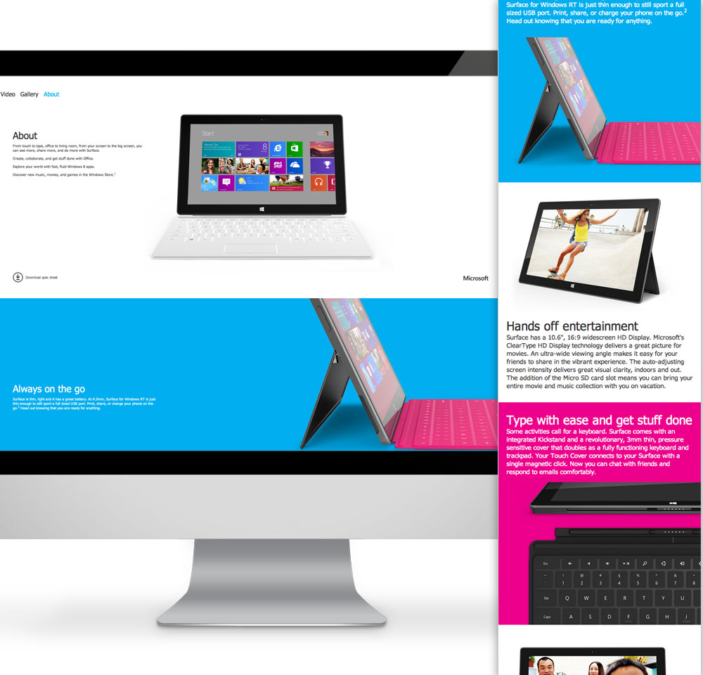
Microsoft utilizes a responsive layout for their Surface tablet’s website, and so the design stacks to fit small screens, but the content itself doesn’t get enough attention, and therefore the website design falls short on small screens. The rows of content, each with a block of text and an image, stack on top of each other, but instead of stacking in a uniform, content-centric way, every other pairing differs as to whether the image or text comes first, creating a somewhat messy look. This could be solved with an alternating float:left and float:right on the image containers, but instead Microsoft relied on the default column resizing to create a “mobile version.” A little extra thought about the specific content on this page at this screen width would have gone a long way.

Furthermore, I believe that Microsoft might have missed an opportunity on large screens to fit a couple image/text pairs side by side. On my 27” iMac, there is arguably too much room around each content pairing, and therefore not enough control in the design.
For Microsoft to improve this website, they’d only need to go a little bit further. The design probably looks best on a laptop screen, where the images and text sit next to each other, one image/text combination per row. But on a larger desktop monitor, the website expands to where it looks too open, and the spaces around content become large and uneven. Another media query can put two image/text combos on each row, evenly separating the screen real estate on screens with enough of it. The font-size and line-height could be increased to accomodate for the available space and make the relation between text and the illustration a bit clearer.
Then, to regain consistency on small screens, the code needs a little adjusting for correct content hierarchy. Each image should be arranged in the layout before its corresponding block of text. It makes sense to code all of the image/text pairs the same way, because they’re most likely to have the same importance in relation to each other. Once they’re coded with the image first, they’ll stack perfectly on a small, mobile screen. For visual interest (repetition with variation) on larger screens, every other image can get a float:right instead of a float:left, and we’ll see the layout we see now with the image/text pairs side by side.
Won’t “Arbitrary Breakpoints” Take Longer To Code?
If you code for content from the beginning and add breakpoint when content dictates it, most screen sizes will just need a little tweaking in the stylesheet to help everything shift around.
In addition, once you have an initial responsive column system, entering the values for column-based percentages is as easy as copying and pasting. I’d argue that the amount of time to add a “special case” media query is the same amount of time that it takes to find a solution that lets content work without an additional media query.
Doesn’t The Importance Of Content Change From Device To Device?
No. According to recent studies, 17% of all adult cell phone owners in the US access the Internet mostly on their cell phones. This is due to the economics of buying phones and computers. If someone can’t afford both, the phone makes more sense because it makes calls and browses the Web.
In addition to that, because of the recent increase in mobile-friendly websites, people are more likely to access information right from their phone, wherever they are, even sitting at their desk in front of their desktop! This is especially true if the phone is the most handy device at the time.
This is why we can’t assume use cases or goals based on device anymore. So we need to code so that our content makes sense on a 300 pixel screen, not a mobile phone screen. We also need to make sure that if we only have 300 pixels to work with, the most important content appears first, the second-most important is next and so on.
Only by thinking this way can we truly utilize responsive design to accommodate future devices. And only through this mindset are we truly taking advantage of responsive design.
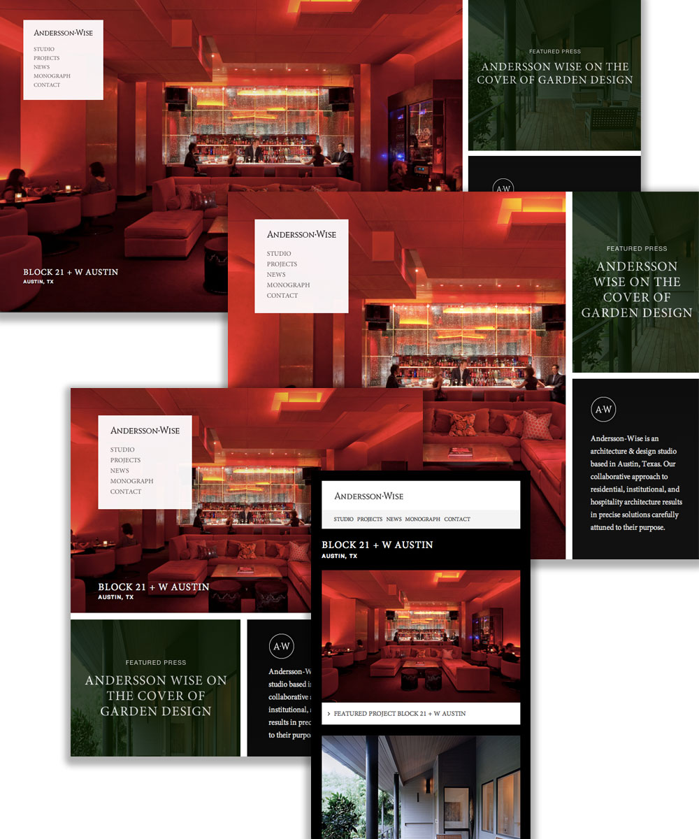
Have a look at architectural firm Andersson-Wise’s impressive and intelligent responsive website. The content shifts and reforms not only based on width, as most websites do, but also on height. The golden ratio is everywhere in this design, and if you play with your browser size, it’s clear that their goal was to present content as efficiently and clearly as possible, reacting to browser shape and size in a systematic and programmatic way.

In my opinion, the main quality that makes Andersson-Wise’s website better compared to the Microsoft Surface website is that there is no screen size or shape where Andersson-Wise’s website looks “undesigned” or out of control. The Surface website, in contrast, seems at times like the content is untamed and not specifically planned. If you imagine it as a static layout, it really only looks well-designed between 1,000 and 1,200 pixels, which is probably the size they started designing with. Other sizes “work,” but they don’t shine, like Andersson-Wise.
One more thing. The user probably doesn’t know anything about code or responsive Web design, and so they won’t be impressed that your website resizes. They do notice if your website doesn’t look good, though, and they know if content is hard to find or hard to read.
Keep in mind that we’re not creating desktop, tablet and mobile websites. We’re creating one responsive website. Look at and think about content at every size you can. Forget about the device, and fix little quirks with custom media queries. Invest in the future of your website and in the future of the Web in general.
Image source of picture on front page.
Further Reading
- Breakpoints And The Future Of Websites
- Logical Breakpoints For Your Responsive Design
- Building A Better Responsive Website
- Responsive Web Design: What It Is And How To Use It


 Flexible CMS. Headless & API 1st


