Mobile Design – How To Prepare Websites For The Unexpected
Designing websites for smartphones is easy compared to retrofitting those already in place. More than that, it’s embarrassing how, almost eight years after CSS gained practical acceptance, a lack of foresight haunts those of us who write HTML.
Converting older websites to responsive design causes headaches not because small screens are difficult, but because most HTML documents were written under an assumption about screen size. Prior to the iPhone’s introduction in mid-2007, designers could rely on windows at least 700 pixels wide (if they ignored accessibility). Conventions like navigation bars, two- and three-column layout and hover effects evolved to fit the mouse-based wide-screen standard. Designers made their upper left corner logos clickable because it was expected.
Mobile devices shake old habits in two ways. Now, not only do we have small-screen iPhones, Android phones, Kindles, iPads and other mobile devices, but we’re asking websites to adapt to whichever device comes knocking. You want CNN on an xBox? It could happen. You want Smashing Magazine on a Web-enabled TV? If it’s not here, it will be soon.
Designing for future cases affects both page layout and website structure. We can’t control on which devices our digital content is viewed — rather, experienced. No amount of “best viewed with…” badges will stop people from reading and remixing what we write, paint, compose or otherwise create. Web pages don’t have to use 12- or 16-column grids, and websites don’t have to follow strict hierarchies. But getting there means facing a legacy that did.
Mobile Is Also A Content Problem
Let’s say you’re employed by a large company. Surveys indicate that many customers are more likely to visit your website with a smartphone. The large company is planning a redesign of their existing site. Your organization (or more likely you and your Web-savvy coworkers) adopts a mobile-first strategy. Yet before sketching icons, perusing responsive grids or cramming HTML5, one fact threatens to derail the redesign project. The content isn’t just ill-formatted for small screens — it’s ill-formatted for anything other than desktop browsers less than 960 pixels wide.
- Details in large images get lost when shrunk.
- Layouts with more than two columns of text or nested columns compress poorly on narrow screens.
- Wider ranges of text sizes do not fit well.
Exceptions compound the problem. WYSIWYG editors added their own formatting or layout to individual pages, and over time different people updated the website their own way.

Variations on a website make it difficult to fit everything into a mobile solution.
The more pages a website has, the more likely it has variations. One solution does not fit all variations, especially when some were intended for a specific screen. We could divide ill-fitting pages into multiple pages for mobile devices, but not without consequences.
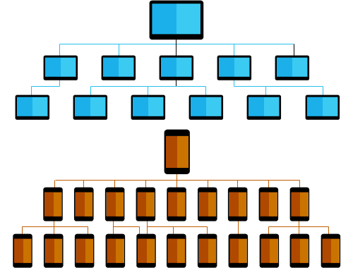
Dividing long content into multiple pages makes information harder to reach.
If designers choose extra pages over long layouts, then conventional structures make information harder to reach.
As an industry, Web design has met similar challenges before. Designers who practiced table-based layout may remember how headaches up front lead to more flexible code later. This time around, we can think beyond today’s move to mobile. Responsive design bridges the gap with use-case instructions. But designers themselves can do more than respond to today’s issues. They can anticipate tomorrow’s.
To ask “what makes content mobile-friendly?” misses the point. Ask instead, “what makes content flexible?” and we address many problems at once. The ideal solution meets a few criteria.
- Don’t sacrifice content for a new medium. We don’t want to offer a watered-down version of the original website.
- Make it usable. We don’t want to simply shrink layouts. Everything from text and images to navigation and forms must be easy to use.
- Prevent (or at least minimize) similar problems in the future. Twenty years ago people questioned the need for a website. Five years ago people questioned the need for a mobile website. What will they question tomorrow?
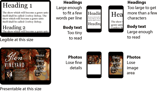
Layouts designed for larger screens often don’t easily translate to mobile screens.
Smaller and more narrow, today’s mobile screens need layouts composed for their distinctive sizes. The task gets harder when each page has columns or text sizes baked in. Once we commit to changing a website — whether our goal is to optimize for mobile or another reason — we must accept that change includes choosing what to save and what to delete.
Popularity, Priority And Vitalness
What content is worth keeping? Back up — what is content?
Traditionally “content” is the information that a website contains. But tradition also said designers could rely on windows at least 800 pixels wide.
To make digital content supple enough for mobile (and prepare for whatever comes next), a website needs focus. And to focus a website, we need to find its vital content.
“Vital” is a subjective measure of content’s usefulness to all parties concerned. It may take the form of text, images or video. It might cover many pages or just a few tweet-length sentences. But vital content is why the website exists. Content does not fill a website; a website is the stage on which designers present content.
While vital is not synonymous with popular, the two are related. Popularity is how the public ranks vital information against itself. Contrast that with priority, or which information the website’s owners consider most-to-least important. Owners may consider information important, but if end users don’t need it, it’s not vital.
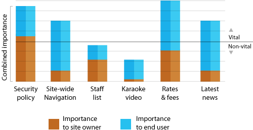
The diagram for a fictitious bank website shows two questionable items, namely the staff list and the Karaoke video. Each column shows how priority and popularity add up to overall importance.
Factors that influence importance include:
- Timeliness. Does the information’s importance wax or wane over time? (e.g. seasonal events, latest updates, today in history, upcoming deadlines)
- Proximity. Does the information’s geography matter? (e.g. local sales, disasters, city or regional politics, concerts)
- Scope. Who does the information affect? (e.g. a circle of friends, special interests, hobbyists, the general public, veterans, newcomers)
- Scale. How big is the information? (e.g. width, height, duration, density)
If a bank’s annual retreat video goes viral — the one where its CEO reveals a lack of karaoke talent — then the video is popular even if the CEO is not. But the bank might place a higher priority on its low fees or savings options (certainly the CEO would.) Similarly, blogs tend to put their latest posts first, but a groundbreaking post from last month might still receive more attention than a minor post today.
Some websites — news or blogs, for example — provide vital content on the home page. But many home pages are not necessarily vital. Home pages with static content introduce a website and help people to choose which pages contain the information they want.
Importance may be subjective, but the need to prioritize is not. The bottom line is to keep information that is vital; question information that either is popular or has priority; archive and remove information that is neither.
Oddly enough, this doesn’t mean removing pages.
Tossing Out Pages And Content Blocks
When computers first gained graphical user interfaces, software engineers helped people make the transition from physical offices to digital files with the metaphor of a desktop. Folder icons represented groups of files; document icons had a dog-eared corner that’s still common long after it was no longer needed. Skeumorphic trash cans are still with us.
Likewise, Web pages were akin to pages in a book or magazine. But the analogy doesn’t fit modern websites, let alone websites for mobile devices. A page is not the smallest unit of information. Rather, websites are collections of useful or informative media which may be sorted into different screens (or sections, or blocks, or views — time will tell which term becomes popular).
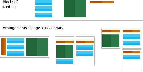
The arrangement of blocks of content may change as needs vary.
Blocks of content may be arranged onto one or more pages as appropriate. Some even appear on several pages; navigation, for instance. Responsive design deals with adapting elements to their medium. The idea of “content blocks” goes further. Because each HTML document (formerly called “pages”) may contain many blocks, Web designers can use mobile devices’ limited screen sizes to their advantage.
Mobile or not, websites may be organized into hierarchies or other formats. But thinking of blocks rather than pages suggests a structure between pages. Because small screens can only show so much of a page at once, they actually reduce clutter. When spaced by gaps — visual pauses — people effectively scroll through “pages.”
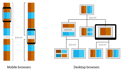
Content can be spaced by gaps, or visual pauses.
Nothing says wide-screen websites can’t also organize views with space. But mobile devices’ limited viewing areas make them naturally suited to a more focused experience.
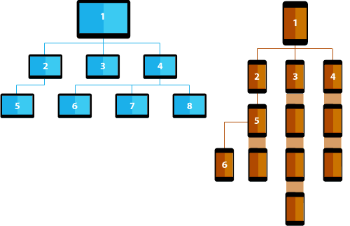
A mobile-optimized structure may result in less screens being needed to display content on mobile, compared to displaying the same content on desktop screens.
Traditional hierarchies branch from the home page (general overview) to sub-pages (specific information). But each page stands alone. A mobile-optimized structure, however, leans towards a “taller” arrangement in addition to hierarchies. Six mobile-centric screens provides as much complexity as eight screens arranged for desktop.
Ideas such as these demonstrate the power of creating content without a specific use. In fact, the more digital media we consider, the more flexible websites become.
Moving Forward
It’s impossible to predict what tech revolution will make mobile design feel antiquated, but we can take reasonable steps to ease the transition. Remember that the goal is not just to reinvent what you have, but to see it with new eyes.
- Delete the website’s home page. (After saving a copy, of course.) Nothing helps find a website’s real introductory content like removing its assumed introductory page. On which page do you find content that introduces the website’s purpose? Can that replace or be combined with the home page?
- Practice repurposing. As you rework individual pages, try it in different environments — and not just other Web browsers. How does the page respond to being emailed? Does it make sense when read aloud? Can it be exported to another CMS? Can it be pasted into Microsoft Word, printed and faxed? Don’t discount ridiculous scenarios. After all, a few years ago designing for 320-pixel-wide screens was laughable.
- Consider variations of metadata. Titles, for example, may be used as standalone links. Take page titles. Even if “about us” is all the visual design needs, it may be insufficient on a Google result page. “About Acme Co’s commitment to quality anvils” is more than a title: it could also double as a link with enough information to decide if the page is worth a visit.
- Find elevator pitches. In each page, seek one sentence that sums up the rest of the page. If there is none, the page may need to be reworked, disseminated into other pages or eliminated altogether. For example, the page you’re reading now has two possible summary statements: the first sentences of its second and fourth paragraphs.
- Substitute suggestions for instructions in content. Sometimes information is created for a particular medium. A video may work best at particular dimensions or a long text file may be broken into chapters. But there’s no guarantee that someone won’t embed the video differently than intended, or that the long text will always be read on a Kindle. Instructions say “display content this way.” Suggestions indicate “this is what I mean.”
<aside>andclass="alignright"are suggestions open to interpretation.style="float:right"andtable width="300"are instructions. Put another way, when was the last time you favored<font>tags written into HTML overfontproperties in a separate CSS file?
While each medium has unique traits which designers may take advantage of (such as a website’s hyperlinks, a video’s motion and linear path, Flash’s interactive animation, an eBook’s bookmarks, a tangible book’s ability to be shared by hand), the cost of porting information between media increases the more we target a few specs on a single platform.
In years past, Web designers laid out pages according to monitors of the day. That hampers today’s move towards mobile websites. If we learn from past mistakes we’ll be better prepared for the next revolution.
Further Reading
- The Creative Way To Maximize Design Ideas With Type
- Tips For A Finely Crafted Website
- The “Wow” Factor in Web Design
- Examining The Design Process: Clichés And Idea Generation


 Flexible CMS. Headless & API 1st


 Register!

