Adapting To A Responsive Design (Case Study)

Email Newsletter
Weekly tips on front-end & UX.
Trusted by 200,000+ folks.


 Flexible CMS. Headless & API 1st
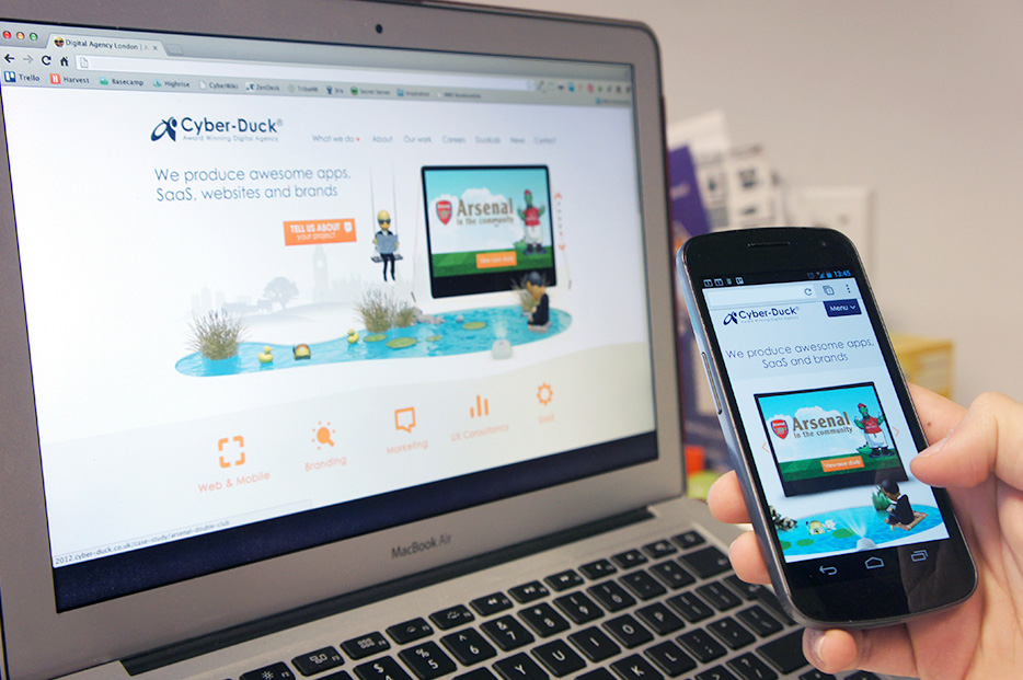
This is the story of what we learned during a redesign for our most demanding client — ourselves! In this article, I will explain, from our own experience of refreshing our agency website, why we abandoned a separate mobile website and will review our process of creating a new responsive design.
At Cyber-Duck, we have been designing both responsive websites and adaptive mobile websites for several years now. Both options, of course, have their pros and cons. With a separate mobile website, you have the opportunity to tailor content and even interactions to the context of your users, whereas a responsive website means better content parity for users and a single website to maintain.
Why Adapt To A Responsive Design?
Our redesign story starts in August 2012. Until then, our previous strategy of having separate mobile, tablet and desktop websites didn’t exactly perform badly; they drove conversions, and user engagement appeared to be good relative to our desktop website. I should mention that this strategy was borne purely out of the need to quickly tailor our ageing desktop website to the increasing number of tablet and mobile users at the time.
We used jQuery Mobile to create our previous mobile-optimized website as a quick fix for the increasing number of mobile users on our ageing desktop website.
We produced our tablet and mobile websites specifically with users of these devices in mind — performance was our top priority. We wanted to improve on the loading time of our “desktop” website dramatically; the desktop home page was 2.2 MB, with 84 HTTP requests, and the mobile home page was still quite large, at 700 KB, with 46 HTTP requests. We had also designed the interfaces specifically with touch in mind, using jQuery Mobile to enhance the user experience with touch gestures.
Changing Our Approach
Despite this, several factors led us to decide that this approach was no longer sustainable for our own website:
- having to support multiple code bases,
- content management,
- the emergence of new mini-tablets and “phablets.”
The first two were not ideal, but at least manageable. The third, however, was a deal-breaker. OK, so we could have designed a website optimized for mini-tablets, but with so many more Web-enabled devices of all shapes and sizes entering the market every day, it would have been only a matter of time before we needed to think about optimizing for new form factors.

We wanted our new website to be easier to maintain and more future-friendly for the inevitable influx of new form factors.
It was at this point that we decided to completely overhaul all three websites and create a responsive design that would provide the best possible experience to all of our users, regardless of how they accessed our website.
Setting Goals For The Responsive Design
At the very start of this overhaul, we set ourselves some simple goals, or principles if you like, that we wanted to achieve with our responsive design:
- Speed Performance affects everyone.
- Accessibility It should work with no styles, backgrounds or JavaScript.
- Content parity The same content and functionality should be on all platforms.
- Device-agnostic Leave no platform behind.
- Future-friendly Cut down on maintenance.
Based on these goals, our starting point for the design was to review our existing mobile website and to use it as a base for our responsive design. We explored how we could enhance for wider screens, rather than attempt to squeeze our previous desktop website down to mobile.
We started by speaking to some of our trusted customers about what they liked about our website, what they didn’t really like, and what was important to them when searching for a digital agency.
We also used analytics data from our previous website, using a mixture of Google Analytics, Lead Forensics and CrazyEgg to help us better understand what existing users wanted and needed from our website. As a result, we were able to streamline and prioritize a content strategy based on how our users actually interact with the website.

Our design team used card-sorting exercises to reorganize our existing content for the new website.
Making Performance A Priority
A potential pitfall of responsive Web design, which you don’t find with a separate mobile website, is that performance can suffer, especially if you are simply hiding content using display: none at certain screen widths. We wanted to avoid this issue by putting the speed of our website at the heart of all design and technology decisions. The advantage is that a better performing website would benefit all users, not just mobile users.
To achieve this, we set a performance budget — a set of targets to improve the speed and size of our new website. For mobile users, we wanted a website that performed at the very least comparably to our existing mobile website; so, we wanted to load no more than 40 HTTP requests and 500 KB of data for our mobile breakpoint. (This was just the start. Our next step was to reduce this to less than 100 KB.)
Third-Party Scripts
The easiest way to trim the fat was to strip down third-party scripts as much as possible. According to Zurb, “to load the Facebook, Twitter and Google social media buttons for a total of 19 requests takes 246.7 KB in bandwidth.” As a result, we replaced heavy social-media plugins with lightweight social media links.

Replacing heavy third-party social buttons with simple social media links can significantly reduce HTTP requests and page-loading times.
While some essential tracking scripts had to stay, we ensured that they would load after the content by putting them at the bottom of the body element in the HTML document and in an external scripts file.
Did We Really Need A CMS?
Early on in discussing the requirements for the new website, we considered whether we even needed a content management system (CMS). After all, as you’d expect in a digital agency, most of the team members are familiar with HTML, CSS and Git, so we could certainly manage our content without a CMS.
By using server-side performance-monitoring tools such as New Relic, we could see that our previous CMS was a key factor in the slow page-loading times. Thus, we took the fairly drastic decision to entirely remove the CMS from our website. We made an exception for our blog, which, due to the volume and frequency of content being published, still required a CMS to be managed effectively.

The previous home page queried the database server 1,459 times, for a total execution time of 2.34 seconds.
Our old website was built with a model-view-controller (MVC) architecture that connected with the Wordpress CMS. To give you an example, a typical page with WordPress uses around 600 to 1,500 queries to load; the database server is queried hundreds of times, and by simply removing the CMS, we managed to reduce this to zero in one fell swoop.

The team developed early prototypes to see how we could improve performance and responsiveness.
By removing the CMS for static pages, we eliminated the need for a database and dynamic templates. Using the popular PHP framework Laravel, we implemented a custom “dynamic route and static template” system. This means that each time a URL is called on our website, the Laravel router knows exactly which template to load by matching the URL to the template’s name, and the template already has all of the content laid out statically in HTML.
As a result of this alone, we managed to improve the processing speed of the website by over 3,900%. Taking the home page as an example, we improved server processing speeds from 2.2 seconds to 56 milliseconds on average.
Server processing speed is now only 56 milliseconds, with zero database queries — approximately 40 times faster than before.
Naturally, this approach wouldn’t suit everyone (nor indeed many of our clients), but we should ask ourselves at the beginning of each project which CMS is most suitable, and whether one is necessary at all. Other options are out there, of course, including file-based CMS’ such as Kirby and Statamic, building or customizing a lightweight CMS such as Perch, or simply implementing better server-side caching such as with Varnish.
Ultimately, we decided to remove the CMS because even the most lightweight, highly optimized CMS with clever caching has overhead and cannot match the performance and server footprint of static files.
Avoiding Off-The-Shelf CSS Frameworks
While CSS frameworks such as Twitter Bootstrap and Foundation are great for quickly building interactive prototypes, they are often far more complex than we need for most projects. The reason is that these frameworks need to be sensitive to and cater to a wide variety of use cases and are not tailored to the particular requirements of your project.
We reduced the size of our style sheets by creating a custom responsive grid system that was simple, fast and extremely flexible to our needs.
We designed from the content out, meaning that the content shaped the layout and grid, as opposed to having the layout define the content.
Clockwise from top: The layout is three columns on a desktop, becomes a single column stack on mobile, and takes advantage of the extra space on tablets by floating the image to the left of the content.
@media only screen and (min-width: 120px) and (min-device-width: 120px) {

   // Uses mobile grid
   .container {
      width: 100%;
   }
   .col12, .col11, .col10, .col9, .col8, .col7, .col6, .col5, .col4, .col3 {
      width: 92%;
      margin: 0 4% 20px 4%;
   }
   .col2 {
      width: 46%;
      float: left;
      margin: 0 4% 20px 4%;
   }
}

@media only screen and (min-width: 600px) and (min-device-width: 600px) {

   // Uses custom grid to accomodate content
   .home-content {
      article {
         width: 92%;
         clear: both;
         margin: 0 4% 20px 4%;
      }
      .image {
         float: left;
         width: 40%;
      }
      .text {
         float: left;
         width: 50%;
         margin-left: 5%;
         .btn {
            @include box-sizing(content-box);
            width: 100%;
         }
      }
   }
}

@media only screen and (min-width: 1024px) and (min-device-width: 1024px) {

   // Uses regular desktop grid system
   .container {
      width:960px;
      margin:0 auto;
   }
   .col4 {
      width: 300px;
      float: left;
      margin: 0 10px;
   }
}
We used Sass for the front-end development to avoid any repetition of code, making sure every bit of CSS is actually being used. Sass can also minify the output to ensure that the CSS is a small as possible.
$sass --watch --style compressed scss:css
We also made use of functions within Sass to build our custom grid. Here is the code for the desktop grid:
@import "vars";

// Grid system
$wrap: $col * 12 + $gutter * 11;
@for $i from 2 through 12 {
   .col#{$i} {
      width: $col * $i + $gutter * $i - $gutter;
      float: left;
      margin: 0 $gutter/2 $vgrid $gutter/2;
   }
}
@for $i from 1 through 11 {
   .pre#{$i} {
      padding-left: $col * $i + $gutter * $i;
   }
}
@for $i from 1 through 11 {
   .suf#{$i} {
      padding-right: $col * $i + $gutter * $i;
   }
}
.container {
   width: $wrap + $gutter;
   margin: 0 auto;
   padding-top: 1px;
}
.colr {
   float: right;
   margin: 0 $gutter;
}
.alpha {
   margin-left: 0;
}
.omega {
   margin-right: 0;
}
From here, we could customize the width of columns and gutters within the grid simply by editing the vars configuration file.
// Grid
$vgrid:      20px;
$col:        60px;
$gutter:     20px;
The grid basically calculates the width of a span of columns based on the number of columns in that span, making it flexible to any configuration of layout or grid. We’ve open-sourced this code on GitHub (we make no apologies for the duck puns), so please fork and adapt this flexible grid system to your own project’s requirements — and let us know how it goes!
Conditionally Loading JavaScript
To further improve the speed of our new website, we wanted to load JavaScript only when it’s needed or supported. We achieved this by using RequireJS to ensure that JavaScript is loaded only after checking that JavaScript is available in the requesting browser and that the browser only loads scripts it can support. RequireJS also works as a module loader, ensuring that any JavaScript is called only if it’s needed on that page.
RequireJS also contains a handy optimization tool that combines related scripts and minifies them via UglifyJS to reduce the file size of the JavaScript.

The optimization reduced the JavaScript’s size from 411 KB to 106 KB.
Optimizing Image Assets
In addition to JavaScript, images are among the heaviest assets to download for most websites. We particularly wanted to improve on this area because our website is fairly image-heavy, showing examples that showcase our work.
We manually optimized images throughout the website by selectively compressing areas of images using Adobe Fireworks’ selective quality options. We also reduced image file sizes through further granular control of compression, blur and desaturation.

By desaturating and blurring parts of images that are not essential, we significantly reduced image sizes.
We also used ImageOptim and TinyPNG to compress our images and sprites. These tools remove all unnecessary data without compromising the quality of an image. This reduced the weight of the main image sprite, for instance, from 111 KB to 40 KB.
For the slideshow banner on the home page, we optimized for different screen sizes by using media queries to ensure that only appropriate-sized images are loaded.

As you can see in the image above, on mobile, the slideshow items are far lighter.
The CSS:
@media only screen and (min-width: 120px) and (min-device-width: 120px) {
   .item-1 {
      background: $white url('carousel/dmd/background-optima-m.jpg') 50% 0 no-repeat;
      .computer, .tablet, .phone, .eiffel, .bigben, .train {
         display: none;
      }
   }
   /* Total loaded: 27 KB */
}
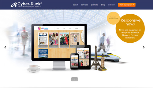
More assets are loaded on the desktop.
Meanwhile, on the desktop, we load more assets to make the most of the larger screen size available to us.
The CSS:
@media only screen and (min-width: 1024px) and (min-device-width: 1024px) {
   .item-1 {
      background: $white url('carousel/dmd/background.jpg') center -30px no-repeat;
      .computer {
         background: url('carousel/dmd/computer.png') center top no-repeat;
         div {
            background: url('carousel/dmd/sc-computer.jpg') center top no-repeat;
         }
      }
      .tablet {
         background: url('carousel/dmd/tablet.png') center top no-repeat;
         div   {
            background:  url('carousel/dmd/sc-tablet.jpg') center top no-repeat;
         }
      }
      .phone {
         background: url('carousel/dmd/phone.png') center top no-repeat;
         div {
            background: url('carousel/dmd/sc-mobile.jpg') center top no-repeat;
         }
      }
      .eiffel {
         background: url('#{$img}carousel/dmd/eiffel.png') center top no-repeat;
      }
      .bigben {
         background: url('#{$img}carousel/dmd/bigben.png') center top no-repeat;
      }
      .train {
         background: url('#{$img}carousel/dmd/train.png') center top no-repeat;
      }
   }
   /* Total loaded: 266 KB */
}
Delivering Content Faster
Yahoo’s golden rule of performance states that “80-90% of the end-user response time is spent downloading all the components in the page: images, stylesheets, scripts, Flash, etc.” In short, each request takes time to process; therefore, each request (such as to serve a file from the server) will inevitably increase the loading time.
By using CloudFlare’s content delivery network (CDN), we have separated the file-serving task of the Web server from the processing of the website. This means that our Web server concentrates on the application, rather than on serving static files. We moved all static assets to a separate subdomain (in our case, static.cyber-duck.co.uk) to reduce the cookies being sent with each request for an asset to a minimum, which in turn reduces the bandwidth required for each asset.
The CDN also caches and ensures that files are delivered from the server nearest to the user’s location, minimizing network latency (because the data is transmitted over a shorter distance), further reducing loading times.
In addition to the CDN, we used the Gzip rules and expires headers in the .htaccess file of HTML5 Boilerplate. This uses Apache’s mod_deflate module to compress the output of files to the browser and also sets an expiration on headers far into the future, to ensure better caching of the website for returning visitors.
Creating A Truly Responsive Design
As set out in our initial goals, we wanted our new website to have content parity and to provide accessibility to all users, regardless of how they access it.
In order to deliver a truly responsive design, we delegated all styling and display tasks to the CSS alone, using JavaScript to simply alter the “status” of elements by adding and removing CSS classes, as opposed to hiding and showing the elements with JavaScript directly.
The Right Code For The Task
Using this method, we could make mobile-specific optimizations, such as transforming the top menu on mobile to have telephone and map buttons so that mobile visitors can call or find our office quickly.
We used this approach throughout the website to activate and deactivate dynamic elements, always ensuring that these elements are still present on the page when JavaScript is unavailable. This way, we can offer content parity to our users while avoiding duplicate markup for specific contextual enhancements, such as those for mobile. With this approach, we ensure that JavaScript is an enhancement to the user experience, rather than a necessity to view the website.
On the right side of the top GUI, you can see the map and phone buttons, accompanied by the standard control to access the rest of the pages.
Here is the JavaScript:
$('#menu').addClass('closed');
$('.btn-menu').click(function(e){
   e.preventDefault();
   $('#menu').toggleClass('closed');
});
The CSS for desktops:
.nav {
   display: block;
   float: right;
}
.btn-menu, .btn-call, .btn-map {
   display: none;
}
The CSS for mobile:
.menu {
   display: block;
   height: auto;
   overflow: hidden;
}
.menu.closed {
   height: 0;
}
.btn-menu, .btn-call, .btn-map {
   display: block;
}
Animations As An Enhancement
For the animated slideshow of our projects on the home page, we used SequenceJS, a plugin that gave us the freedom to create the slideshow using only HTML and CSS for the content. This way, whenever JavaScript is unavailable or the screen size is too small, we don’t have to download all assets for the animation, only those necessary for a smaller, lighter version.
Elsewhere, we decided to use CSS3 for animations. These enhance the user experience for browsers that support CSS3 animations, while older browsers still get the functionality, if not the eye candy. For example, when a user is on a latest-generation smartphone and expands the menu or a portfolio item, it animates with CSS3 rather than with JavaScript.
This improves the performance of these animations by using hardware acceleration, offloading tasks of the central processing unit (CPU) to the graphics processing unit (GPU). For smartphone and tablet users, this can make a massive difference to performance by reducing consumption of their already limited CPU resources.
Delegating animation to the CSS enables us to make the most of hardware acceleration.
.menu {
   height: auto;
   transition: height 200ms linear;
}
.menu.closed {
   height: 0;
   transition: height 200ms linear;
}
Breakpoints Based On Content And Design, Not Device
For the breakpoints, we used multiple CSS media queries to responsively deliver the optimal presentation of content to screens both large and small.
This device-agnostic approach ensures that we do not need to optimize the code later when other devices come to market. We included (though did not limit) breakpoints at 120, 240, 600, 760, 980 and 1360 pixels, as well as targeted media queries for specific content on pages and also high-pixel-density screens.

The website responds fluidly between each breakpoint.
While we did not design breakpoints based on particular devices, in order to ensure further future-friendliness, we did test our website across as many devices and browsers as we could get our hands on, from the common (desktop browsers and a variety of phones and tablets) to the uncommon (Lynx, Playstation 3, Kindle Paperwhite, PSP Vita and others). We even tested the website on old Nokia devices, where the website still performed well.

Our designers and front-end team tested the new website on a wide variety of devices, including old models such as this Nokia X2.
Being More Accessible
Our responsibility as Web designers and developers is not only to make our websites more accessible, but also to educate our clients and colleagues about why they should care.
Below are a couple of quick wins for accessibility that we applied to our website.
Text
- Text is legible against backgrounds, with a contrast ratio of 3:1 for headings and 4.5:1 for body text.
- The text is structured with appropriate headings and in a meaningful order, and it describes the topic or purpose of the content.
- Text can be resized without losing content or functionality.
Links
- The purpose of all links is made clear with descriptive text and, when that isn’t practical, with alternative text.
- The first link on every page bypasses the navigation to move straight to the content. This is hidden by default in a standard browser but is accessible in appropriate scenarios.
- Page addresses (i.e. URLs) are human-readable and are permanent wherever possible.
- We implemented access keys for quick navigation to important pages and features.
Here is the HTML for the “skip” navigation link:
<a href="#content" title="Skip to content" accesskey="s" class="btn-skip">Skip navigation</a>
And the CSS:
.btn-skip {
   position: absolute;
   left: -9999px;
}
Images
- All content images have alternative text (with the
altattribute), which is shown where images are disabled or not supported. - Content is accessible and understandable when images are disabled or not supported.
Video
- All videos hosted on YouTube have captions (subtitles) if they include spoken words.
Forms
- All form controls and fields are properly and clearly labelled.
- Form inputs have been assigned types and attributes so that the correct keyboard is loaded on touchscreen devices.
- All crucial form fields are checked for errors when the form is submitted.
- Any error found is described to the user in text, along with suggestions on how to correct the error.
- All forms have an appropriate focus order so that they can be navigated with the
Tabkey on the keyboard. - All forms can be submitted using the “Return” or “Enter” key.
Using the proper input types and attributes, such as required and placeholder, is easy and makes the form more accessible.
<input type="email" id="email" name="email" value="" required="" placeholder="Pop your email address in here">
Just Getting Started
Since we launched our new website a couple of weeks ago, the results have been impressive. Mobile traffic has increased by over 200% (with an 82% increase on average for all traffic); the average duration of a visit is up by 18%; and the exit rate on the home page for mobile users has decreased by over 4,000%. While statistics can tell us only so much, these indicate that the responsive website is performing better on mobile than our previous separate mobile website.
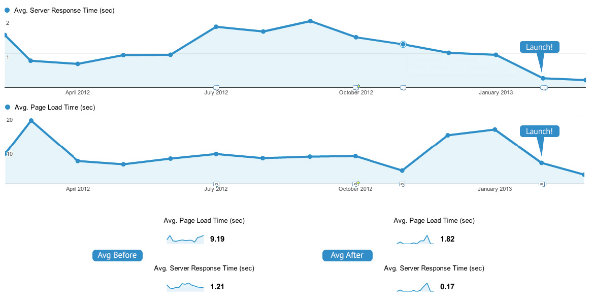
According to Google Analytics, server-response times have decreased from an average of 1.21 seconds to 170 milliseconds. Similarly, page-loading times have decreased from an average of 9.19 seconds to 1.82 seconds.
The important thing to remember here is that this is just the beginning. We know we can improve in some areas: pushing performance optimization much further, reducing file sizes, being more future-friendly with touch gestures across all breakpoints, using server-side solutions such as adaptive images for further contextual enhancement, conforming more closely to the Web Content Accessibility Guidelines’ “AA” standards.
Going responsive is just the first step for our website.
At 2012’s inaugural Smashing Conference, Brad Frost quoted Benjamin Franklin, who said, “When you are finished changing, you’re finished.” For anyone working in the Web industry, this statement will particularly ring true. We work in a medium that is both rapidly and constantly evolving. Keeping up to date with this ever-changing landscape is a challenge, but it’s what makes working with the Web so fantastic and exciting.
We see the launch of our new website as the first improvement of many in our quest for a truly responsive design — and we can’t wait to see where it takes us.
Further Reading
- Responsive Web Design: What It Is And How To Use It
- Design Process In The Responsive Age
- Responsive Web Design Techniques, Tools and Design Strategies
- 12 Factors In Selecting A Mobile Prototyping Tool
 (al, ea, mrn)

