Choosing A Responsive Image Solution

Email Newsletter
Weekly tips on front-end & UX.
Trusted by 200,000+ folks.


 Flexible CMS. Headless & API 1st

If you code websites, it’s a good bet that at least one of your clients has asked about or requested a mobile-friendly website. If you go the responsive design route (whereby your website is flexible enough to adjust visually from mobile to desktop widths), then you’ll need a strategy to make images flexible, too — a responsive image solution.
The basics are fairly simple to learn, but once you’ve mastered them, you’ll find that scaling images is only the beginning — you might also have performance and art direction conundrums to solve. You’ll be faced with a wide field of responsive image solutions to choose from, each with its own strengths and weaknesses – and none of them is perfect! This article leads you through the basics, and then arms you with the information you’ll need to pick the best responsive image solution for your situation.
The Basics
Styling foreground images to adjust to the width of their container is very easy. In your style sheet, perhaps in your normalize or reset style sheet, you’d add the following code:
img {
    max-width: 100%;
}
In most cases, that tiny style rule will do the trick! Once it’s in place, if the container around the image becomes narrower than the width of the image, then the image will scale down to match the width of its container. Setting the max-width to 100% also ensures that the image does not scale larger than its actual size, which would significantly reduce the image’s quality. If you’re still stuck providing support for IE 6 or 7, you’ll want to add a width: 100% style rule targeted only to those browsers, because they don’t understand max-width.
High-resolution “Retina” images can make this basic implementation a bit tricky. Let’s say you want your 150 × 150-pixel logo to display at double the usual pixel density, and the image is small enough that having two separate versions wouldn’t be a problem. So, you create a 300 × 300-pixel version of the logo and plug it in — and now it’s huge! Your first inclination is probably to try something like this in CSS:
img.sitelogo {
    max-width: 150px;
}
Unfortunately, this doesn’t work as expected — the logo image will now refuse to scale nicely with the other images on the page.
To limit the maximum width of an adaptive image, you’d have to limit the maximum width of the image’s container, rather than of the image itself! Let’s say you’ve wrapped your logo image in a module with a class of branding. Here is the style that will do the trick:
.branding {
    max-width: 150px;
}
So, now we have scalable responsive images in our website’s fluid layout. Mission accomplished. Time to go find out what this strange “outdoors” place has to offer to a sun-starved developer, right?
Not so fast! We still have two main challenges to overcome.
The Performance Problem
With the responsive image solution outlined above, all devices are fed the same images. Small icons and logos might not be too bad, but the problem compounds quickly as the images get larger and heftier. Retina images exacerbate the problem — you don’t want to send a big Retina image to a device that isn’t capable of displaying its full detail!
Think about it. Should we really be sending a 990 × 300-pixel 100 KB image meant for desktop viewers to a mobile phone? Sure, the mobile visitor might be on their local coffee shop’s Wi-Fi connection — however, they might be on the road trying to get crucial information from your website, with one shaky bar of wireless service. Every mobile user who gives up when your page takes too long to load is a potential customer lost!
Many mobile websites that are just as big or bigger than their desktop counterparts can be found in the wild today. Guy Podjarny ran some tests a year apart, and there hasn’t been much improvement: in 2011, 86% of websites were the same size or larger, and in 2012 that number went down to 72%, but the overall sizes of websites increased. Dave Rupert also captured the problem beautifully in his article “Mo’ Pixels Mo’ Problems.”
Complicating It Further: Browser Preloading
When I first began wrestling with performance issues on responsive websites, my initial thought was to put all of the image variations on the page, and set up some CSS classes with media queries that would hide big images and show small images at small widths, and vice versa at desktop widths. It seemed logical: shouldn’t the browser only download the visible images?
The problem is that browsers are too quick for us! In order to provide the fastest loading time possible, browsers preload all of the images that they can identify in the source code before any CSS or JavaScript is processed. So, this approach would actually penalize mobile visitors more, by forcing them to download all of an image’s variants!
Because of this preloading, most solutions require either a back-end solution (to preempt the preloading) or special markup and JavaScript.
Bandwidth Detection
The last piece of the performance puzzle is network speed. We know that we want to feed only the large images to devices that are on a speedy network, but how do we determine that? A few techniques are out there to estimate network speed, but they aren’t foolproof yet.
The W3C has been working on a Network Information API, which could be very helpful in future, but currently it’s supported by only a handful of devices (and not the big ones, unfortunately). It is currently implemented in a few responsive image solutions, but I don’t expect it to be widely adopted until it’s more widely supported. Network measurements are difficult and as Yoav Weiss states in his Smashing Magazine’s article, reliable “bandwidth media queries” don’t seem to be something that can be accurately implemented in the near future.
Foresight.js by Adam Bradley uses JavaScript to test how long the browser takes to download a 50K image, then stores that information and uses it to make bandwidth decisions. It does have a few small drawbacks: it does add a 50K image download to your page, and it can block download of other images on your page until the test image download is complete. Many of the responsive image solutions that currently implement bandwidth detection use a variation or adaptation of Foresight.js.
The “Art Direction” Problem
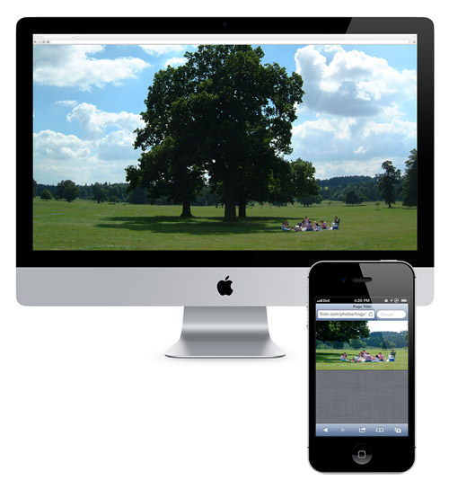
Let’s say you’ve got a beautiful wide image on your home page. It shows a wide bucolic expanse of fields and forest, blue sky and fluffy clouds above, and a happy family having a picnic on the grass.
Now scale it down to 300 pixels wide, mobile-style. At this scale, our vacationing family looks more like the ants at the picnic!
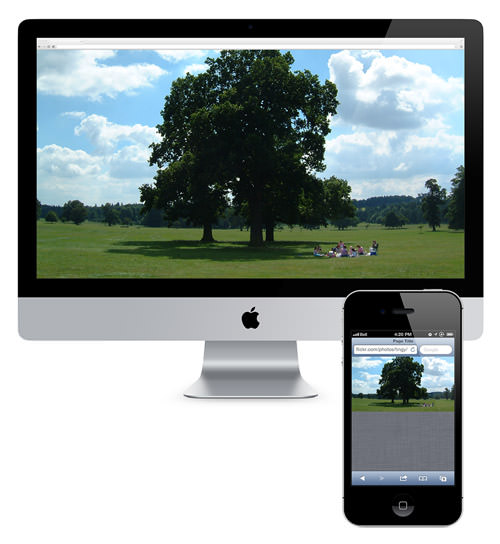
Herein lies what we call the “art direction” problem. Some images just don’t scale well; fine detail is lost, and dramatic impact is reduced. In the case of our hero image, it would be much nicer visually if the mobile version of the photo was zoomed in, cropped and focused on our happy family. To solve this problem, we need a responsive image solution that enables you either to specify different versions of the image for different situations or to adjust the image on the fly.
Choosing Your Solution
Luckily, the web development and design community has no shortage of creative, smart people who have been working to solve these problems. Of course, the flip side of that coin is that it’s easy to get overwhelmed by the sheer number of responsive image solutions out there. How do you decide which is best for you?
Choosing between them can be an extremely complicated matter, because so many factors come into play. No current solution is perfect for every situation; each was designed to solve a particular set of problems. To decide, you’ll need to weigh each solution against your project’s particular needs. Chris Coyier has done a great job of summarizing the deciding factors (including a spreadsheet to track them all, although some newer solutions aren’t mentioned).
Here are some factors to consider:
- Do you need to solve the art direction problem (i.e. different image ratios, crops and sizes for different widths)?
- Do you have a huge website or a CMS on which going back to add special markup to every image is not feasible?
- Are all images present upon the page loading, or are some images loaded dynamically via JavaScript?
- Do you want to test for the user’s bandwidth to determine whether their connection is fast enough to handle high-resolution images?
- Does the solution require a platform that is unavailable to you (such as jQuery or PHP)?
- Is a third-party solution acceptable, or do you need to keep the solution hosted in-house?
With this in mind, let’s look at some responsive image solutions that have been out there for a while and that are widely used within the developer community.
Please note: The list of solutions below is by no means comprehensive. They are the ones either that I’ve found most useful personally or that have proven track records for reliability. Have a favorite solution of your own that’s not here? Let us know in the comments!
Tried And True Responsive Image Solutions
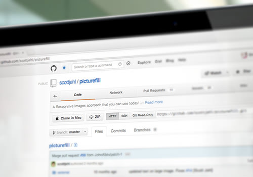
Picturefill
The Web is truly worldwide, and we have to confront the fact that not everyone has access to fiberoptic connections and 4G networks. Scott Jehl encountered this digital divide first-hand while travelling and working his way through Southeast Asia, and he is a strong advocate of mobile-first and responsive websites that don’t put an undue burden on mobile users. His Picturefill script is a polyfill for the proposed <picture> element — JavaScript code that mimics the picture API, enabling us to use it on our websites today. The future is now, baby!
Picturefill does not require jQuery, but obviously it does require the picturefill.js script to be included somewhere in the page. Picturefill also requires some special markup, with divs to represent the image variations, differentiated by data-media attributes that act just like media queries in CSS. You may also optionally put an image in conditional comments for browsers that don’t support media queries (I’m looking at you, IE 8), and a fallback in a <noscript> tag for browsers that don’t have JavaScript enabled (I’m looking at you, BlackBerry).
Here’s an example of a typical Picturefill setup:
<span data-picture data-alt="Descriptive alt tag">
    <span data-src="images/myimage_sm.jpg"></span>
    <span data-src="images/myimage_lg.jpg" data-media="(min-width: 600px)"></span>

    <!--[if (lt IE 10) & (!IEMobile)]>
    <span data-src="images/myimage_sm.jpg"></span>
    <![endif]-->

    <!-- Fallback content for non-JS browsers. -->
    <noscript>
        <img src="images/myimage_sm.jpg" alt="Descriptive alt tag" />
    </noscript>
</span>
That’s all you need to display adaptive images at page-loading time using Picturefill. Drop in the script, configure the markup, and everything just works. You can also call Picturefill programmatically if you need to add images to the page on the fly.
Picturefill requires a lot of custom markup, so it might not be the best choice for those who cannot alter their website’s source code for any reason. It also doesn’t do any bandwidth detection. If bandwidth detection is important to your project, then have a look at this next solution.
HiSRC
HiSRC, by Marc Grabanski and Christopher Schmitt, is a jQuery plugin that enables you to create low-, medium- and high-resolution versions of an image, and the script will show the appropriate one based on Retina-readiness and network speed.

To set it up, first make sure that jQuery and the HiSRC script is included somewhere on the page.
In your HTML code, first add a regular image tag to the page, and set the source to be the low-resolution (or smallest) version of the image. Add a class to the image or its wrapper (like .hisrc) to specify which images HiSRC should process. Then, add some special markup to your image tag: data-1x and data-2x attributes, pointing to the medium- and high-resolution versions, respectively. For example:
<img src="https://placekitten.com/200/100" data-1x="https://placekitten.com/400/200" data-2x="https://placekitten.com/800/400" class="hisrc" />
Then, after the DOM has loaded, just call the function on the image class that you’re using, like so:
$(document).ready(function(){
  $(".hisrc").hisrc();
});
In practice, the browser will first load the image source — i.e. the mobile version of the image. Then, the script checks to see whether the visitor is using mobile bandwidth (such as 3G). If so, it leaves the mobile-first image in place. If the connection is speedy and the browser supports a Retina image, then the @2x version is delivered. If the connection is speedy but Retina is not supported, then the @1x version is delivered.
You might have noticed that the low-resolution image always loads, even if the script later decides that the user’s device is a good candidate for high resolution. Even though this is technically a double-download, it only penalizes those on speedy connections. I’m willing to accept that compromise!
HiSRC can handle images that are added to the page dynamically. It also allows for multiple images, so you can specify different crops and sizes to beat the art-direction problem.
As for weaknesses, HiSRC does require jQuery, so it won’t be useful unless you’re using that library. It also requires custom markup in the HTML, so it might not be the best choice if you have a huge website with a lot of legacy images or a CMS in which the output of the image tag can’t be altered. If that’s your situation, read on!
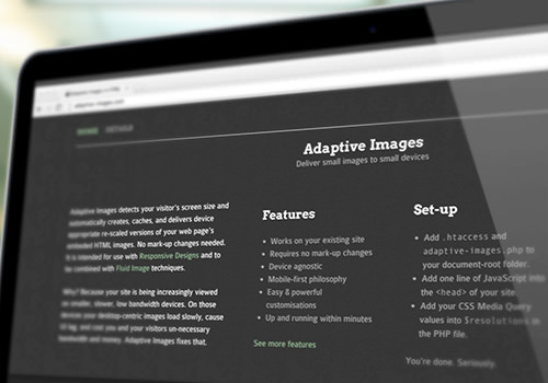
Adaptive Images
Unlike the previous two scripts, Adaptive Images, by Matt Wilcox, is mostly a server-side solution. It requires a tiny bit of JavaScript, but the real work is done via the Apache 2 Web server, PHP 5.x and the GD library.
To install it on your Web server, you’ll need to alter or add an .htaccess file, upload some PHP files to your website’s root directory, add some JavaScript to your pages (which will add a cookie to record the user’s screen resolution), and configure some breakpoint variables in the PHP files to match your website’s media queries.
The installation instructions are quite verbose — a bit too lengthy for the scope of this article. For more information, visit the official website and click the “Details” link at the top.
The best feature of Adaptive Images is that it requires no custom markup on any of your images. Once you’ve installed and configured it correctly, you’re all set! The PHP script will intercept any request for an image and will resize it on the fly as needed to your specified breakpoint sizes and serve it on your pages automatically.
The PHP has a lot of configurable options, such as image quality, breakpoints, caching, and even a sharpening filter to apply to the generated scaled images.
It has a few limitations:
- Because it requires the combination of Apache and PHP, Adaptive Images might not match up with your website’s platform or be available on your Web host’s server.
- It relies on the Web server’s ability to intercept any requests for images (via the
.htaccessfile). So, if your images are hosted elsewhere, such as on a content delivery network, then it won’t work. - It doesn’t detect bandwidth.
- It’s not meant to solve the art direction problem, because it only rescales the original images. It can’t crop or create different aspect ratios from the original image.
You may have noticed that all of the solutions thus far require JavaScript, and often some detailed configuration. If you’re looking for one that doesn’t require JavaScript and that is fairly simple to implement, then have a look at this next one.
Sencha.io Src
Previously known as TinySrc, Sencha.io Src is a third-party solution that acts as a proxy for images, so you don’t need to configure anything on your server. Just point your image at Sencha’s servers (with or without some options specified), and Sencha will process it and send back a resized version as needed.

Let’s say you have a big image:
<img src="https://www.your-domain.com/path/to/image.jpg" alt="My large image" />
At its simplest, you’d just prefix the src attribute with https://src.sencha.io/, like so:
<img src="https://src.sencha.io/https://www.your-domain.com/path/to/image.jpg" alt="My large image" />
By default, Sencha.io will resize your image to fit the width of the device’s screen, using the user-agent string for detection. Phones might be sent a 320-pixel-wide image, tablets a 768-pixel-wide image, etc.
You can also configure the Sencha.io prefix string to return particular measurements, orientations, percentage sizes or any number of complex calculations.
Sencha.io is a free service for individual users and can be a very convenient adaptive image solution. However, you’re adding a third-party dependency, with the possibility of downtime and problems beyond your control. Weigh these risks carefully.
Responsive Image Solutions To Watch
The solutions outlined till now are usable today, but they’re not the only fish in the sea. Some newer solutions show a lot of promise, and I’m keeping a sharp eye on them to see how they evolve with current Web technology. Below are two in particular that you might want to watch.
Capturing/Mobify.js 2.0
Capturing is a new feature of the in-development Mobify.js 2.0, which proposes to give you access to (or to “capture”) the HTML source markup before it is parsed or rendered by the browser. Accessing the source code at this stage enables you to swap an image’s src attribute before the browser downloads it. You can even craft a fallback to one of the other solutions, such as Picturefill, in case something fails.

Since this technique directly circumvents native browser preloading, it is a bit controversial in web performance circles. If misused, it could actually create performance problems on a site instead of alleviating them!
The other thing holding me back from running to this solution with open arms is its cross-browser support. Capturing won’t work in any version of IE lower than 10, so IE 8 and 9 users will be left out in the cold. I’ll keep watching, though — down the road a ways, when IE 8 and 9 finally fade into the sunset, this solution might be more viable!
If you’re interested in finding out more about Capturing, the Mozilla team goes into more detail in its blog post, “Capturing: Improving Performance of the Adaptive Web.”
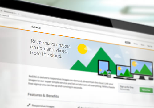
ReSRC.it
ReSRC.it is another third-party solution (recently out of beta) that delivers responsive images from the cloud. It seems to be very similar in implementation to Sencha.io Src, but adds image filters and bandwidth detection and doesn’t rely on user-agent detection or cookies.
To get started, you first need to sign up for a trial account at ReSrc.it.
Second, you’ll need to insert their Javascript file on your page (this is the simple JS code; they offer an asynchronous embed method as well to improve performance):
<script src="//use.resrc.it"></script>
Then, suppose you have an image like this:
<img src="https://path/to/image.jpg" alt="My large image" />
You would prefix the image source’s URL with a path to ReSRC.it’s servers, and add a CSS class of “resrc” to the image. They currently have two servers, one for paid accounts and one for trial accounts — we’ll use the trial one for our example:
<img src="https://trial.resrc.it/https://www.your-domain.com/path/to/image.jpg" alt="My large image" class="resrc" />
ReSRC.it allows you to add parameters to the requested URL to perform operations on the image, such as rotating, cropping and flipping. This allows for quite a bit of flexibility and potentially addresses the art-direction problem. The parameters are processed in order from left to right and can be strung together.
Here’s an example of an image that’s being flipped horizontally, resized to 300-pixels wide, with the resulting image optimized to an 80%-quality JPEG:
<img src="https://trial.resrc.it/r=h/s=w300/o=80/https://www.your-site.co/image.jpg" alt="My large image" class="resrc" />
ReSRC.it is recently out of beta, so if anyone using the service has tips or advice (pro or con), we’d love to hear more about it in the comments.
Test, Test, Test!
After you’ve chosen and implemented a responsive image solution, testing the performance of your website is absolutely necessary to making sure that the solution is working well. Below are a few useful online testing tools to help you.
YSlow
Created by Yahoo, YSlow is a client-side tool that analyzes your website against 23 testable rules that Yahoo has determined can adversely affect Web page performance. YSlow awards your website a grade for each rule, explaining each one and suggesting how to improve your website’s performance. YSlow is available for Firefox, Chrome, Safari and Opera (as well as by a few other means, such as the command line).
WebPageTest
The online tool WebPageTest is an open-source project maintained by Google. You enter your website’s URL, perform a speed test from a chosen location, and specify which browser to use. Advanced settings allow you to perform multi-step transactions, pick a network speed (cable, DSL, FiOS, etc.), disable JavaScript, block ads and make other requests, and more. The results come in the form of tables, charts, screenshots, a performance review and a lot of great data to dig into!
The Yottaa blog has an article detailing how they used WebPageTest to test out their website both with and without responsive image loading – check it out!
Conclusion
If you read Smashing Magazine, you’re probably already on board with creating the best possible website experience for your audience. So, the next time you craft a beautiful, usable experience for mobile visitors, try out one of these responsive image solutions and take your website the extra mile. Your mobile visitors will thank you!
Delve Deeper
- Jeremy Keith took some wonderful notes on Scott Jehl’s presentation “Responsive and Responsible” at An Event Apart in Atlanta.
- Jordan Moore has written a great article that goes deeper into responsible considerations for responsive design.
- Feeling confused and frustrated? It’s OK; we’re all figuring out this responsive design thing together! Josh Long exhorts us all to band together and share our experiences in “I Have No Idea What I’m Doing With Responsive Web Design.”
- Want to take it further? Get involved! Join forces with the folks in the Responsive Images Community Group. You can also follow them on Twitter.
Further Reading
- One Solution To Responsive Images
- Simple Responsive Images With CSS Background Images
- How To Solve Adaptive Images In Responsive Web Design
- Responsive Images In WordPress With Art Direction
 (al, mrn)

