How To Create High-Performance Mobile Websites

Email Newsletter
Weekly tips on front-end & UX.
Trusted by 200,000+ folks.

 Register!
 Flexible CMS. Headless & API 1st


Editor’s Note: This article features just one of the many solutions for creating high-performance mobile websites. We suggest that you review different approaches such as Building A Responsive Web App, Improving Mobile Support and Making Your Websites Faster before choosing a particular solution.
People start to lose interest in a website if they don’t get a response within three seconds. Fulfilling this expectation for mobile phone users requires a different approach to usage analysis, design and testing.
This article expands on the techniques that Johan Johansson explains in his article “How to Make Your Websites Faster on Mobile Devices,” published in April 2013.
We’ll demonstrate methods to identify how people interact with a website differently on mobile devices, and the design decisions that can be made based on this understanding. Our objective is not only to improve Web performance but to increase the client’s return on investment.
The techniques we’ll demonstrate center on the two unique characteristics of mobile phones, which are not going to change any time soon: small batteries and small screens.
Small Batteries
Mobile phones use radios for all communication, and they have little batteries that need to be carefully managed in order to avoid running out of power. As a result, radios are shut down very quickly when not in use, increasing the perceived time that a Web page takes to appear. 2G and 3G radios could require up to two seconds to establish an operational HTTP connection. If we accept that users start to lose interest after three seconds, then a website has only one second to respond. Think of this as the “golden second.”
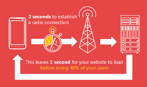
Maximizing the “golden second”.
Small Screens
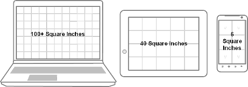
In the physical world, content is produced for billboards and magazines and customized to account for the size and viewing distance of the medium. In the digital world, a typical mid-range smartphone has a screen with around six square inches of real estate. An MacBook Pro with a 15-inch display will have over 100 square inches. Thus, not only can we optimize website performance by reducing the amount of content sent to phones, but we can optimize business processes to improve the return on investment for website owners.
The code examples in this article are provided in .NET. Where equivalents are possible in PHP, Java, C or Python, I’ve made them available in a companion article. I’ll explain why I’ve used .NET at the end of this article.
Maximizing The “Golden Second”
Website designers and developers with high-bandwidth Wi-Fi and fixed-line connections often used to take bandwidth for granted. Responsive Web design (RWD) limits the creative process by forcing the same content, navigation and business processes to be presented on every device, irrespective of its physical capabilities.
Solutions to ensure that we can easily measure performance, monitor user behavior based on the characteristics of the device and optimize Web pages for low-bandwidth devices are required to maximize the golden second.
Simulating The Real World
Essential for mobile Web performance testing is a method to simulate real-world mobile bandwidth conditions. Many wireless routers that cost less than $100 support bandwidth limiting. This simply involves limiting the uplink and downlink bandwidth for LAN-side clients. If the router doesn’t support this capability out of the box, then DD-WRT, an open-source firmware upgrade, may be used to replace the default operating system on many popular routers to limit bandwidth.
I use a Linksys E3000 router modified with DD-WRT. The procedure to upgrade the router is pretty simple, and full instructions are available on the DD-WRT website.
Once DD-WRT is installed, go to the “QoS” (quality of service) menu, and enable bandwidth limiting. Then, set values for the uplink and downlink. I prefer 256 kbps for the downlink and 28 kbps for the uplink to simulate an average mobile bandwidth connection.
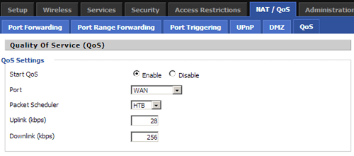
Limiting bandwidth in the “Quality of Service” options.
Now the bandwidth of any Wi-Fi or ethernet-cabled devices that are connected to the router will be artificially reduced. The actual bandwidth being used over time can also be monitored.
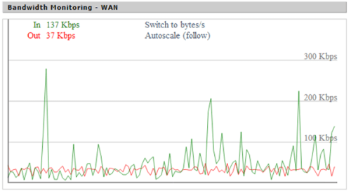
Monitoring bandwidth using DD-WRT.
While this approach doesn’t introduce random drop-outs, variable bandwidth conditions or the delays associated with radio wake-up, it is better than performing all of your testing on a fast low-latency broadband connection. When introduced at the beginning of the website development cycle, it’s an easy way to informally test performance during the development process and ensure that you don’t get any nasty surprises during formal testing.
You Can’t Manage What You Can’t Measure
Peter Drucker, a management consultant, once famously said, “If you can’t measure something, you can’t manage it.”
Average screen size growth over time.
Continually monitoring the content that users view according to device characteristics (such as supported radios or physical screen size) will help you to identify the content and services that are more or less popular on mobile phones. Perhaps you will see no difference, but unless you measure it, there’s no way to know for sure.
Feed Me Now: An Example
A global fast-food franchise wanted to create a mobile-optimized version of its big-screen website. Before creating the first iteration of the mobile-optimized website, it performed analysis to determine which options on the big-screen website were being accessed by users on small-screen devices. The main menu, special offers and the store finder were the most popular, and so a mobile-optimized website was created that focused on these areas.
Work didn’t stop there. Continued analysis revealed that the store finder was the most popular option. The mobile home page was altered again to focus on the store finder. Continued monitoring will show how many visitors choose other options, and the website will be continually refined to ensure that the most popular outcomes are catered to in the simplest possible way.
Better Logging
Google Analytics provides some information about device model, but it lacks the detail we need to make informed decisions based on screen size and input method. Fortunately, a comprehensive device-detection repository (DDR) can be used to add this information to existing log files. The following code snippet can be added to a .NET website to obtain the screen’s physical dimensions in inches and write the output to a simple CSV file.
// Write a log file containing the current time, and the screen
// size of the requesting device in inches.
File.AppendAllText(
    Path.Combine(
        AppDomain.CurrentDomain.BaseDirectory, String.Format(
            "App_Data\Simple_Log_{0:yyyyMMdd}.csv",
            DateTime.UtcNow)),
    String.Format("{0:s},{1},{2},{3}rn",
        DateTime.UtcNow,
        Request.Path,
        Request.Browser["ScreenInchesWidth"],
        Request.Browser["ScreenInchesHeight"]));
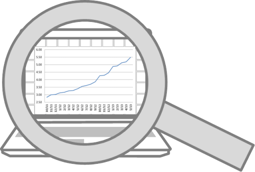
The first column is the date and time that the request was processed. The second is the page being requested. The final two columns are the width and height in inches. Once sufficient data has been captured, the average screen size in square inches can be calculated and plotted on a chart, similar to the following:
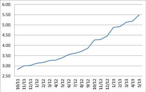
Comparison of the average sizes of device screens over 20 months.
The analysis could be narrowed down to individual pages. Other characteristics about device, operating system and browser may be added as columns.
Similar code could be used with PHP, Java, Python and other environments.
Existing Log Files
Sometimes, existing Web pages can’t be altered in the way shown. In these situations, a DDR may be used to perform offline analysis of log files containing user agents. The following .NET code is a functional command-line program that will parse a space-separated log file and calculate the average screen size in square inches for the requests it represents. The first argument is the log file’s location, the second is the index of the UserAgent column within the log file.
using System;
using FiftyOne.Foundation.Mobile.Detection.Binary;
using System.IO;

namespace ConsoleApplication
{
    class Program
    {
        static void Main(string[] args)
        {
            // The number of devices read from the log file.
            int count = 0;

            // The column in the input file the user agent is held in.
            int column = int.Parse(args[1]);

            // Screen dimension variables.
            double total = 0, width, height, squareInches;

            // Create a provider to determine the device capabilities.
            var provider = Reader.Create("51Degrees.mobi.dat");

            // Read each line of the log file provided in argument  0.
            // Assume the value at column 8 is the UserAgent string.
            using (var reader = File.OpenText(args[0]))
            {
                while(reader.EndOfStream == false)
                {
                    var values = reader.ReadLine().Split(new[] { ' ' });
                    if (values.Length >= column)
                    {
                        // Get the device information based on the UserAgent.
                        var device = provider.GetDeviceInfo(
                            values[column - 1].Replace("+", " "));
                        if (device != null)
                        {
                            // Determine the screen dimensions in inches.
                            double.TryParse(
                                device.GetFirstPropertyValue("ScreenInchesWidth"),
                                out width);
                            double.TryParse(
                                device.GetFirstPropertyValue("ScreenInchesHeight"),
                                out height);
                            squareInches = width * height;
                            // If valid values are available (not a desktop/laptop)
                            // then add the values to the results.
                            if (squareInches > 0)
                            {
                                total += squareInches;
                                count++;
                            }
                        }
                    }
                }
            }

            Console.WriteLine(
                "Average screen size '{0:#.00}' square inches from '{1}' devices",
                total / count,
                count);
            Console.ReadKey();
        }
    }
}
Analyzing log files is less accurate because HTTP headers other than User-Agent affect the detection’s results. This is especially true with Opera Mini and Opera Mobile browsers, in which a second HTTP header, named Device-Stock-UA is used to provide information about physical hardware not available in the standard User-Agent.
Why Monitor?
Monitoring enables us to remove unpopular content from major landing pages, thus improving the performance of content that is more important or relevant. The removed content should still be available via second-level pages — just not placed on landing pages, where they would eat up valuable bandwidth and slow down performance.
So, how do we create a separate mobile website optimized for performance?
Divide And Conquer
I understand why RWD makes a lot of sense from the perspective of user interface design. It’s great in situations in which content, navigation and business-process requirements are identical between 6-square-inch screens and 100-square-inch screens and only the layout needs to be altered.
Average device screen size.
However, having a separate mobile website makes a lot of sense when the conditions above aren’t true or when performance is critical.
Separate mobile websites are often implemented in a way that delivers a poor user experience. Google is now shining a light on these common issues by penalizing websites with lower search engine rankings. Mistakes include sending every desktop page to a single mobile home page, redirecting to application download pages, preventing the user from accessing the big screen website, and treating all devices with a particular operating system in the same manner.
These poor implementations have given the concept a bad reputation. Here’s how to do it simply and properly.
The following .NET web.config section will redirect the first request from a smartphone to an equivalent page on the “Smartphone” section of the website. Importantly, the query string and page name are retained across the redirection.
<redirect firstRequestOnly="true"
    mobileHomePageUrl="~/Mobile/Default.aspx"
    timeout="20"
    devicesFile="~/App_Data/Devices.dat"
    mobilePagesRegex="/(Mobile|Smartphone)/" >
    <locations>
        <!--Send smartphones to an equivalent version of the original page, preserving the page name and query string.-->
        <location name="smartphone" url="~/Smartphone/{0}" matchExpression="(?<=^w+://.+/).+">
            <add property="IsSmartphone" matchExpression="true"/>
        </location>
    </locations>
</redirect>
In most situations, when redirected to alternative pages, users should be able to return to the original page if they wish; perhaps they’re more familiar with the big-screen version of the website. The firstRequestOnly attribute ensures that only the first request from the device is redirected. The devicesFile attribute is used to track devices on which cookies aren’t supported. The timeout attribute controls how long the device is remembered (for the purpose of redirection).
The redirection system also has to know which pages are designed for which type of device. The mobilePagesRegex attribute is applied to requested URLs. If there is a match, then the page won’t be eligible for redirection. This prevents cases of infinite redirections.
The locations element allows for different locations and associated rules to be configured. The example inserts the folder Smartphone into the original URL. The query string and other URL information are retained across the redirection. All information that affects the context of the request must be transferred in order for the user to receive the content they are expecting.
This simple approach enables a search engine-friendly, Google-compliant, mobile phone-optimized website to be delivered, with a good user experience and superior performance. Essential to the process is a DDR that provides information about the device quickly, consistently and accurately. Users who change their mobile phone’s browser settings to surf in desktop mode will be respected, and the redirection will not occur.
Beware Of Clouds
Cloud services are a popular way to easily add features to a website. But they bring a performance penalty by calling out over the Internet. Ignoring processing time, we’ve observed an average 200-millisecond delay with data transmission from Amazon Web Service-hosted cloud services.
200 milliseconds is 20% of the golden second. Therefore, consider carefully where you use cloud services, ensuring they’re called asynchronously to enable other processing to continue while waiting for the response. They should be avoided for critical path activity, such as determining information about the requesting device.
Squeezing Content
After video, images, CSS and HTML make up the bulk of Web traffic. We need methods of optimizing them all. Video is an article on its own and will have to wait for another day.
Images
A popular solution is to provide three versions of the same image, and select the one that is best for the requesting device using JavaScript or CSS3 when the browser renders the page. This is a great start, but managing different versions of the same image is a pain; the image is never ideally optimized, and the method puts the burden of resizing onto the mobile device’s limited CPU and battery.
There is a better way, using an image optimizer. There are many great options out there; if you decide to use our very own image optimizer, you can add it to an ASP.NET website via the Visual Studio IDE. The following configuration will be added automatically to the web.config.
<handlers>
    <add name="Image" verb="GET" path="P.axd" type="FiftyOne.Framework.Image.ImageHandler, FiftyOne.Framework" />
</handlers>
The handler tells Internet information services (IIS) that the image handler should process any GET requests for the resource P.axd.
Once enabled in web.config, the following ASP.NET code will use the image optimizer to define an image element with three possible sources — being 240, 480 and 640 pixels wide, respectively.
<mob:Image runat="server" ID="ImageBanner" CalculateSizeMode="ClientWidth" Style="clear: both; width: 100%">
    <mob:AltImage ImageUrl="~/Images/Landscape240.png" />
    <mob:AltImage ImageUrl="~/Images/Landscape480.png" />
    <mob:AltImage ImageUrl="~/Images/Landscape640.png" />
</mob:Image>
When the image is initially displayed, the server will send a white 1 × 1-pixel GIF to appear in place of the image. This is the resulting HTML:
<img id="B" src="P.axd?i=E.gif&i=1"/>
Once the page has loaded, JavaScript is used to work out the exact dimensions required by the image and request a precisely sized image from the server. After JavaScript processing, the HTML above will be transformed to this:
<img id="B" src="P.axd?i=1&w=500"/>
The image handler referenced in web.config correlates the I query string parameter with the sources of the image, so that the best image can be used as the starting point for resizing on the server. The w query string parameter specifies the width of the image required. Multiple images don’t need to be provided; a single image will work almost as well.
This approach is easy to implement, and the result is a precisely sized image, which reduces bandwidth consumption, mobile phone CPU cycles and power consumption.
HTML
The full Oxford English Dictionary contains 171,476 words. If a computer were to represent each word as a unique binary number, rather than letters in an alphabet, then 18 bits (or 3 bytes, if rounded up) would be required. This technique is why compression algorithms are so effective.
However, HTML is not very efficient because it’s full of words for elements, IDs, classes, styles and JavaScript, without even considering the human-readable words. Compression reduces this, but it remains an overhead. This is why popular libraries have minified versions that appear almost unreadable to humans.
Some of these markup-related words can also be minimized before being sent to the browser by the server, without losing any of their meaning. Taking the image example shown earlier, the standard HTML ID attribute of the image element in ASP.NET would be ImageBanner.
<mob:Image runat="server" ID="ImageBanner" CalculateSizeMode="ClientWidth" Style="clear: both; width: 100%">
However, the code sent to the browser would use just B. For a single element, the performance improvement is negligible, but on a complex page with hundreds of elements, the page will transfer more quickly and the browser will be able to process everything that much faster.
Includes
Something else is slightly peculiar about the resulting HTML from the image example.
<img id="B" src="P.axd?i=1&w=500"/>
The ASP.NET code includes a style attribute that is missing, and there isn’t a class attribute for the img element. So, how is the style being applied?
The server-side-minimizing process will identify style information and create a CSS include for the page, thus reducing the HTML. If the HTML changes, then the style information will already have been cached in the browser and will not need to be downloaded again. The CSS snippet looks like this:
#B{clear:both;width:100%;}
If many elements share the same styling, then their IDs will be added to the CSS and they’ll share the same information.
Style information can also be shared across elements and pages using a server-side style element. The following code extends the previous image example to demonstrate a shared style element.
<mob:Style runat="server" ID="StyleBanner">
    <mob:Filter Style="clear: both; width: 100%"/>
</mob:Style>

<mob:Image runat="server" ID="ImageBanner" CalculateSizeMode="ClientWidth" StyleID="StyleBanner">
The elements can be further extended to apply different styling based on the capabilities of the device and to optimize style sheets across multiple pages.
This technique will always ensure that only the required CSS is transferred, thus improving performance over subsequent requests to the same page, particularly where there are only minor differences in HTML content.
Why .NET?
The techniques and code examples shown for image optimization and dynamic minification of HTML and CSS content rely on content being altered after the page has been rendered but before transmission to the browser by the server. Such preprocessing techniques are relatively easy to implement in architectures such as ASP.NET Web forms.
However, they are a lot more complex to implement in script-based architectures such as PHP. For this reason, the examples in this article are provided in .NET for consistency. Where I’ve been able to apply the techniques to other languages, the example code is available in a companion blog.
Examples
Public Health Foundation Enterprises implemented the techniques shown in this article and experienced a 23% increase in successful outcomes during the first week.
Other performance-aware websites — including 24.com (media), ServiceTick (analysis), LettingWeb (property), AdSupply (advertising) and Kitsap Credit Union (finance) — are all optimizing for mobile using some or all of techniques covered in this article.
Summary
We need to consider the return on investment for a website’s owner in order to truly optimize performance. Monitoring differences in the characteristics of devices is the essential starting point.
We can then deploy solutions such as using separate mobile websites to split up or change the focus of content. And we can squeeze maximum performance out of mobile phones by minifying images and HTML, removing jQuery, questioning when to use RWD alone, and other techniques. Of course, established techniques are critical, too, such as configuring caching directives and compressing content.
Tweaking our development environment to simulate real-world conditions will also yield a greater understanding of performance throughout the development process.
Optimize Now
To get you thinking even more about performance, I’ve set up a competition to find the world’s heaviest website. Find a Web page that performs poorly on a mobile phone and submit it to the competition. We’ll work out the page’s weight, and if it’s the heaviest, you’ll win $1000. Meanwhile, implement the techniques covered in this and other great Smashing Magazine articles to ensure that your website doesn’t top the list when we weigh in on performance!
There’s never been a better time to improve your website’s performance.
Further Reading
- Eye-Tracking In Mobile UX Research
- Why You Should Consider Graphs For Your Next GraphQL Project
- Sustainable Web Development Strategies Within An Organization
- Art Direction For The Web Using CSS Shapes
 (al, ea, mrn)

