Breaking Out Of The Box: Design Inspiration (September 2016)

Email Newsletter
Weekly tips on front-end & UX.
Trusted by 200,000+ folks.
 Flexible CMS. Headless & API 1st


Inspiration isn’t tied to a specific timeframe or shows up when you need it. There isn’t a magic formula to rely on. Luckily, this year’s summer vacation was fruitful in providing us with many visual stimuli to get the creative process going. Enjoy!
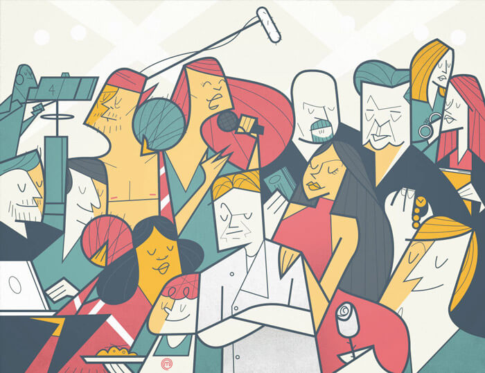
The Hollywood Reporter
This editorial illustration for the Hollywood Reporter has a really nice style. The face expressions are so well done with just a few simple lines. That’s not easy to accomplish!
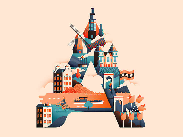
Wanderlust Alphabet A
A fantastic series to get the travel bug. Just by looking at this you’ve probably already guessed that the ‘A’ in this case stands for ‘Amsterdam’. Lovely usage of two complimentary colors cleverly applied, especially to add depth into shadows and highlights.
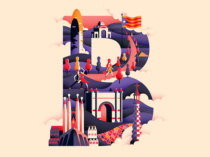
Wanderlust Alphabet B
Second installment of the travel bug illustrations I’ll be sure to follow. The letter ‘B’ stands for ‘BarcelonaÄ. Again, look at how depth is created by using a strong color palette and this beautiful clean 2D style. The famous parts of this city are so well done with such simple lines.
Giphy Pool
James Curran is one of the masters of animated gifs to watch. This one made laugh and is so colorfully pleasant. And look at that jump! Just perfect.
Slack — Work Simplified
Great integration of the colors used by Slack. It shows how crazy work life is. Beautiful illustration style. Just perfect branding material.

Stamps Inspired (1965)
Illustration based on original stamps from Bulgaria. Quite beautiful! I love the bright yellow in combination with the darker color, as well as the red and orange tones.
Saga Magazine
I first noticed the interesting structure/texture that works so well with the chosen colors. Love the circles, and ‘straight’ 90° lines — very geometrical. Feels a bit like a puzzle.

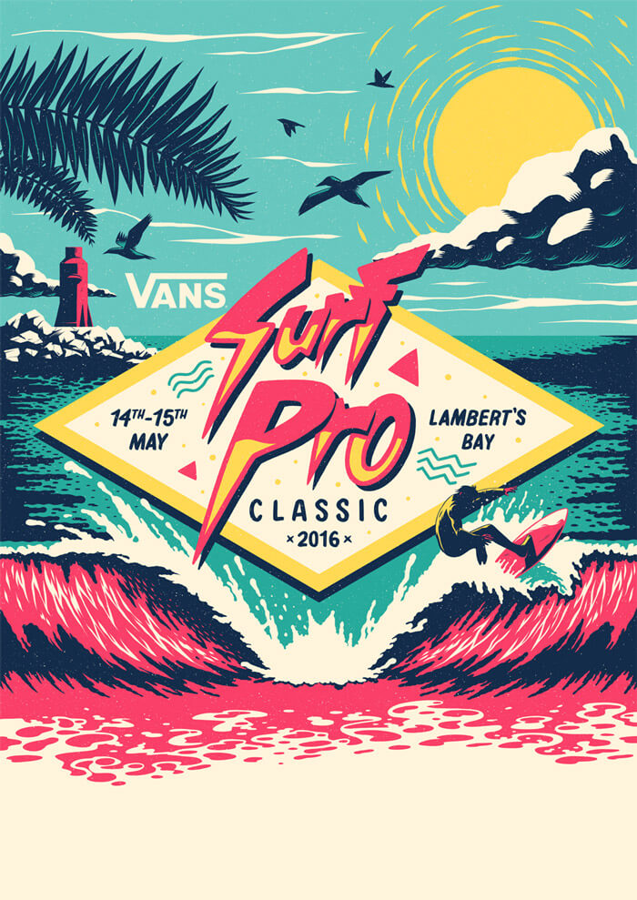
Vans Surf Pro Classic
The colors just pop so magnificently off the screen in this surf-related illustration. Very fitting for the subject. Inspiration came from late 80s and 90s surf artwork.
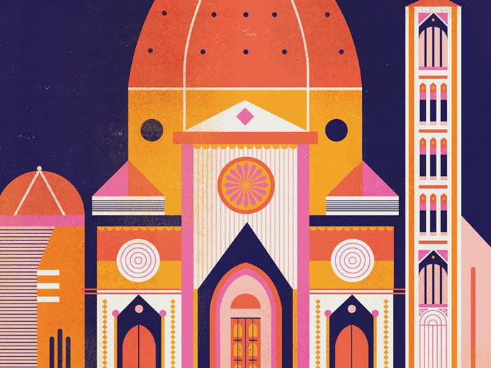
Firenze Duomo
Lovely illustration of the Duomo in Florence. Color palette is on point. Tasty texture, too. Simply beautiful to look at and get inspired.
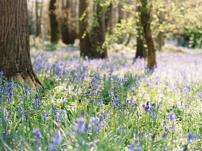
In The Woods
Well taken shot of one of my favorite moments in the month of May. The smell is just overwhelming of these beautiful bluebells. Magical light and bokeh.
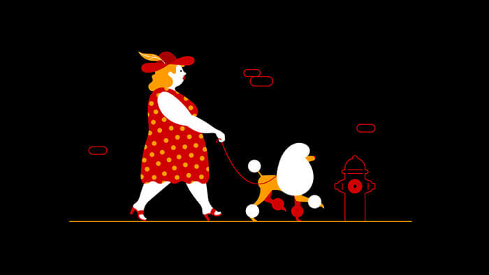
Mastercard Campaign
Some clever use of white space. The dog is just so awesomely done.
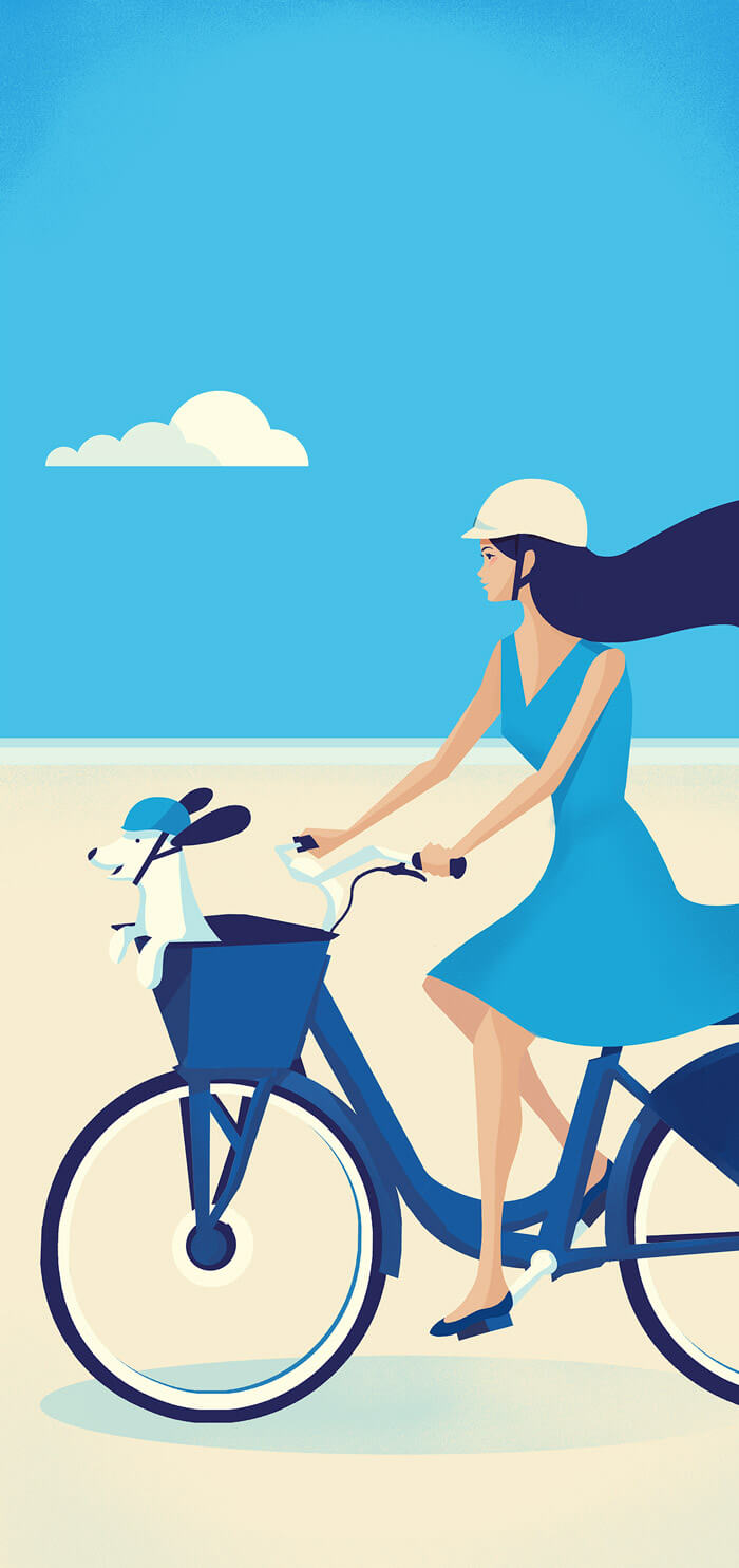
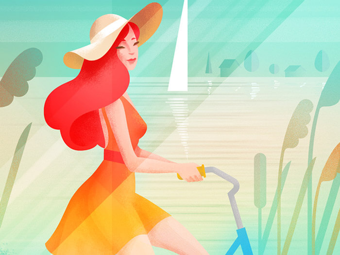
City Bike Miami
Love the eyes and the illusion of the hair in the wind. Same with the dog ears, so cute. That lovely summer feeling on the bike! Perfectly expressed.
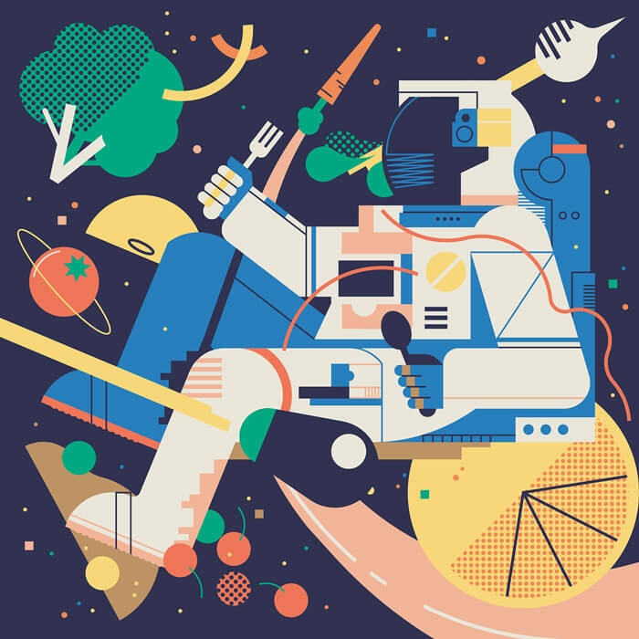
Umami
An illustration which takes on curiosity and exploration of different tastes and flavors. It’s a great composition and an inspiring color palette.
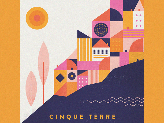
Cinque Terre
Great color scheme! Illustration that documents a trip to Italy to see Cinque Terre. It’s a must-see apparently. The geometry combined with how the colors are applied is just so perfect.
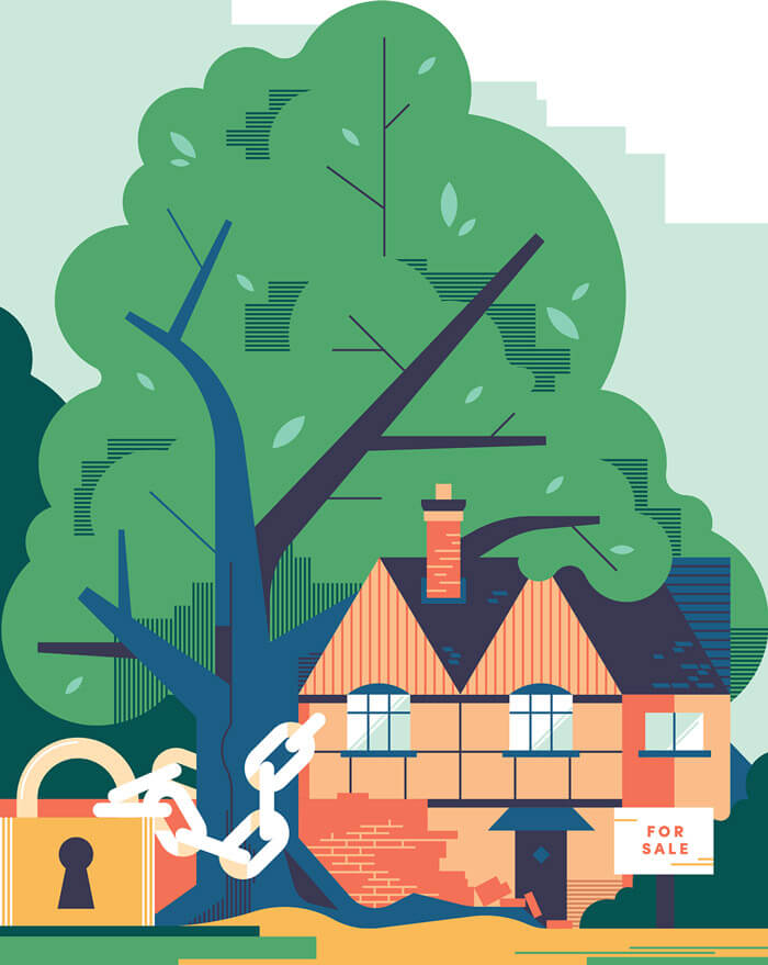
Protected Trees
An illustration for The Telegraph’s property section on buying a home with protected trees in vicinity. Some inspiring choices of shapes and lines.
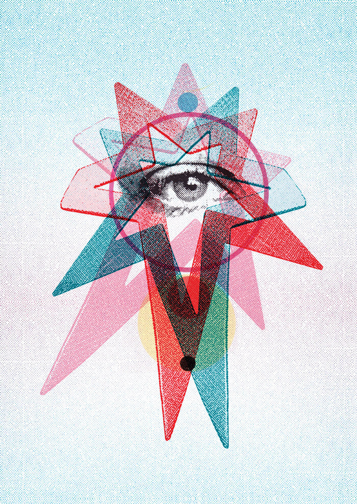
Shop Magazine — Eye Blue
If you like interesting collages, you’ll love the work of Jimmy Turell. The colors and the half-tone effects are the items that made me pick this one.
Year In Ideas (2014)
Created for Wired. Another color combo that works wonderfully well together. I always look at how things are constructed, and I’m quite impressed by this illustration.
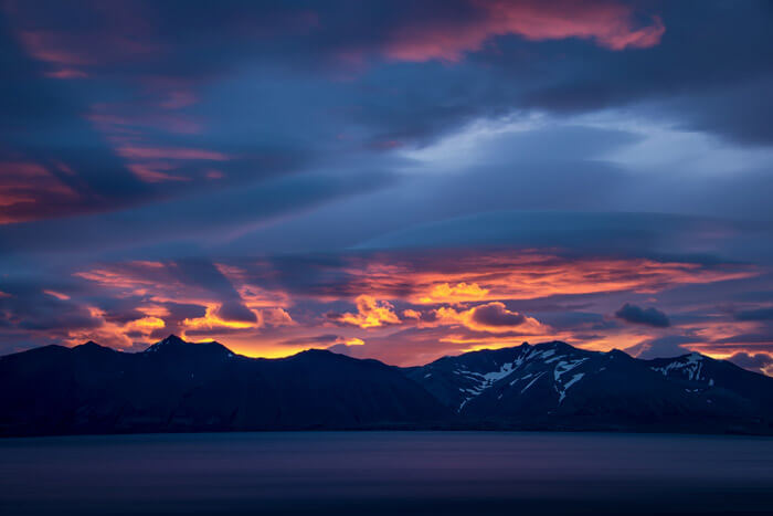
The Westfjords
Beautiful colors of the sky — almost like fire.
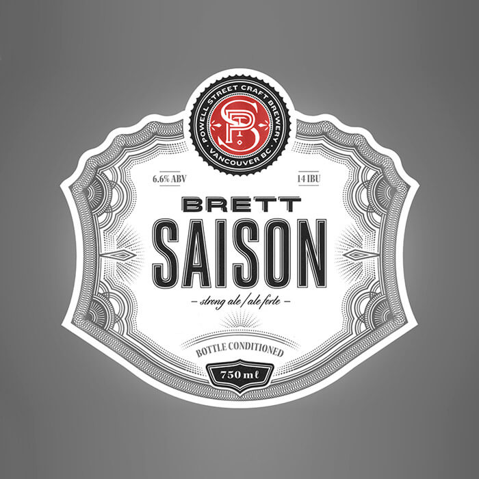
Saison
Wonderful die cut beer label design. I always admire such great lettering work. Be sure to check the rest of Ben Didier’s the portfolio as there is some stellar lettering work in there.
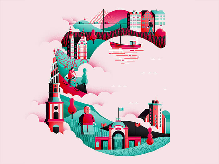
Wanderlust Alphabet C
The third installment in the Wanderlust alphabet that Jack Daly is creating. This time I believe the ‘C’ stands for ‘Copenhagen’. Interesting palette of colors in this one.
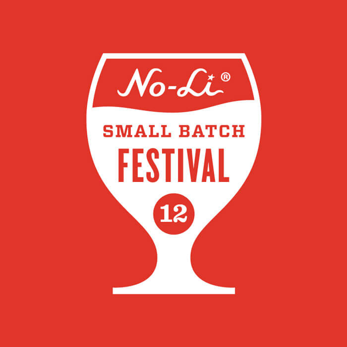
No-Li Small Batch Festival
Nice logo for the No-Li Brewhouse’s Small Batch Festival. The different styles of typefaces really work well together. Beautiful and elegant!
SHOP Magazine Austria Spring/Summer 2016
The cover illustration for the spring edition of SHOP magazine in Austria. It depicts the Museum quarter of Vienna. Lovely combination of geometrical and elegant organic lines. Such perfect soft color tones combined with a few more brighter accents.
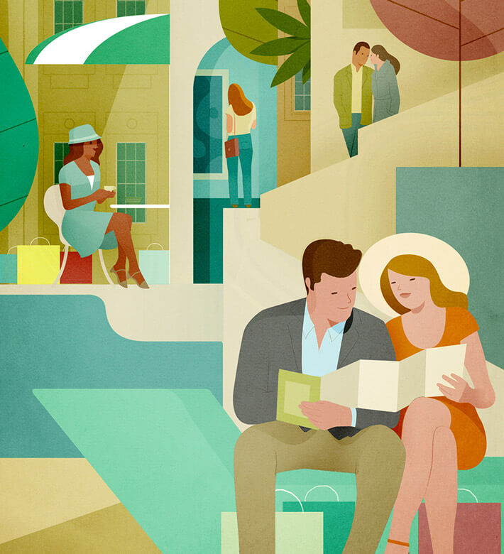
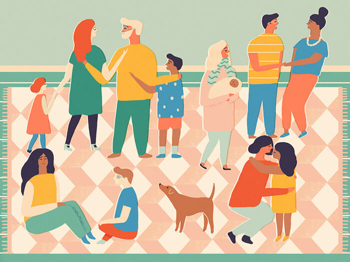
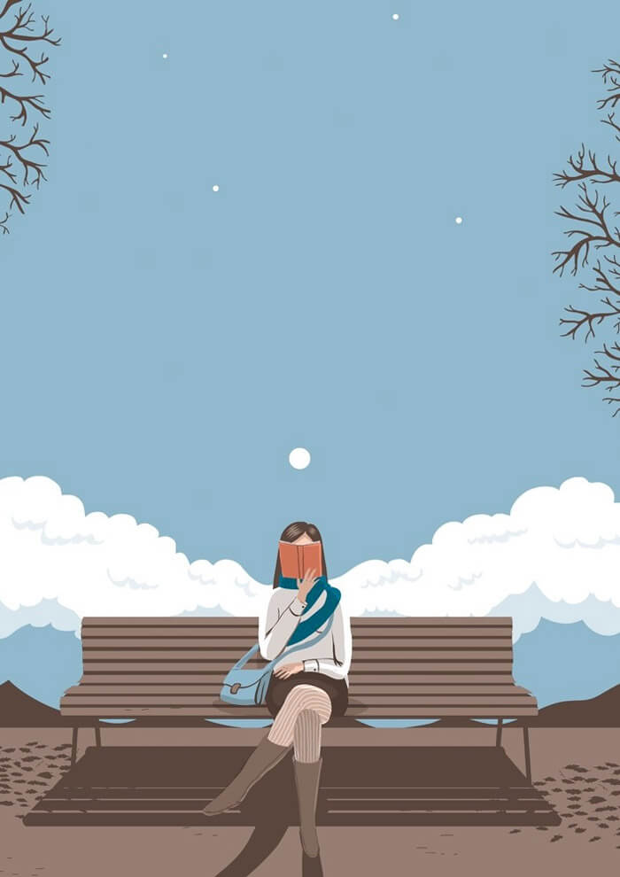
Girl On The Go
Such a wonderful scene! Especially the colors used and the inspiring details such as the skirt of the woman and the boots of the guy sitting on the bench on the right.
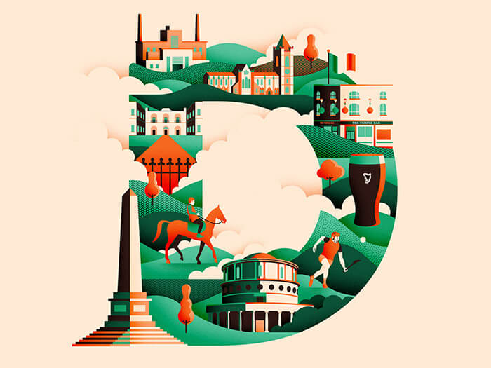
Wanderlust Alphabet D
The fourth installment in the Wanderlust alphabet that Jack Daly is creating. This time the ’D’ stands for ‘Dublin’. Just look at how shadows and highlights are applied — such perfect contrast.
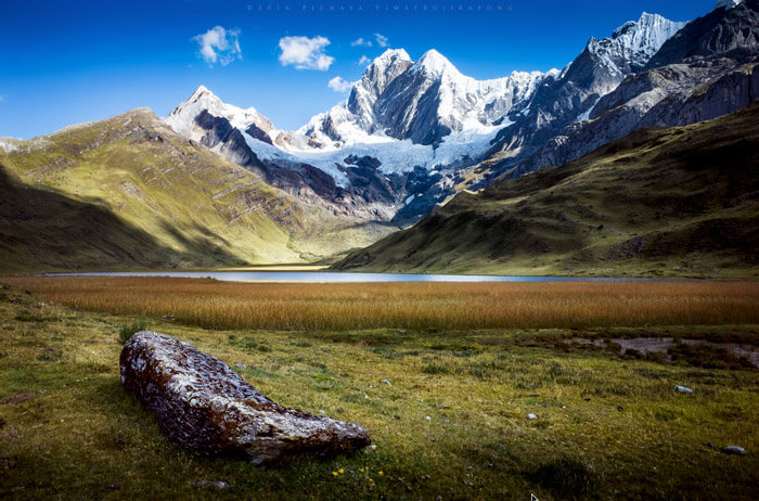
An Afternoon At Miticocha
Well worth a two-hour round-trip hike I would say if you get to see a scenery like this. This place has a beautiful view of Ninachanca, Jirishanca, and Jirishanca Chico. Pure wanderlust!
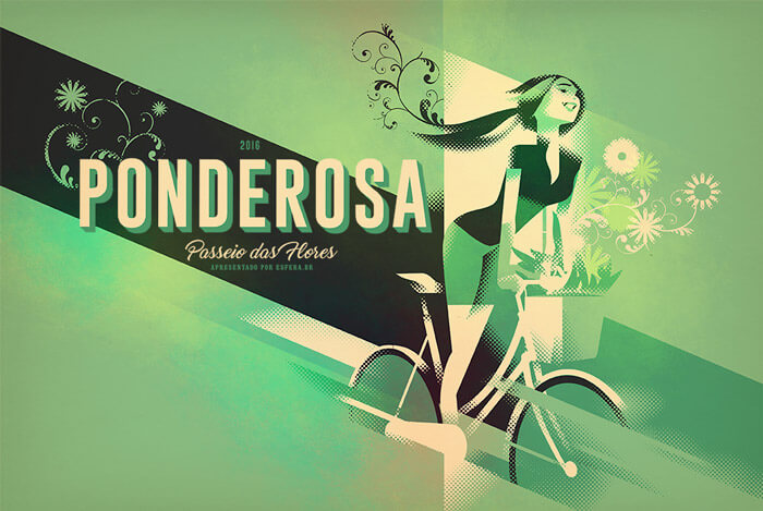
Ponderosa 2016
Not just because there’s a bicycle in it ;) Most of all picked because it has a wonderful composition with fine details.
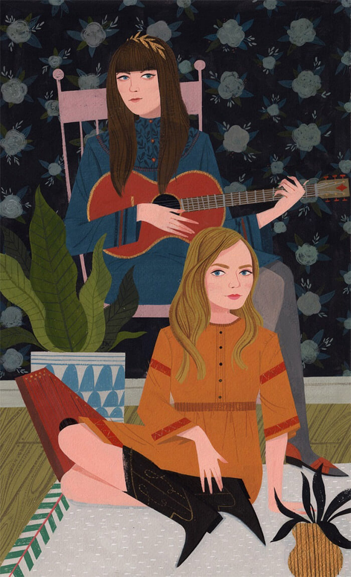
Music Girls
A wonderful fusion between contemporary and retro. Some inspiring texture work going on in there as well. The wooden floor and the little details on the faces — look at those eyes!
Facebook Events — Naomi
Part of a set of illustrations created for Facebook’s event cover images. Totally loving these colors! Lovely simplistic style, too.
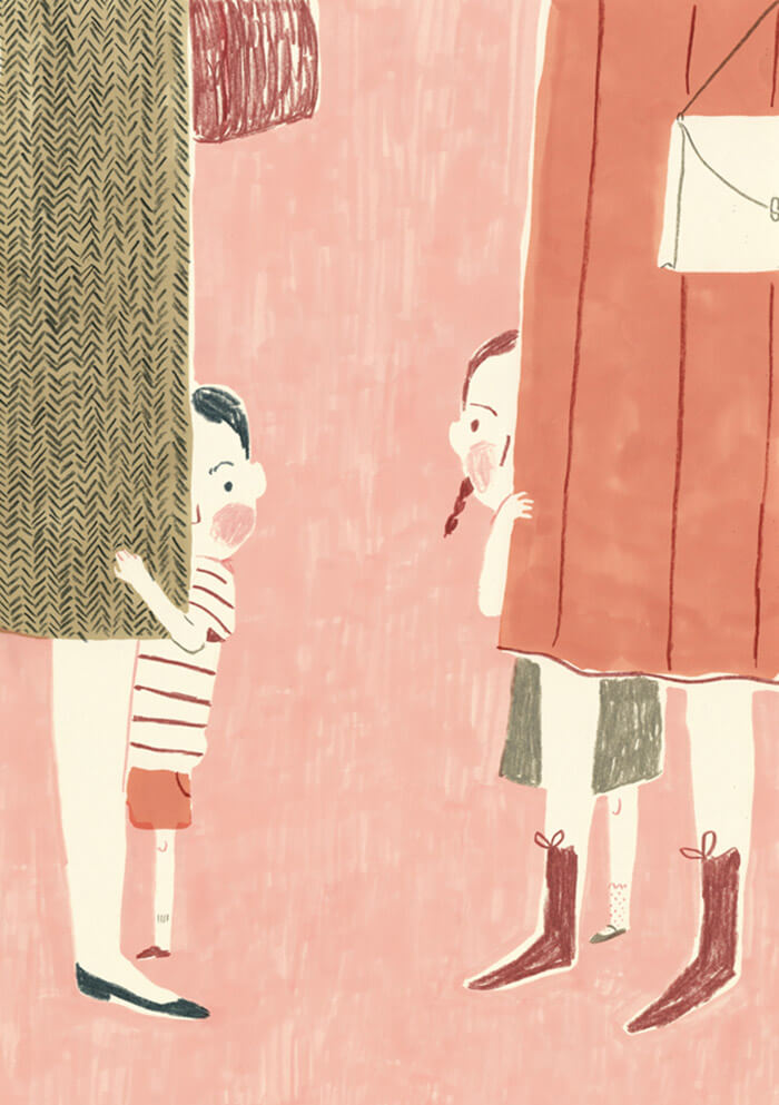
Hiding Behind Mom
A great example of what is possible with a few pencil strokes. The socks on the girl are adorable.
Look Around
An illustration to get the travel bug going. Great style and subtle usage of textures. For a touristic guide of the Garda Lake.
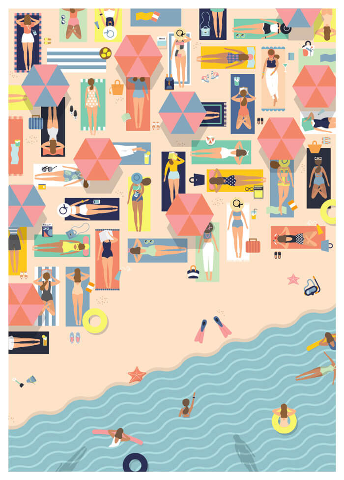
Summertime
“Let the waves hit your feet and the sand be your seat!” Exactly. I love compositions where there is much to discover. Great mix of colors.
Summer Bike Ride
Love how the diagonal line adds to the whole composition. Subtle use of shadows and transparency. Such perfect curved lines, especially hair and hat are done so perfectly in every way. Looking at this makes me want to go outside and ride.
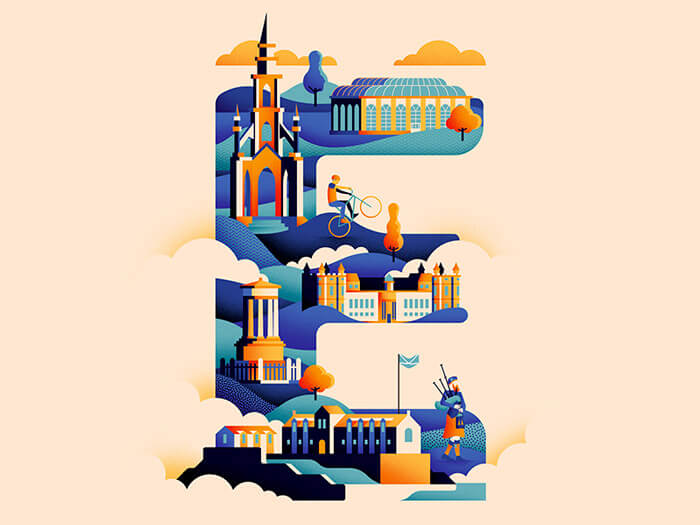
Wanderlust Alphabet E
The fifth installment in the Wanderlust alphabet that Jack Daly is creating. This time the ‘E’ stands for ‘Edinburgh’. The color treatment is great again. So many good details.
American Illustration 33
Super clean and the character really gets your attention. Love how the stockings are done. So simple, yet so elegant.
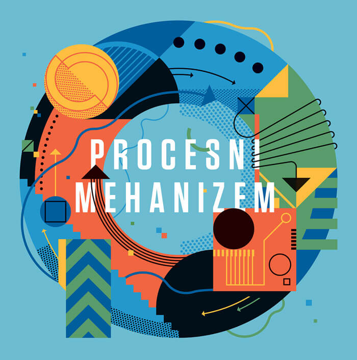
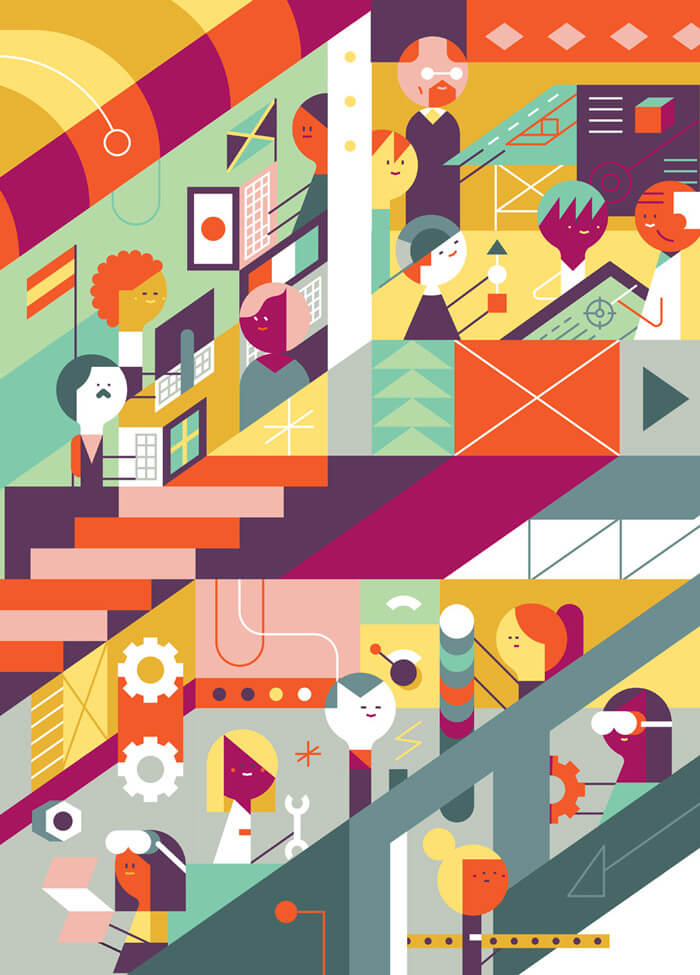
Procesni Mehanize
Illustrating the never-ending cycle. I always love to analyze the many elements that make a fantastic illustration. You can learn a lot from it.
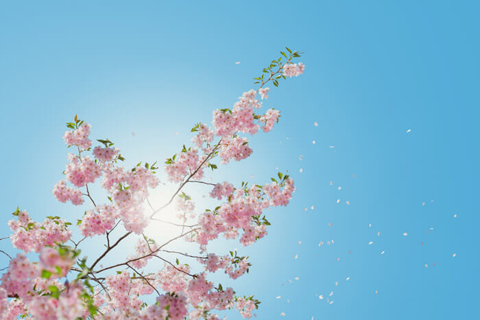
Blossom
One of the hardest things to get right is shooting directly into sunlight. This one nails it beautifully. Summer vibes!
Focus Magazine Illustration
Adorable cuteness and great usage of some basic shapes. Look at that cute mustache of the guy on the left. The color palette is absolutely perfect.
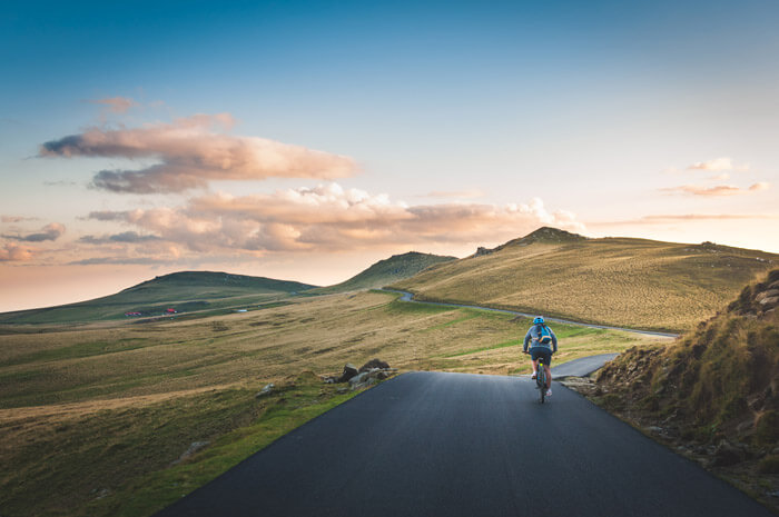
The Joy Of New Roads
Getting out on your bicycle and discovering new roads and amazing sceneries is a joy hard to describe in words. Lovely light in this photo.
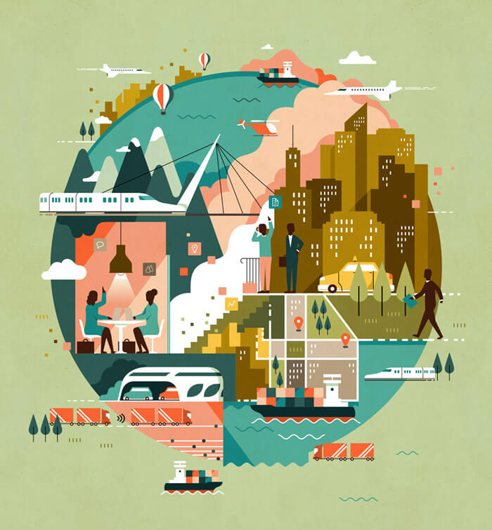
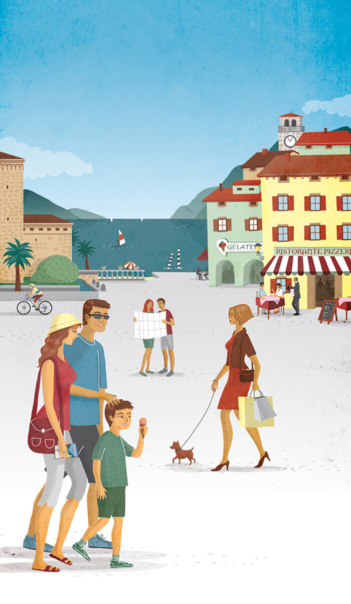
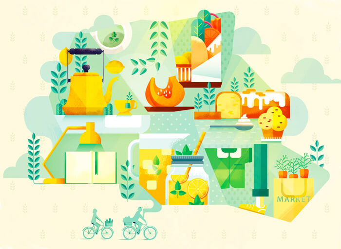
City Guide Berlin-London-Paris
Inspiring arrangement of all the different items in this composition. Beautiful 2D style with lovely subtle textures and patterns to finish things off. The colors also draw you in.
Velorama — Lightyear
Love the combination of line art and typography. Looks so elegant! The bike is so well drawn. It shines! Look at the frame, the handlebars and the saddle.

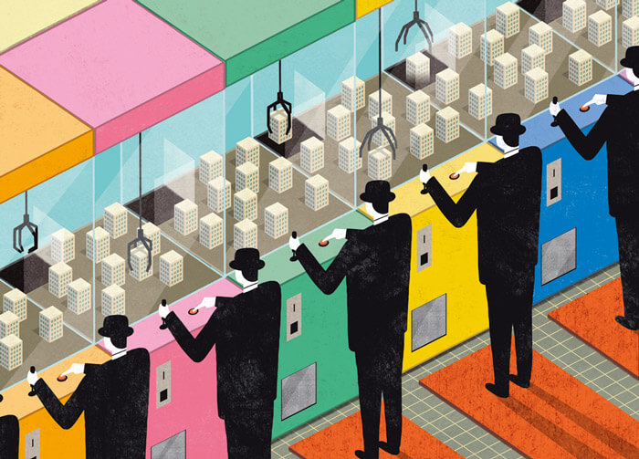
Els Amos Ocults Del Totxo
The Brickmasters in the Shadows. Great editorial illustration. The duplication of the gentleman withthe hat is the eye-catcher. The chosen colors make the whole scene complete.
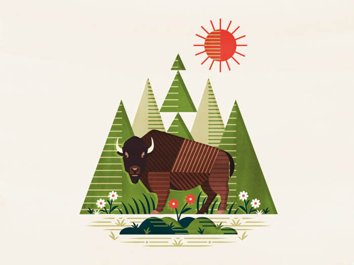
Bison
Right on target! Love what is done with the lines here.
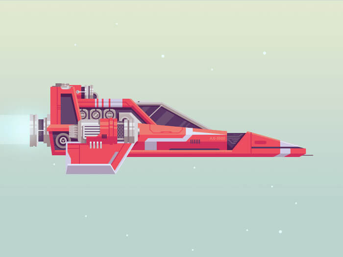
No Man’s Sky
Pretty fly! It looks highly complicated but is quite simplistic at the same time. The color scheming is on point, too. The subtle background gradient is so perfect.
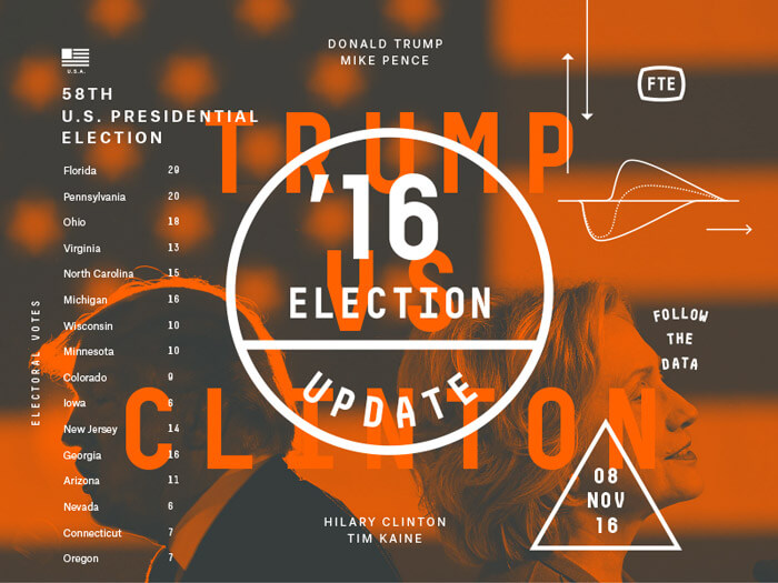
FiveThirtyEight Election
This looks fantastic! The many layers of typography are so inspiring.
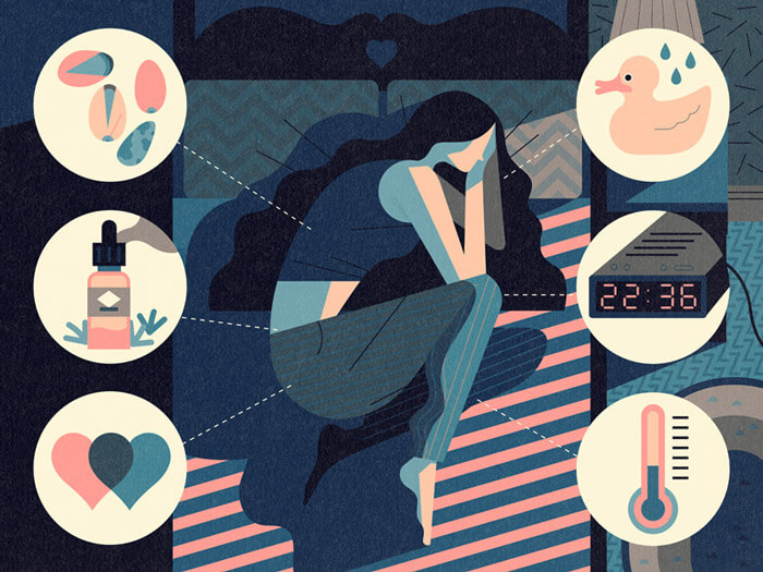
The Secret To Sleep
Lovely muted color palette for starters and some subtle textures work in combination with double shading makes this interesting. I really love the imagination and fantasy.
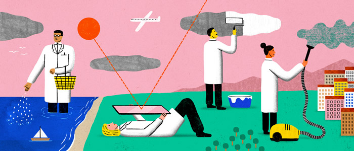
On Geoengineering
Created for an editorial piece about geoengineering. Love how it all has been translated to the screen.
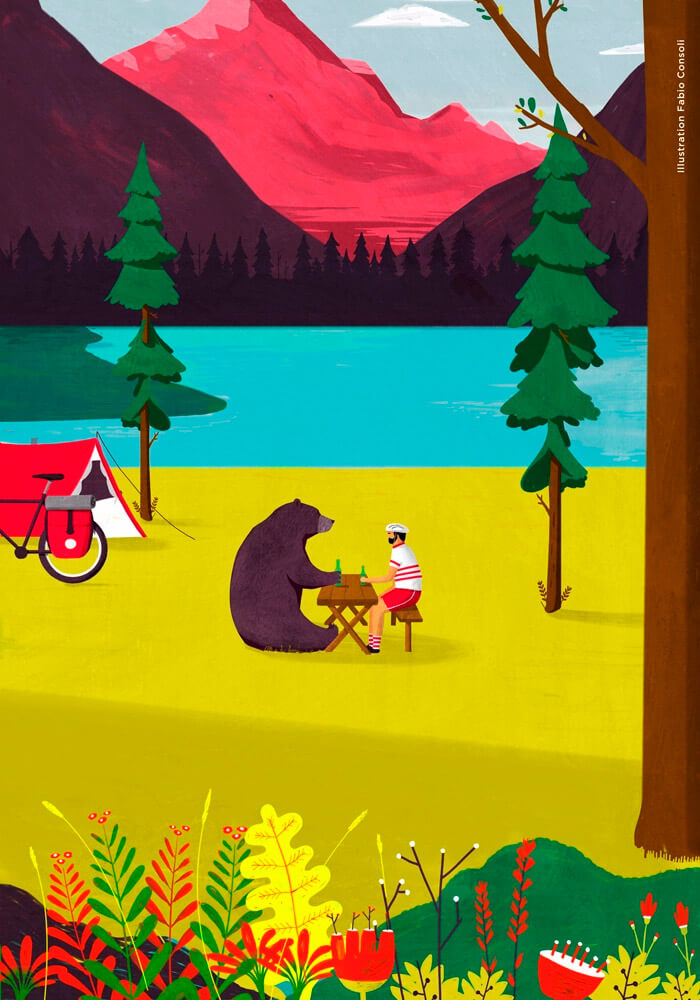
Bicycle Adventure Meeting (BAM)
In my opinion, a bit of humor always adds something special to any illustration. This one is about the Bicycle Adventure Meeting, a place where lonely, adventurous bike travelers join together. The lovely bright colors give this illustration a happy feeling.
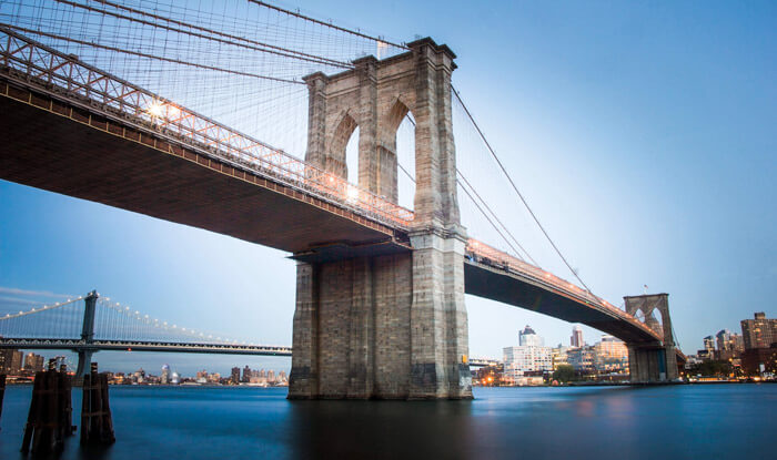
Brooklyn Bridge
Well captured! The tranquility of the water is what does it for me. Just the right shutter speed I’m assuming to get the effect.
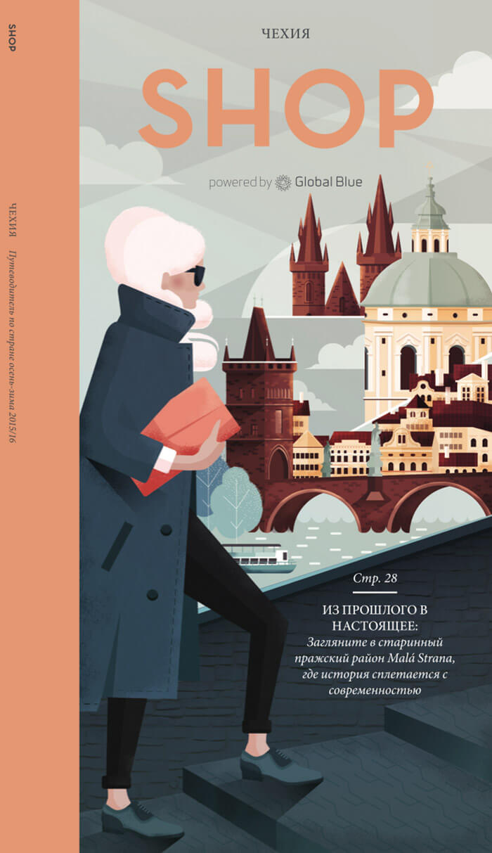
SHOP Magazine — Czech Republic
Charming textured style and an inspiring color palette.
Bicycling Magazine
Editorial illustration for an article on the importance of teamwork when learning road biking. I like how the three guys are nicely aligned and how the legs are drawn. As an illustrator, you have the freedom to break with reality in order to achieve beautiful compositions.

Further Reading
- Art Inspirations with Individual Artist Portfolios
- Pop Art Is Alive: Classics and Modern Artworks
- Beautiful Photoshop Illustrations By Artists Around The World
- Inspiring Illustrator Artworks By Artists Around The World


