Elements To Ditch Or Repurpose On Mobile

Email Newsletter
Weekly tips on front-end & UX.
Trusted by 200,000+ folks.


 Register!

 Flexible CMS. Headless & API 1st
With the end of the year quickly approaching, everyone is chiming in with predictions for 2019 web design trends. For the most part, I think these predictions look quite similar to the ones made for 2018 — which is surprising.
As we move deeper into the mobile-first territory, we can’t adhere to the same predictions that made sense for websites viewed on desktop. We, of course, can’t forget about the desktop experience, but it needs to take a backseat to mobile. This is why I wish 2019 predictions (and beyond) would be more practical in nature.
We need to design websites primarily with mobile users in mind, which means having a more efficient system of content delivery. Rather than spend the next year or so adding more design techniques to our repertoire, maybe we should be taking some away?
As the abstract expressionist painter Hans Hofmann said:
“The ability to simplify means to eliminate the unnecessary so that the necessary may speak.”
So, today, I’m going to talk about the mobile design elements we’ve held onto for a little too long and what you should do about them going forward.
Why Do We Need To Get Rid Of Mobile Design Elements In 2019?
Although responsive design and minimalism have inched us closer to the desired effect of mobile first I don’t think it’s taken us as far as we can go. And part of that is because we’re reticent to let go of design elements that have been with us for a long time. They might seem essential, but I suspect that many of them can be removed from websites without harming the experience.
This is why: On desktop, there’s a lot of room to play with. Even if you don’t populate every inch of the screen with content, you find creative ways to use the space. With mobile, you’ve drastically reduced the real estate. One of the biggest side effects of this is the amount of scrolling that mobile visitors have to do.
Why Does This Matter?
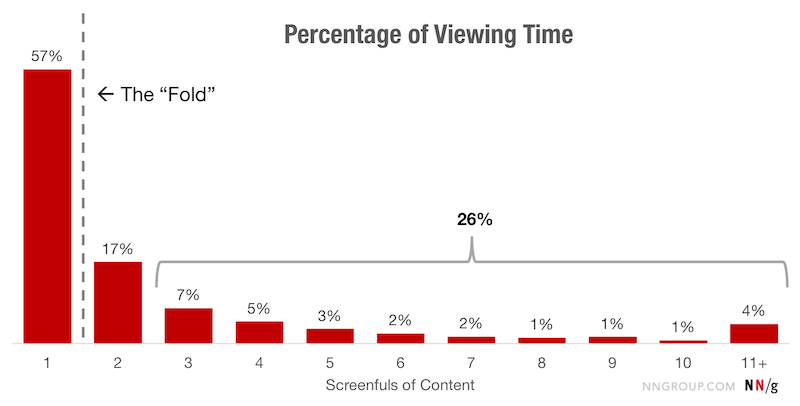
A 2018 study from the Nielsen Norman Group on scrolling and attention demonstrates that many users (57%) don’t mind scrolling past the above-the-fold line. That said, 74% of all viewing time occurs within the first two screenfuls.
If you try to fit all of those extraneous design elements from the traditional desktop experience into the mobile one, there’s a good chance your visitors won’t ever encounter them.
Although a longer scroll on mobile might be easy enough to execute, you might also find your visitors suffer from scrolling fatigue. My suggestion is to delete design elements on mobile that create excessive scrolls and, consequently, test visitors’ patience.
4 Mobile Design Elements You Should Ditch In 2019
If we’re not going to drastically change web design trends from 2018 to 2019, then I think now is a great time to clean up the mobile web experience. If you’re looking to increase times spent on site as well as your conversion rates, creating a sleeker and more efficient experience would greatly improve your mobile web designs.
In order to explain which mobile design elements you should ditch this year, I’m going to pit the desktop and mobile experiences against one another. This way you get a sense for why you need to say goodbye to it on mobile.
1. Sidebars
A sidebar has been a handy web design element for blogs and other news authorities for a long time. However, with responsive and mobile-first design taking over, the sidebar tends just to get shoved at the very bottom of blog posts now. But is that the best place for it?
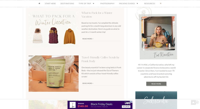
The Blonde Abroad is an example of one that puts most of the sidebar content into the bottom of a post.
Here is how a post appears on desktop:
Note that this isn’t the end of the sidebar either. There are a number of other widgets below the ones shown in this screenshot. Which is why the mobile counterpart runs on way too long for this website:

What you’re seeing here isn’t a cool social media-centric page. This is what mobile users find after they scroll past:
- Ads,
- A promotion of her web store,
- Recommended/related posts,
- A subscriber form,
- A comment form.
The Instagram feed then shows up, followed by the subscriber form once again! All in all, it takes about half of the page’s scrolls to get to the end of the content. The rest of the page is then filled with self-promotional material. It’s just way too much.
If Instagram is that prominent of a platform for her, she should have a link to it in the header. I would also suggest cutting back on the number of forms on the mobile web pages. Three forms (two of which are duplicates) is excessive. And I’d also probably recommend turning the recommended posts with images and titles into plain text links.
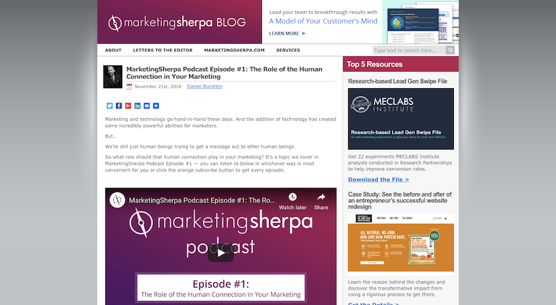
An example of an authority site that handles sidebars well is the MarketingSherpa blog. As you can see here, there is a fairly dense sidebar included in the desktop experience.
Turn your attention to mobile, however, and the sidebar disappears completely. Instead, you’ll encounter a super lightweight experience:
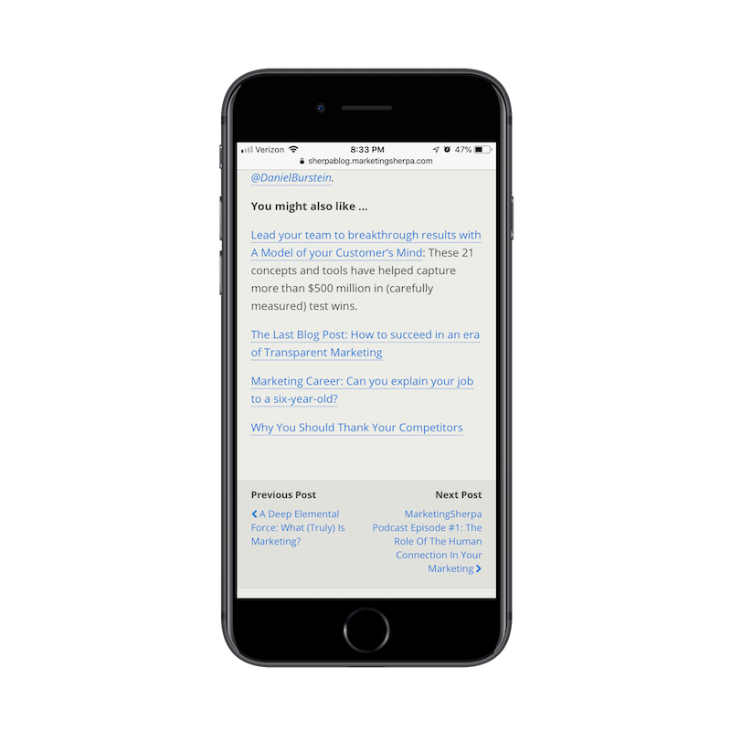
Below each post on the blog, you’ll find a succinct list of links recommended by the author. There is also a Previous/Next widget that enables readers to quickly move to the next published post. It’s a great way to keep readers moving through the site without having to make a mobile web page unnecessarily long.
2. Modal Pop-ups
I know that mobile pop-ups aren’t dying, at least so far as Google is concerned. But intrusive pop-ups aside, does the traditional pop-up have a place on mobile anymore? If we’re really thinking about ways to optimize the user experience, wouldn’t it make sense to do away with the modal altogether?
Here’s an example from Akamai that I’m shocked even exists:
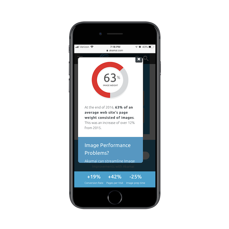
While perusing one of the internal pages of the mobile site, this pop-up appeared on my screen. At first, I thought, “Oh, cool! A pop-up with a graphic and statistic.” But then I read it and realized it was a scrolling pop-up!
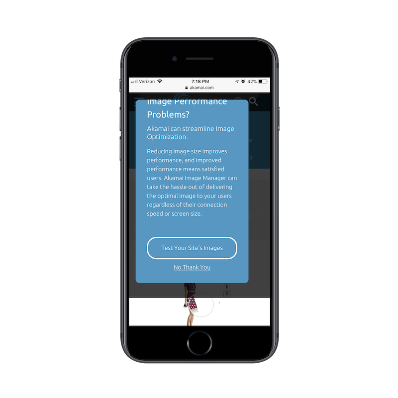
I’m honestly not sure I’ve seen one of these before, but I think it’s the perfect example of why modal mobile pop-ups are never a great idea. In addition to blocking the content of the site almost completely, the pop-up requires the visitor to do work in order to see the whole message.
I ran into another example of a bad pop-up. This one is on the Paul Mitchell website:
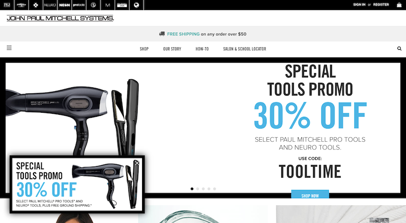
I thought it was an odd choice to place the same promotion in both the pop-up and the scrolling hero image. This one, however, is easy enough to dismiss since it’s clear what is the pop-up and what is the image.
On mobile, it’s not that easy to distinguish:
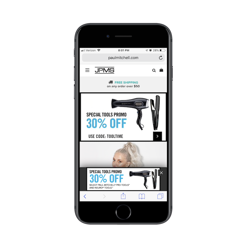
If I hadn’t seen the matching pop-up on desktop, I likely would’ve thought this web page had an error upon first seeing the duplication. It also doesn’t help that the hero banner now has an arrow icon in a black box, which could easily be confused for the “X” that closes out the matching pop-up.
It’s a very odd design choice and one I’d tell everyone else to stay away from. Not only does the pop-up appear instantly on the home page (which is a no-no), but it creates a confusing first impression. It might not be the traditional modal, but it still looks bad.
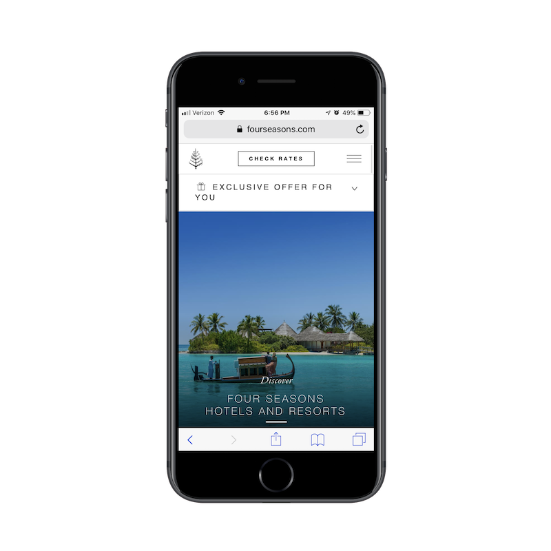
Switching gears, the Four Seasons website does a very nice job of handling its pop-ups. Here is the desktop pop-up widget:

Click on the pop-up, and it will open a full-screen pop-up offer. This is a nice touch as it gives the visitor full control over whether they want to see the pop-up or not.

The mobile pop-up counterpart does something similar:
The pop-up offer sits snug against the header, never intruding on the experience of the mobile site.
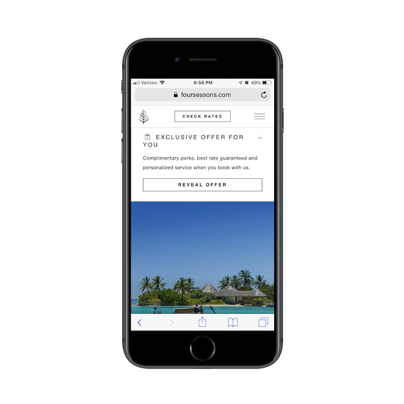
Even once the pop-up is clicked, it never blocks the mobile website from view. It only pushes the content down further on the page. It’s simply designed, easy to follow and gives all of the control over to the mobile user in terms of engagement. It’s a great design choice and one I’d like to see more mobile designers use when designing pop-up elements going forward.
3. Sticky Side Elements
I think a sticky navigation bar or bottom bar on a mobile website is a brilliant idea. As we’ve already seen, visitors are willing to scroll on a website. But visitors are more likely to scroll further down a page if they have an easy way to go somewhere else — to another page, to check out, to a special discount offer, etc.
That said, I’m not a fan of sticky elements on the side of mobile websites. On desktop, they work well. They’re typically tiny icons or widgets that stick to the side or bottom corner of the site. They’re boldly colored, easy to recognize and give visitors the choice of interacting when they’re ready.
On mobile, however, sticky side elements are a bad idea.
Let’s take a look at the Sofitel website, for example.

As you can see, there’s an orange “Feedback” button stuck to the left side of the screen. As you scroll down the page, it remains put, making it convenient for visitors to drop the developer a line if something goes wrong.
Here’s how that same button appears on mobile:
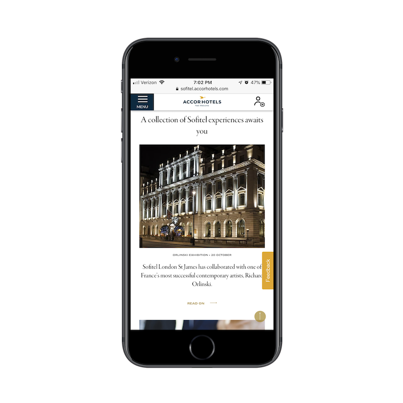
Although the “Feedback” button is not always blocking content, there are occasions where it overlaps an image or text as a user scrolls. It might seem like a minor inconvenience, but it could easily be what takes a visitor from feeling annoyed or frustrated with a website to feeling completely over it.
Wreaths Across America is another example of a sticky element getting in the way. On desktop, the blue live chat widget is well-placed.
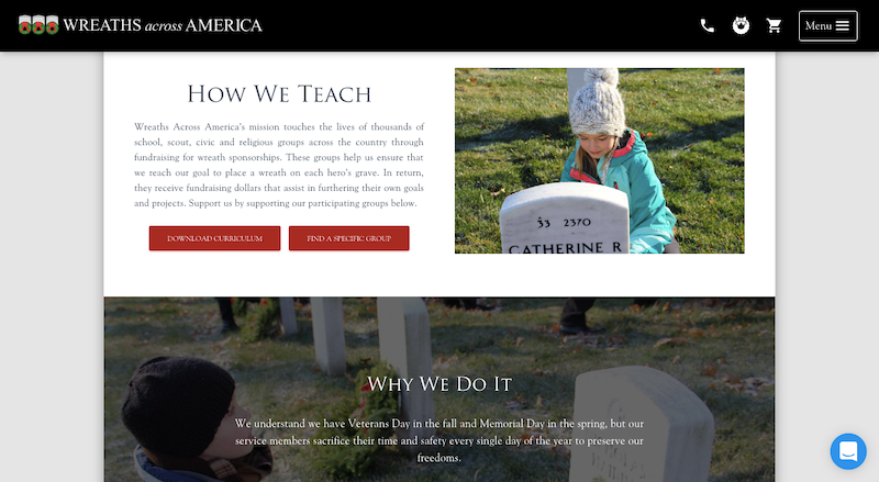
Then, move it over to mobile, and the live chat continuously covers a decent amount of content residing in the bottom-right corner.
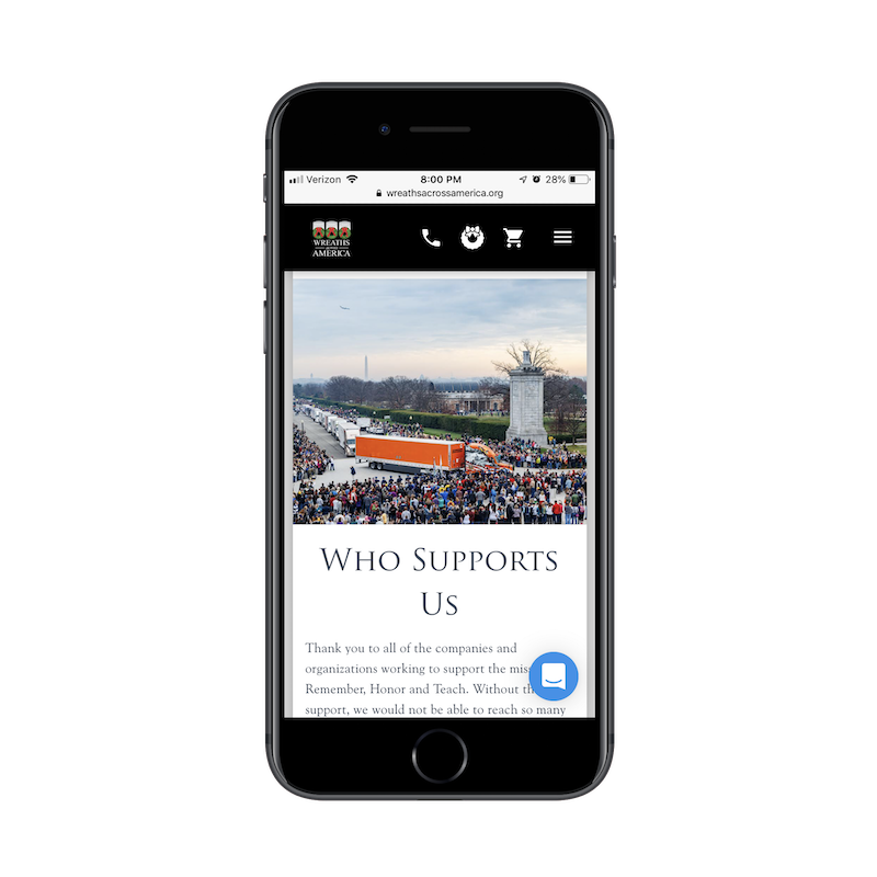
If your visitors aren’t actively engaging with live chat or other sticky side elements on mobile (and your statistics should tell you this), don’t leave them there. Or, at the very least, present an easy way to dismiss them.
One way to get around the sticky overlap issue is the solution BuzzFeed has chosen.
In recent years, many websites utilized floating and sticky social media icons. It was a logical choice as you never knew how long it would take for readers to decide that they just had to share your web page or post with their social media connections.
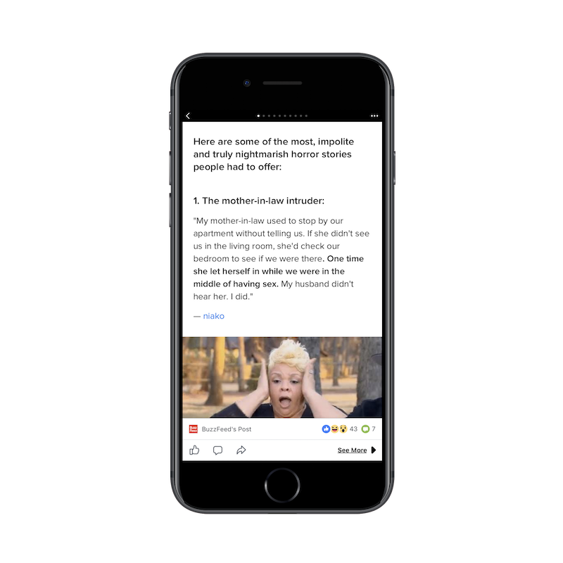
As we’ve seen with the live chat and Feedback widgets above, elements that stick to the side of the screen just don’t work on mobile. Instead, we should look to what BuzzFeed has done here and make those icons stick flush with the bottom of the screen.
We already know that sticky navigation and bottom bars stay out of the way of content, so let’s use these key areas of the mobile device to place sticky elements we want people to engage with.
4. Content
It’s not just these extraneous design elements or outliers that you should think about removing on the mobile experience. I believe there are times when content itself doesn’t need to be there.
If you want to get visitors to the crux of your message in just a few scrolls, you can’t be afraid to cut out content that isn’t 100% necessary.
I think ads are one of the worst offenders of this. TechRepublic has a particularly nasty example of this — both for desktop and mobile.

This is what the TechRepublic desktop website looks when you first visit it. That alone is horrendous. Why does anyone use ad banners above the header anymore? And why does this one have to be so large in size? Shouldn’t TechRepublic’s logo and navigation be the first thing people see?
It was my hope that, upon visiting the mobile site, the ad would’ve gone away. Sadly, that wasn’t the case.
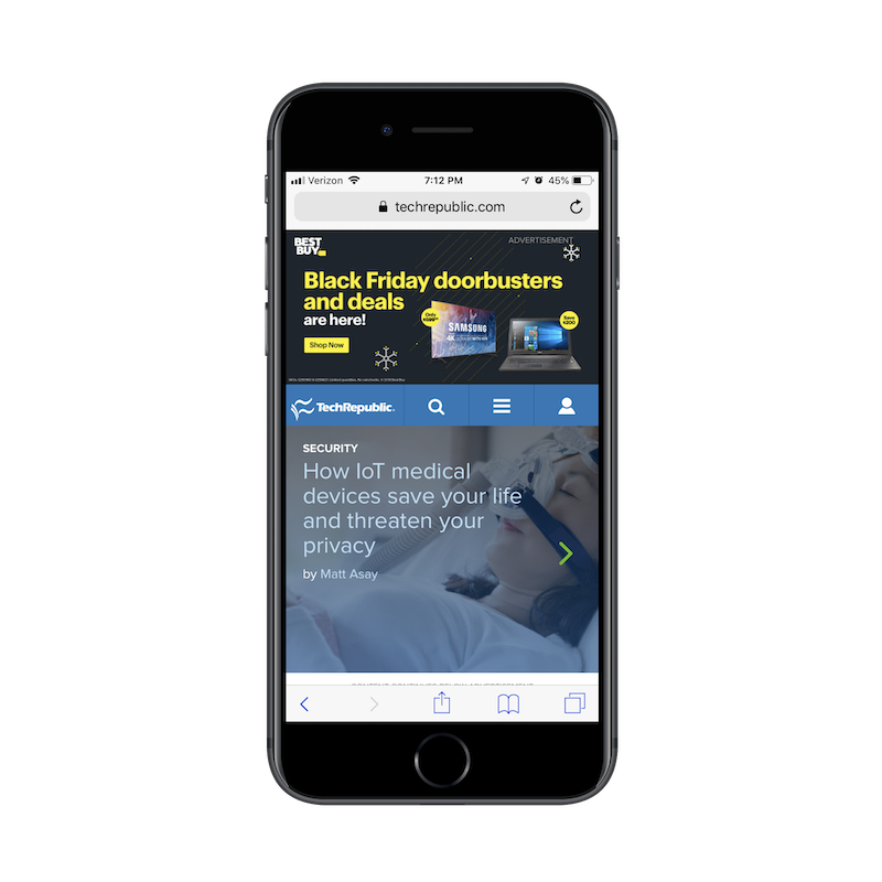
What we have here is a Best Buy ad that takes up roughly a third of the TechRepublic mobile home page. Sure, once a visitor scrolls down, it will go away. But where do you think visitors’ eyes will go to first? I’m willing to bet some of them will see the logo in the top left and wonder how the heck they ended up on the Best Buy website.
This is one of those times when it’s best to rethink your monetization strategy if it’s going to intrude and confuse the mobile user’s experience.
Now, let’s look at the good.
Kohl’s has a pretty standard product page for an e-commerce website:
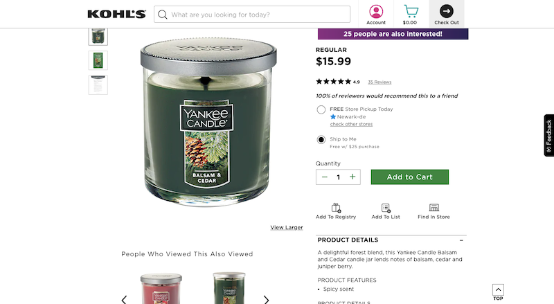
When displayed on mobile, however, you’ll find that the product views disappear:
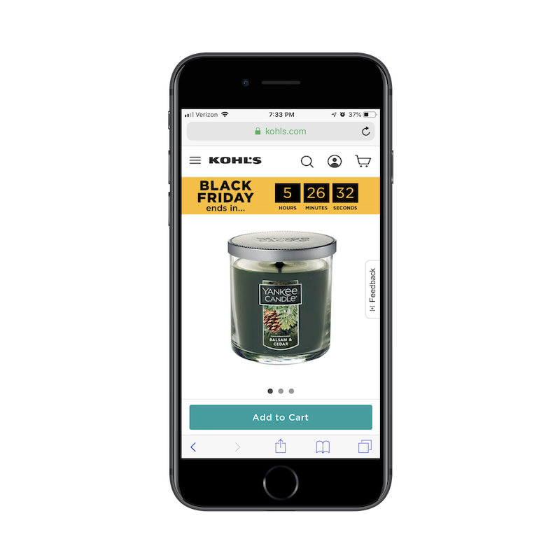
Instead of trying to make room for them, the different product views are hidden under a slider. This is a nice choice if you would prefer not to compromise on how much content is displayed — especially if it’s essential to selling the product.
Another great example of picking and choosing your battles when it comes to displaying content on mobile comes from The Blonde Abroad.
Readers of her blog can choose content based on the global destination, as shown here on the desktop website:
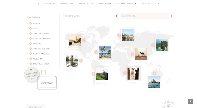
It’s a pretty neat search function, especially since it places the content within the context of an actual map.
Rather than try to force a graphic like this to fit to mobile, The Blonde Abroad includes only the essentials needed to conduct a search:
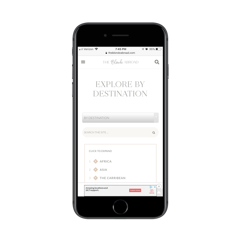
While mobile readers might miss out on the mapped content, this provides a much more streamlined experience. Mobile users don’t want to have to scroll left and right, up and down, in order to search for content from an oversized graphic. At its core, this section of the site is about search. And, on mobile, this clean presentation of search options is enough to impress readers and inspire them to read more.
Wrapping Up
In Stephen King’s guide to writing, On Writing, he says something to this extent:
“Create your content. Then, review it and delete 10% of what you created.”
Granted, this applies to writing a story, but I believe this same logic applies to the designing of a mobile website. In other words: Why test your visitors’ patience — or even worse — create too cumbersome of an experience that they miss the most important parts of it? Go ahead and translate the idea you had for the traditional desktop landscape into a mobile setting. Then, review it on mobile and gut all of the unnecessary bits of content or design elements.
Further Reading
- Accessible Target Sizes Cheatsheet
- Iconography In Design Systems: Easy Troubleshooting And Maintenance
- The Things Users Would Appreciate In Mobile Apps
- Connecting With Users: Applying Principles Of Communication To UX Research
 (ra, yk, il, mrn)

