Exploring The Latest Web Design Trends Together With Be Theme

Email Newsletter
Weekly tips on front-end & UX.
Trusted by 200,000+ folks.
(This is a sponsored article.) Designers have a strange relationship with trends. On the one hand, when designers follow a crowd, they might feel that they aren’t able to express enough creativity. On the other hand, trends can tell designers a lot about user preferences — what people love, what they hate — and ultimately help designers to create products with better adoption rates.
People are visual creatures, and visual design has a significant impact on the way we understand products. In this article, I want to focus on the most crucial web design trends and illustrate each trend using Be Theme, a responsive multipurpose WordPress theme.
Let’s get started.
1. Digital Illustrations
Digital illustrations have become one of the most important trends in visual design. Relevant illustrations can make your design stand out from a crowd and establish a truly emotional connection with visitors. Illustrations are quite a versatile tool; product designers can use digital illustrations for various purposes: for hero sections, for feature descriptions, or even as a subtle icon in the navigation bar.
Two types of illustrations are popular among digital designers: hand-drawn flat illustrations and three-dimensional ones. Flat hand-drawn ones give an impression of fine craftsmanship, of a hand-made design; it’s relatively easy to see the personal style of the illustrator through their work. Slack, Intercom and Dropbox are just a few companies that use flat hand-drawn illustrations.

Three-dimensional illustrations are quite a new trend. Designers started using them to add more realism, blurring the boundary between the digital and physical worlds.
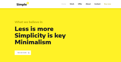
2. Vibrant Colors
There is a reason why so many digital product designers strive to use vibrant colors: Vibrant colors give visual interest to a layout. User attention is a precious resource, and one of the most effective ways to grab attention is by using colors that stand out. Bright colors used for the background can capture the visitor’s attention and contribute to a truly memorable experience.
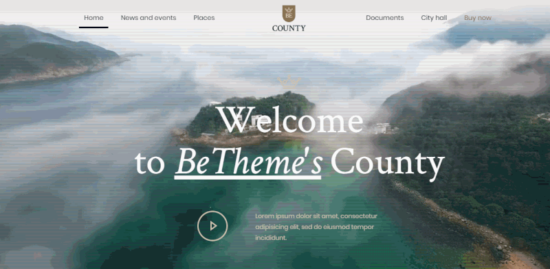
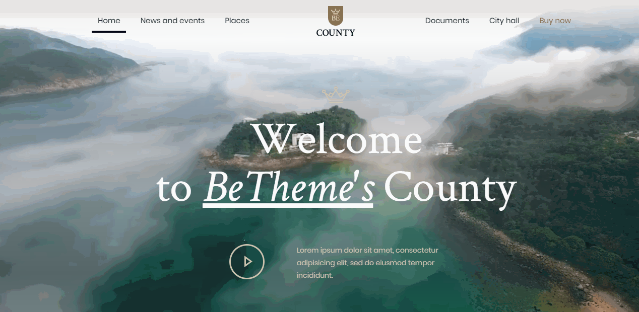
3. Hero Video Headers
“Show, don’t tell” is a foundational principle of good product design. Imagery plays a key role in visual design because it helps the designers to deliver the main idea quickly.
For a long time, web designers have had to use static imagery to convey their main idea. But the situation has changed. High-speed connections make it much easier for web designers to turn their home pages into immersive movie-style experiences. Video engages users, and users are more willing to spend time watching clips. Video clips used in a hero section can vary from a few seconds of looped video to full-length preview clips with audio.
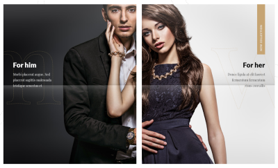
4. Split Screen
Split screen is a relatively simple design technique. All you need to do to create one is divide the screen into two parts (usually 50/50) and use each part to deliver a distinct message. This technique translates well on mobile; two horizontal panels of content can be collapsed into vertical content blocks on small screens. The technique works well when you need to deliver two separate messages, as shown below.
It also works well when you have to pair a text message with relevant imagery:

5. Geometric Patterns
Designers can use geometric shapes and patterns endlessly to create beautiful ornaments. This technique works equally well for digital products. Designers can use SVG images and high-resolution PNGs with geometric patterns as backgrounds. Such backgrounds scale well, so you won’t have to worry about how they will look on small and large displays.

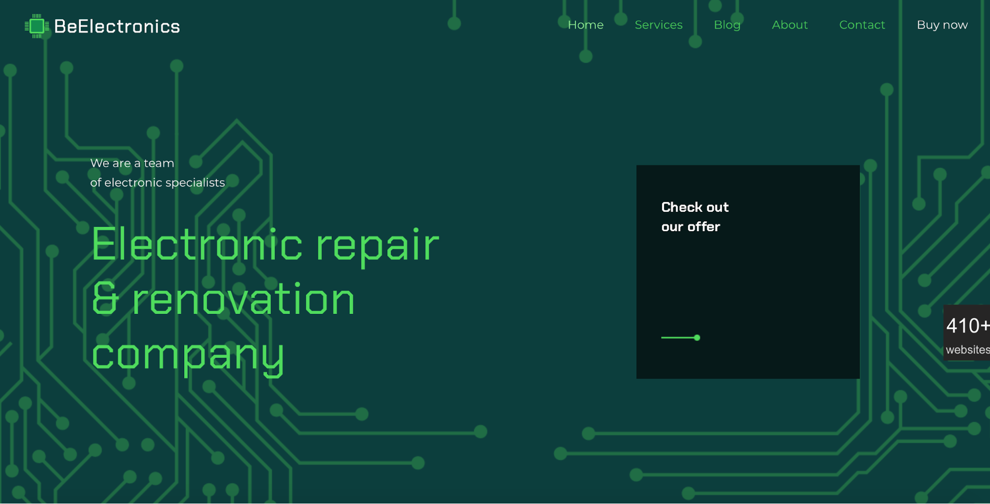
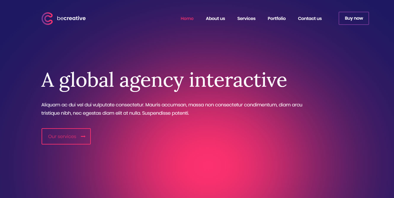
6. Gradients and Duotones
Gradients are the multipurpose tool that works in pretty much any type of design. Designers often use gradients to give their work a little more depth. Modern graphic design trends dictate the use of big, bold and colorful gradients, which help designers make a statement.
When it comes to gradients, designers have a lot of creative freedom. They can experiment with various colors and types, using radial gradient, linear gradients, etc. For example, this is what happens when you put a linear one-color gradient overlay on a photo:

And this is how a radial two-color gradient looks on a plain background:
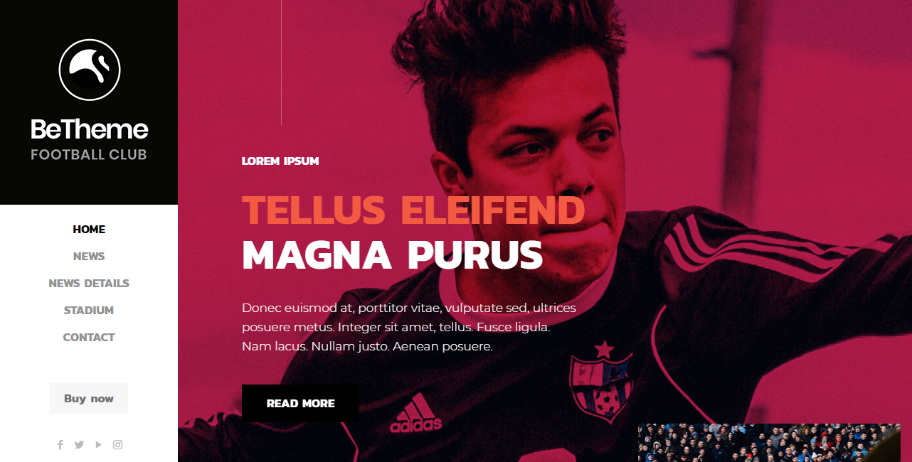
The duotone effect was made popular by Spotify, the online music-streaming service. The service was searching for a bold identity for its brand and decided to use duotones in its design.
In the simplest terms, duotones are filters that replace the whites and blacks in a photo with two colors. Duotones can make almost any image match your company’s branding; simply use your brand’s primary color as the duotone filter.

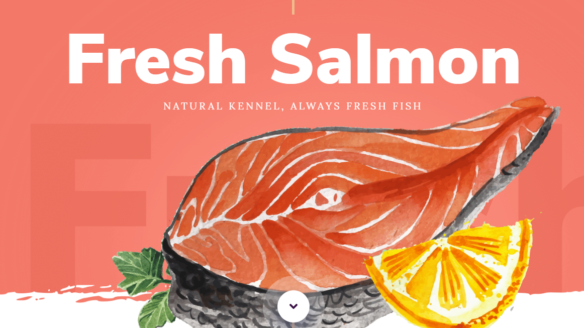
7. Bold Typography
Most designers know that content should always come first in the design process. A design should honor the message that the product’s creators want to deliver to their users. Bold typography helps designers to achieve that. Massive, screen-dominating text puts the written content center stage.
Bold fonts serve a functional purpose — they make it easy to read the text. Consider the following example. This template is an excellent example of how powerful a bold font can be:

Conclusion
“Should I follow the trends?” As a designer, you have to answer that for yourself. But if you want to see how each trend works for your project, you can do it right now. All of the Be Theme examples listed above can serve as excellent starting points for your creative journey.